It won’t surprise you that Atlassian is data-driven and the data from their guides is tracked along with other app usage analytics.
A few years back we started to see Atlassian introduce a few tips; the craft and sophistication has increased over time – here is a fresh example.
Recently Confluence got a make-over and they do a nice job of introducing the change.
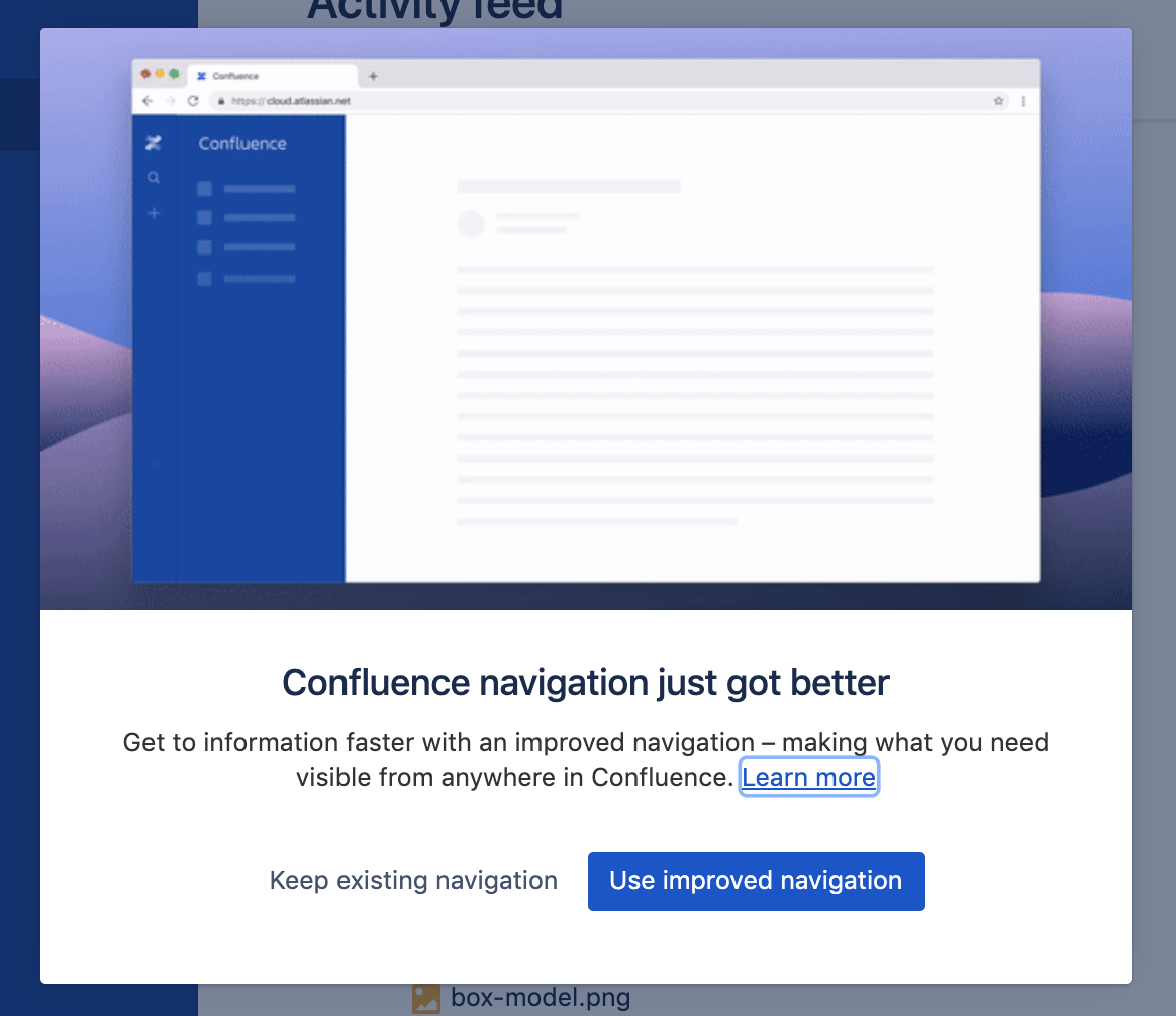
What’s cool about the use of graphics here is:
1. that they abstract away everything you don’t need to see (other sidebar menu options, body text) so that you don’t get distracted.
2. Super-clear call-to-action. Its clear that the Confluence team want to get most users across onto the new navigation.
3. “Learn more” is present but not the highest priority – they allow your to take the guide if you are unsure as there is an element of unknown for the user.
Whats more controversial is that they don’t show the guide before the prompt – this is also likely a decision that comes from analytics showing than many people WILL jump to the new navigation if you show it upfront.
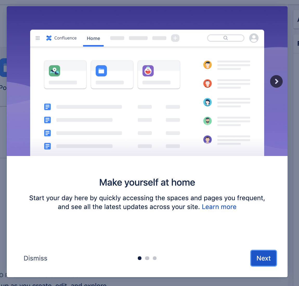
The “Learn more” is a fairly normal guide in a carousel form. Again the intelligent use of graphics use the main characteristics of the screen as signpost the user can recognise.
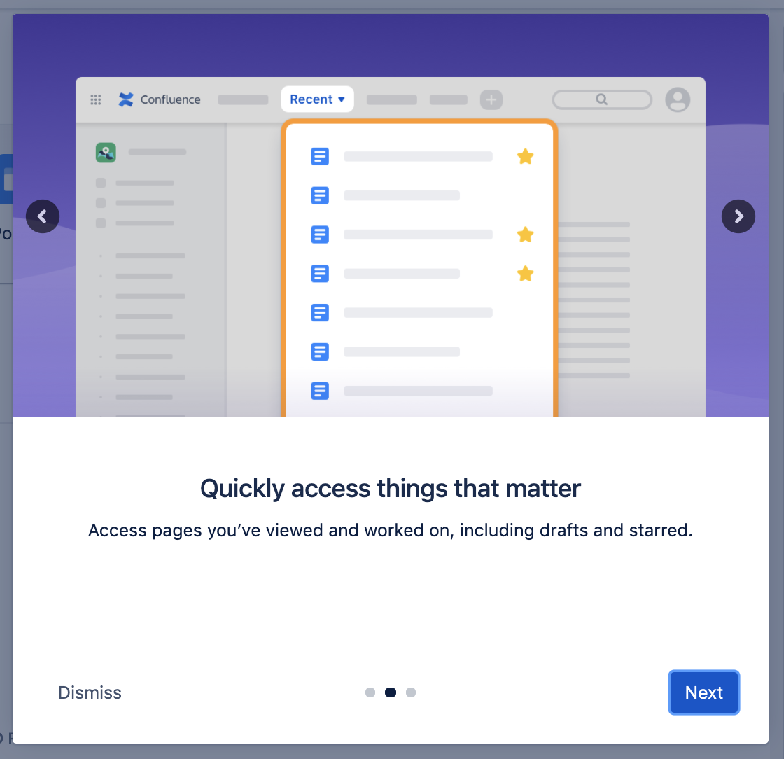
Good elements of a carousel:
1. Clear title/description.
2. Back/Next arrow buttons
3. “Next” button is highlighted and strongest as the intention for the product team to get the user through the process.
3. “Dismiss” is important as an escape route. Could also be a “X” button at top right.
4. Progress indicator “…” lets the user understand how much time they’ve invested and how much time left. This type of contextual orientation is essential to avoid abandonment.
5. The cutout on “Recent” is a little inconsistent with the previous “Home” step. However, you can really get the focus with the cutout. At Contextual we love cutouts as it really allows the point to standout and user remains undistracted. The cutout is even more important when you are doing contextual guides pointing at things ACTUALLY on the screen.
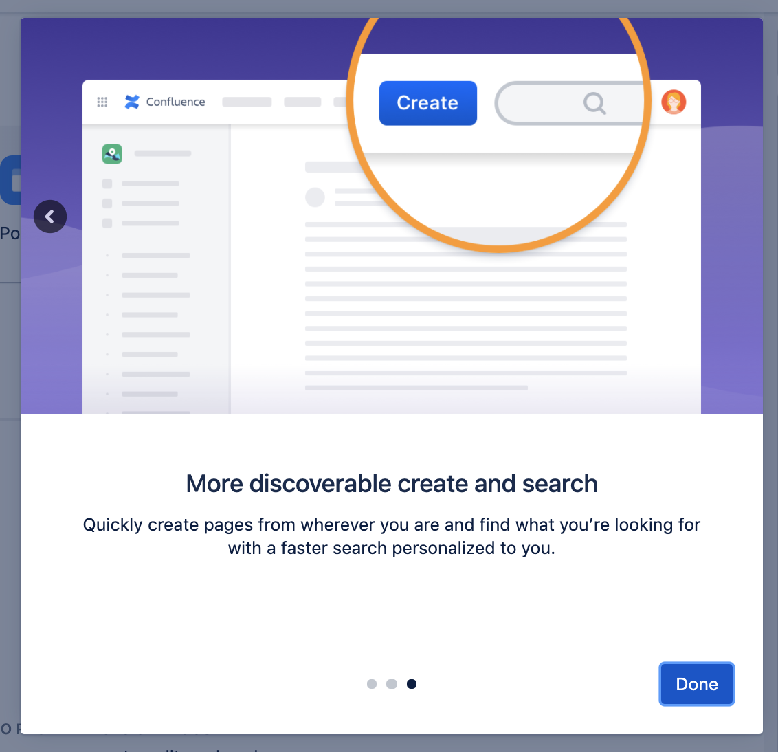
In summary, Atlassian have opted for a takeover carousel dominating the whole user experience rather than point at specific screen elements. It would be great to understand why – maybe it just controls the experience more.
So it’s not really a “Guide” but its a great intro to the new navigation in confluence.
The intelligent use of abstracted graphics is beautiful and informative – but it does require you having an artist on staff – not a luxury many teams have. Sure you have a designer but they may not have the skill, tools or time to do with the same quality. So using guides maybe a better approach.


