What Is App User Onboarding?
It is all about the first impression. All the combined steps a user takes as soon as he opens the app, from the welcome page to the info screen represent onboarding sequences.
It is the foremost condition that determines user retention, proven to be effective in over 50% of the cases if done correctly.
You want to focus on progressive onboarding. What does it mean exactly? The MAGIC of your user engagement strategy is getting people to learn and connect with:
- Your key use-case in the onboarding process
- Secondary functions and uses downplayed to reach your primary objective
- Nudging users to go further at the perfect moment
- Contextual support when they need it
Trialler abandonment is scary for any App’s Product Manager. But we’ve seen Apps that have increased user engagement over the time – so what is the hidden secret? It’s time to walk you through some of the best UX practices!
The User Onboarding Checklist
All businesses approach the app onboarding process differently, depending on the product’s features or the target audience. Let’s take a look at the key elements that transform the onboarding experience into a successful tool for user retention.
- Focus On Your Value Proposition
Instead of prioritizing your app’s functionality, begin by discussing what the user would gain from using it. It will not only encourage people to use your app in the future, but it will also reassure them that it is functional and serves the purpose for which it was designed.
- Ask for Concise Information
Your ultimate goal is to get new users to sign up for your product. Keep the procedure as short as possible and offer them the chance to use other existing accounts to fill in the signup form, as a way of saving time. Make sure that the information required is clear and short, as it reduces the amount of friction generated by the sign-up obligation in the user onboarding process.
- Offer A Personalized Experience
By far, we know that the key step of your user engagement strategy is to personalize everything they see based on their preferences. It does not only show that you are customer-centric, but it also enhances their experience, as the content they see is tailored to their needs and choices.
- Invest in Good UX
A good design can be a game-changer for any app. When UX influences user experience, conversion lift can increase by up to 83%. Following the best UX practices, we notice that users are more likely to stick around and be engaged with your app, as visuals have a great impact on user retention.
Examples of Apps With the Best User Onboarding Flow
App onboarding directly impacts your user engagement strategy and pays off in a variety of ways.
Low churn, greater retention, and higher customer happiness are all benefits of a strong onboarding experience that helps the user grasp the product and its relevance.
Let’s take a look at the best examples out there!
Are you looking to get more users to love your mobile and web apps? Click on the buttons below to get your 14 day free trial or contact us for a demo!
1. Slack: No distractions
We’ve written about Slack tips and guides before. Created as a messaging app between teams to help businesses communicate more effectively, Slack offers a great example of user onboarding, as it keeps it simple and without distractions. When opening the app, new users are prompted with its features and a four-step tour that portrays the app’s value-oriented onboarding strategy.
Users are encouraged to walk through the software as they try it out and actually use it. The tooltips are concise and helpful, and the tour may be stopped at any time. Slack also introduced a modal window to allow desktop alerts, as part of their onboarding flow.
Popups are used to showcase all of the most significant aspects and the onboarding procedure is simple due to the lack of hard steps. Users are not distracted by unnecessary notifications, email confirmation, or creating a password.
2. Duolingo: Increased User Engagement
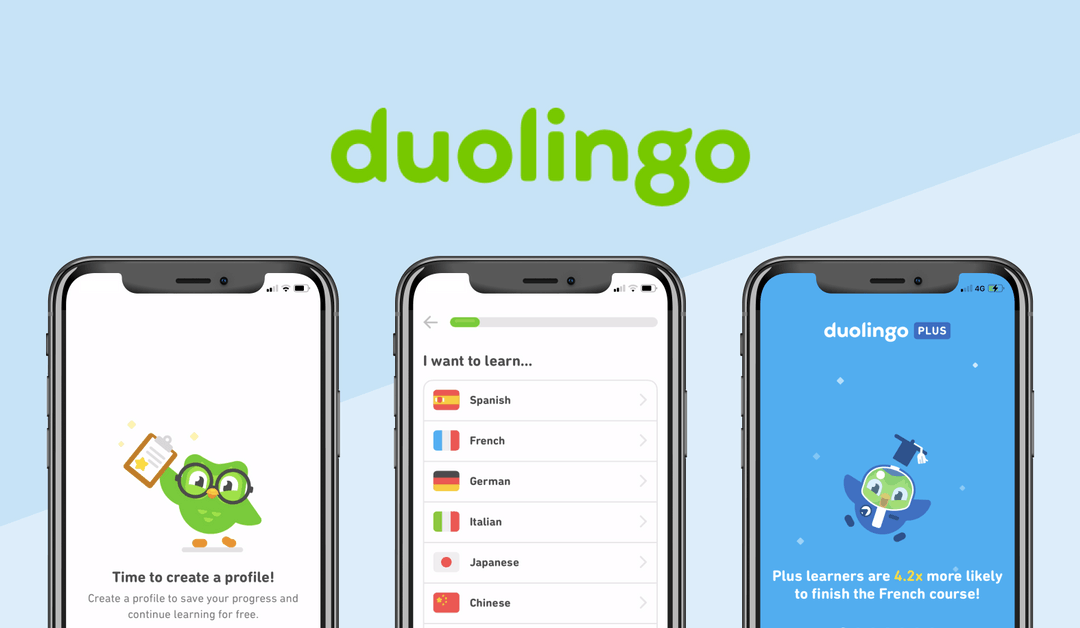
Unlike many other apps out there, Duolingo does not focus on the user onboarding process from the beginning.
New users are not prompted to sign up right after opening the app, instead, they are asked to set a goal. This is a great example of JTBD and “getting out of the way”.
After deciding on a language goal, Duolingo gives new users the choice of starting from the beginning or taking a placement exam. Only at the third interface level does the experience become individualized, as the app presents several tools that users can choose from based on their preferences.
The onboarding strategy has proven to be very effective, as it focuses on the product first and only after that, users can choose to create an account. Unregistered users are restricted from accessing some features, but they can still enjoy learning a new language. The sign-up process is simple as well, it only asks for a name, email, and password.
3. Strava's Onboarding Flow

Created as a platform site for cyclists and athletes who track their runs and rides through GPS, Strava offers one of the best and most simple mobile app onboarding (mobile user onboarding) experiences out there. The app is accessible through Facebook, Google, or e-mail. During the signup process, Strava directs you to a screen where you can connect your Facebook friends – this is key to user activation – Strava has probably figured out via analytics, surveys, user interviews that Strava is inherently social.
Strava requests permission to notify users through email about their statistics, updates, or community stories when they create a basic profile.
Then, it asks users about the sports they are practicing and asks for some data records. Strava has one of the best UX practices due to its clear and simple user interface.
4. Calm: Simple and Effective Design

We’ve compared Calm and a few other meditation apps before – since then Calm has become a “unicorn” (a startup valued at more than $1B). As an application that aims to help users reduce stress and anxiety, Calm clearly knows how to make a good first impression, by greeting them with “take a deep breath”.
Then, it familiarizes the user with the app’s features: sleep tales, breathing programs, and guided meditation.
The users are then asked to set their goals and allow push notifications, as well as create an account or link the app to an existing one. Even though an account is not mandatory, users are presented with the benefits of having one and the premium features it has to offer. The minimalistic and simple design allows users to discover the product by themselves, still providing them with simple and effective in-app tutorials.
5. Voly - fast grocery delivery service

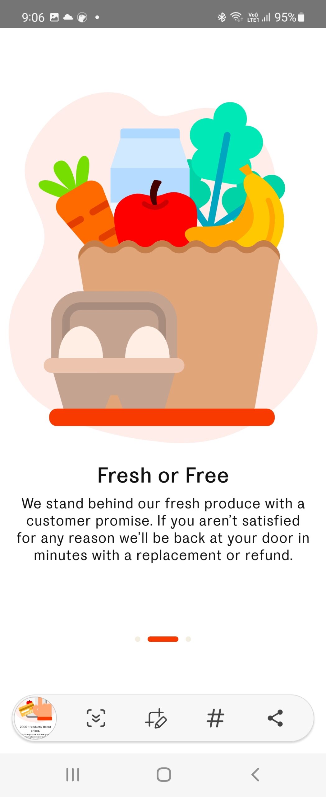
Voly is new (in Australia) but it’s one of the new, new breed of 15minute grocery delivery startups – another is Milkrun. Readers know I’m not a huge fan of carousels because they are often just repeating what the marketing says.
However, we do think carousels can explain and emphasize business value or purpose – in this case Voly speaks to their “replace or refund guarantee” and that is important to tell users.
You can create user onboarding guides just like the big guys! Click on the buttons below to get your 14 day free trial or contact us for a demo!