Category: carousels

  • Top 10 reasons for using Carousels for Mobile app user onboarding

    Top 10 reasons for using Carousels for Mobile app user onboarding

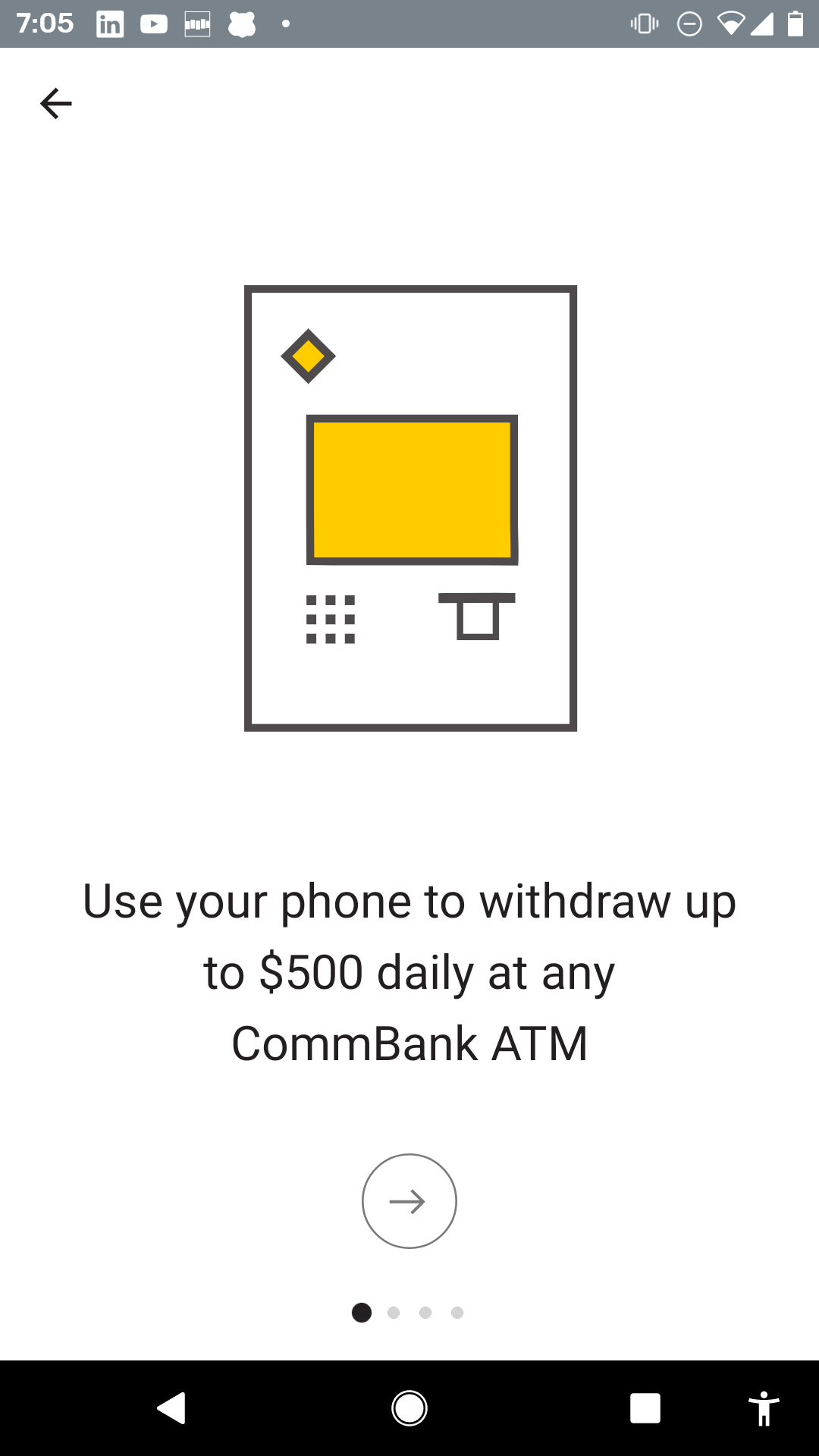
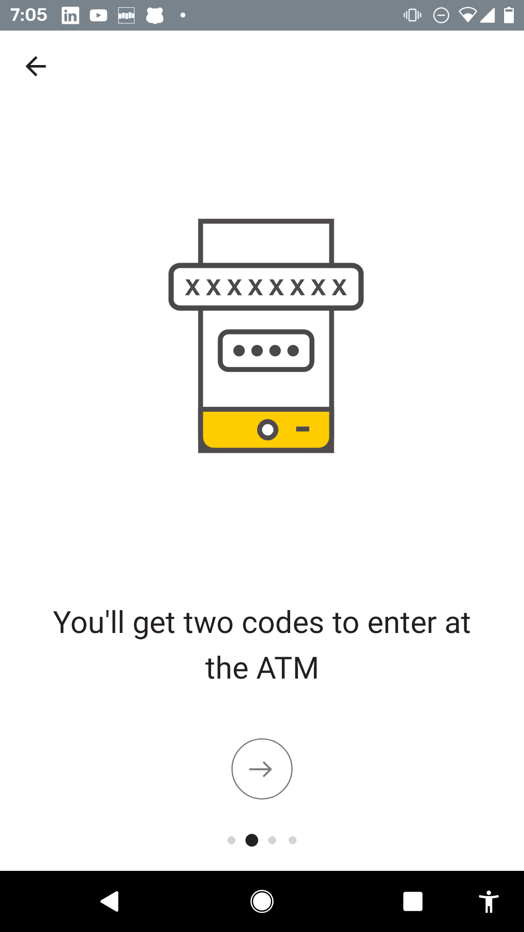
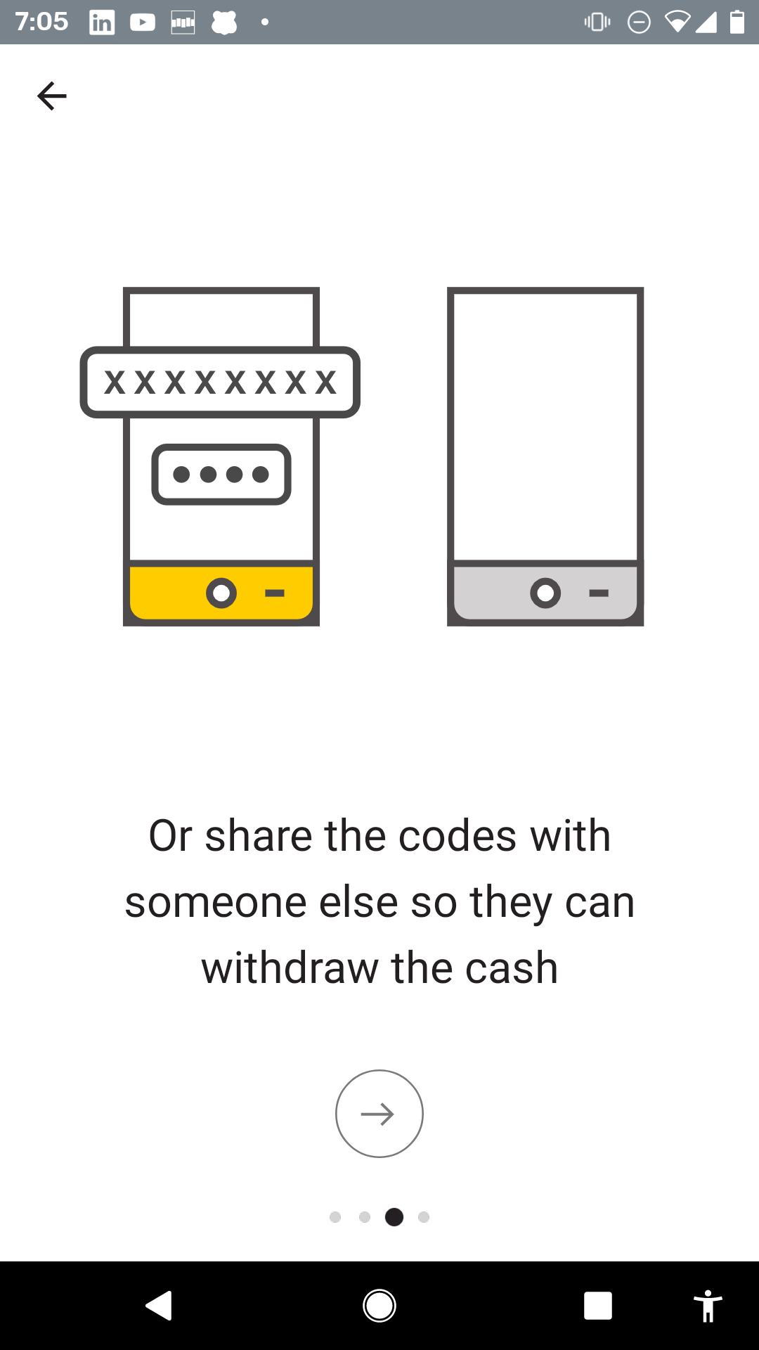
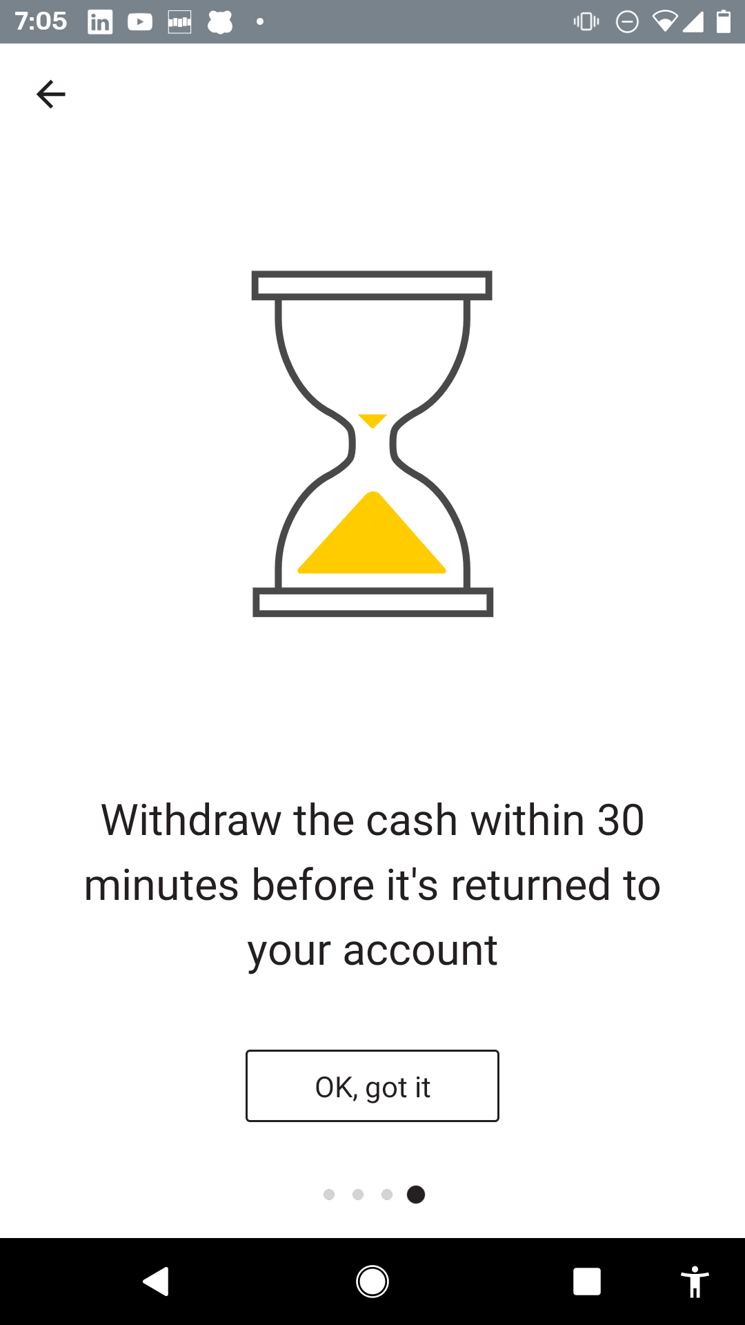
    For mobile app user onboarding carousels used to be a thing but what about now?  Carousels (also known as sliders or onboarding screens) were still a common design pattern in mobile app onboarding. They are used to introduce users to the primary features or benefits of an app when it’s first launched. Carousels typically consist of several swipeable screens, each with visuals and text, sometimes accompanied by pagination dots to indicate progress.

    However, the usage and effectiveness of carousels in onboarding can vary based on several factors:

    Effectiveness: Some studies and anecdotal evidence suggest that not all users swipe through all the screens in a carousel. If the first couple of screens don’t grab their attention, they might skip the rest. Carousels, when used in mobile user onboarding, serve a variety of purposes. Here’s a breakdown of the role they play:

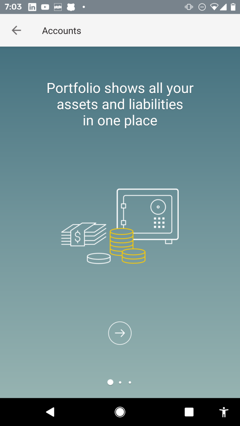
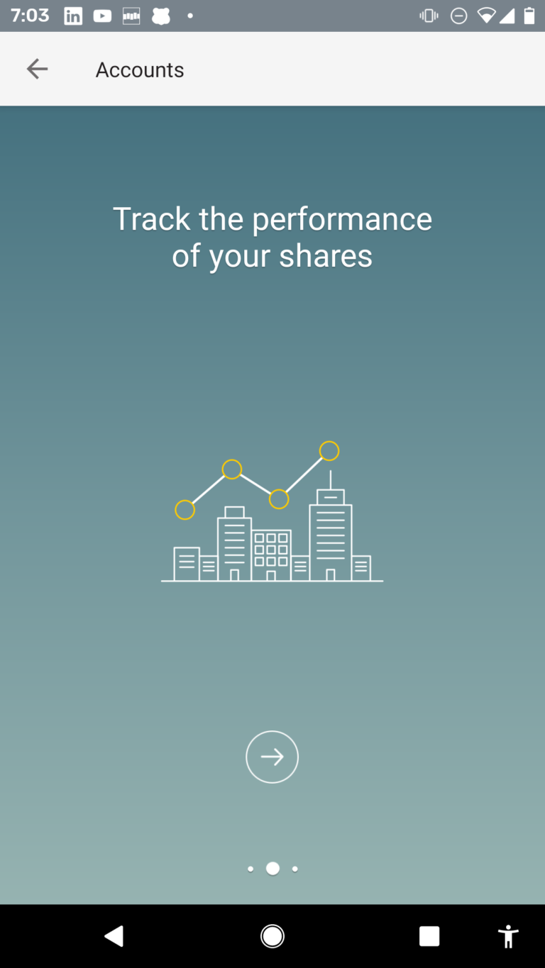
    1. Introduce Key Features: One of the primary uses of carousels in onboarding is to give new users a quick overview of the app’s main features. By swiping through a series of screens, users can get a glimpse of what the app can do before they dive in.
    1. Simplify Information: Instead of overwhelming a user with a single screen full of information, carousels break down information into bite-sized chunks. Each slide typically focuses on a single feature or benefit, making it easier for the user to digest.
    1. Engaging Visuals: Carousels allow for the use of visuals, including illustrations, animations, and screenshots, to complement text. Engaging visuals can make the onboarding experience more enjoyable and memorable.
    1. Tutorials and Guidance: Some apps use carousels to guide users through a series of steps or tutorials. For example, an image-editing app might use a carousel to demonstrate how to crop a photo, add a filter, and then save the edited image.
    1. Highlight Value Proposition: Apart from just showcasing features, carousels can emphasize the benefits of using the app. This helps users understand the value the app offers, which can be key to retaining them.
    1. Flexible Design: Carousels can be designed to match the app’s aesthetic and brand identity. This makes them a versatile tool in the designer’s toolkit, suitable for a range of apps and audiences.
    1. Prompts and Calls to Action: Many carousels conclude with a call to action, like signing up, logging in, or diving into the app’s main interface. This prompt can encourage users to take the next step in their journey.
    1. Conditional Onboarding: Some advanced carousels might change their content based on user responses. For example, asking a user their primary purpose for downloading an app could tailor the subsequent carousel screens to that specific use-case.

    However, while carousels can be useful, they’re not without criticism:

    Overuse: Because carousels have become a staple in app design, some users may skip them, thinking they already know how the app works.

    Accessibility Issues: Carousels can pose challenges for visually impaired users or those who use screen readers. It’s essential to ensure that carousels are accessible to all users.

    Information Overload: If not done well, carousels can still overwhelm users with too much information. It’s crucial to strike a balance between being informative and being concise.

    In summary, carousels in mobile user onboarding can be a powerful tool for introducing users to an app’s features and benefits. However, they should be designed with care, ensuring they’re accessible, engaging, and genuinely helpful for the user.

    Contextual onboarding and carousels can complement each other when used strategically. While carousels usually offer a generalized introduction, contextual onboarding offers help and guidance based on where the user is within the app and what they are doing. Merging these two can offer a rich, layered onboarding experience. Here’s how they can be used together:

    1. Initial Overview with Carousels: Start with a carousel to introduce the app’s primary features and benefits. This gives users a high-level understanding of what to expect.
    1. Contextual Tutorials Post-Carousel: Once the user has swiped through the carousel and enters the app, provide contextual tutorials. For instance, if they land on a dashboard for the first time, tooltips or highlight overlays can guide them through the features specific to that page.
    1. Progressive Disclosure with Carousels: Instead of showing all the features upfront, use the carousel to introduce basic functionalities. As users dive deeper into advanced features, use contextual onboarding to guide them.
    1. Interactive Carousels: After a general carousel introduction, integrate interactive elements. For instance, if introducing a photo-editing tool, the carousel can show the editing feature, and the next step might allow users to try it out on a sample photo within the carousel itself.
    1. Adaptive Onboarding: Gauge user interactions during the carousel phase. If a user shows particular interest in one feature (by spending more time on a specific slide or interacting with it), the subsequent contextual prompts can be tailored around that feature.
    1. Feedback Loops: After introducing features through the carousel, use contextual onboarding to ask for feedback. For instance, after showing a new feature in the carousel, a contextual prompt can ask, “Would you like a detailed tutorial on this?”
    1. Contextual Reminders: If a user skips the carousel or rushes through it, contextual cues can remind or reintroduce those features when the user encounters them within the app.
    1. Deep Linking from Carousels: If your carousel touches on advanced features, deep linking can be useful. For instance, a carousel slide introducing a particular function can have a “Learn More” button that, when tapped, takes the user directly to that feature with contextual onboarding ready to guide them.
    1. Continual Learning with Carousels: For apps that frequently update and add new features, occasional carousel reintroductions can be beneficial. Once users are familiarized through the carousel, contextual onboarding can take over, offering in-depth guidance on the new features.
    1. Personalized Experiences: By analyzing user behavior and preferences, the carousel can be personalized to show the most relevant features to individual users. Following this, contextual cues can further tailor the onboarding based on the user’s interaction with the carousel.

    In essence, while carousels set the stage by offering a bird’s-eye view of the app, contextual onboarding goes deep, offering guidance and assistance as users navigate the app. When combined, they offer a holistic onboarding experience that is both informative and user-centric.

    Are you looking to get more users to love your mobile and web apps?  Click on the buttons below to get your 14 day free trial or contact us for a demo!


    Get Started


    Get a Demo


    Contact Us

  • When Mobile Carousels make sense

    With Contextual you can create carousels without coding. But readers will know that I’m not a huge fan. I AM a huge fan of JTBD (Jobs-to-be-done) and to me carousels seemed to stand between the user and their job.

    So thats not a good thing.

    Elsewhere in a banking app, I was positive on using carousels for feature discovery. In this post, we look at how the world of cryptocurrencies is trying to become easier to consumers. Specifically why carousels help explain a new concept from a crypto project called Argent.

    In the world of crypto, post-Mount-Gox, the familiar catch cry is “not your keys, not your coins”.

    That won’t make sense to most people and hence why crypto is largely for either for geeks or the very committed. Like all movements, you have wearly adopters and eventually the movement “crosses the chasm”. The diagram below was made famous by Geoffrey Moore in his book of the same name.

    Briefly:

    1) when we store our cash in a bank account, the bank is the custodian – they hold the keys.

    2) in the crypto world:

    1. you can choose to have an exchange (CEX) or some other entity (paypal, square, soon Robinhood) hold your keys but you need to make a leap of faith to trust them like a bank.
    2. you take responsibility for your own coin and tokens via “wallets” (paper, cold and hot).

    If you are confused, no problem, this is because we are still on the RED left hand-side of the curve below.

    Argent want to help change that.

    Credit: slidemodel.com

    Argent have a radical and new way of avoiding the custodial role by adding “Guardians” – but for a new user to understand: it does need education, and it does need people to collaborate. I’ll let them explain.

    Argent-Carousel-Example-5
    Argent-Carousel-Example-6
    Argent-Carousel-Example-8
    Argent-Carousel-Example-9
    Argent-Carousel-Example-10

    Previous
    Next

    This is a complex new area for consumers and this use of Carousels by Argent is not interferring with the JTBD, but actually bootstrapping the consumers understanding. I think they’ve done a good job. They were probably tempted to use a video explainer, but this keeps the user inApp, contextual and ready to proceed.


    BTW, they did have an introductory Carousel which I was less excited about. I’ve included it here for completeness.

    Argent-Carousel-Example-4
    Argent-Carousel-Example-3
    Argent-Carousel-Example-2
    Argent-Carousel-Example-1

    Previous
    Next

  • How one Bank App uses Feature Announcements

    Contextual was designed for Apps to make onboarding, education and Feature Discovery simple and code-less. Most commonly the use of Tips and Tours to nudge a user into action is a great user engagement approach.

    But what happens when you are rolling out a major feature?

    • Perhaps tips of a popup are a good introduction but not impactful enough.
    • A Home Screen carousel is just too interrupting to the user flow and has low conversion rate.

    Try a Feature Carousel

    St George Bank is a major bank and they made a significant investment across their ATM machine network to support “Cardless Cash”. If you’ve not heard of Cardless Cash its a major improvement to getting money easily for your wallet – the benefits are:

    1. Card Security – you don’t need to pull your card out and put it in the machine, where you might forget it. Risk of “skimming” is also eliminated.
    2. PIN Security – you don’t need to expose your PIN where someone may spy it.
    3. Fast – its pretty quick to get the cash out, just a few keystrokes at the terminal.
    4. Money for others – A parent can send the access code to a child who can then get cash for an emergency.

    The challenge is that whilst a huge rollout investment is made, getting customers to use this feature hits the human fear, uncertainty, doubt and plain laziness.

    So the Product Management team at St George obviously wanted to give the new capability the best chance of uptake and embedded a Feature Carousel into the App. So if a user explores this section of the App for the first time, they get a richer walk-through that is eye-popping and more persuasive than just a tip. Here is the introduction.


    There is a couple of interesting things to observe:

    1. They decided to reduce the number of swipes by putting 2 steps on each page. I don’t know if this helps with memory retention of activation – but its an interesting experiment. With Contextual, you could run an A/B split to see what gets better conversion.
    2. Short Sharp Action-oriented text. Notice how there is no waffle and Verbs like “Get”, “Find”, “Withdraw” get task focussed.
    3. The explanation is contextual and the user can immediately perform the task.
  • Carousels for Feature Discovery ????

    The Commonwealth Bank of Australia is* the 71st most powerful company and 43rd largest bank in the world.

    Their mobile app has won many design prizes and they have huge resources to pour into it. This post looks at some excellent Feature Discovery, Feature Onboarding they use in parts of the App.

    If you’ve read other posts, you know we are skeptical of having a carousel at the start of the App. Simply put it is a barrier to the user’s Job-to-be-done.

    However, we’ve always thought its an excellent way to explain concepts and key points about a subset of the Apps features. Commbank does a great job here.

    Cardless Cash Example

    Using the App, a bank customer can walk up to an ATM machine with a special one-time PIN and get cash out, the use-cases for this are:

    • convenience
    • not getting mugged at the ATM of your wallet
    • you can send the code to a family member or friend and they can access that
    • you’ve lost your card etc.

    When banks started rolling out this capability millions were spent on implementation and then they found nobody was using it.
    This is an extreme case of what many Product Manager experience:

    1. the team works hard on a feature
    2. they release it into the product
    3. crickets and tumbleweeds.

    So next the Product Manager walks over to marketing and asks for an email to be sent out announcing this fabulous new feature. So they wait a week or two and the email is sent. Crickets and tumbleweeds.
    Here is how Commbank get users familiar with Cardless Cash.

    cba-cardless-cash-1
    cba-cardless-cash-2
    cba-cardless-cash-3
    cba-cardless-cash-4

    So the interesting thing here is that Commbank:

    1. doesn’t show this when I open the app, only when I go to that part of the App for the first time.
    2. They tell me about the benefits and the journey to get the cash. They don’t tell me how to use the UI.
    3. They may still later use tips to help me with using this part of the App but they don’t overwhelm me now.
    4. It’s a clean introduction that helps people over the barrier of doing something new and different.

    Portfolio example

    Portfolio is a cool tool that allows a bank customer to record other assets. Clearly Commbank wants people to use that feature and the Portfolio tab is BIG and Obvious. The curious user can’t help but touch that tab.

    The first time on Portfolio, the user sees this 3 step carousel that explains the top-level-benefits.

    It is weird the design is different to the Cardless Cash carousel – even the CTA button is different. But the design is sophisticated and resonates well for a user that has more assets.


    cba-portfolio-1
    cba-portfolio-2a
    cba-portfolio-3
    cba-portfolio-4

    In summary, these deep features are not thrown in the user’s face first-time, when they become curious they are given a very human introduction – I think its quite nice and is a “just-in-time” approach.

    Your company may not be the 71st most powerful organization in the world, but you can achieve these types of carousels and target to specific personas, users or first time a user enters a part of your application – you can do this with Contextual and once the SDKs are integrated you don’t need to bug your developers to implement – these carousels are code-free!


    ** with current COVID-19 creating havoc on financial markets, their rank may be up or down!

    Are you looking to get more users to love your mobile and web apps?  Click on the buttons below to get your 14 day free trial or contact us for a demo! 


    Get Started


    Get a Demo


    Contact Us

  • Compare: User onboarding in 2 Meditation apps

    I was listening to a podcast recently with the founder of Headspace a popular meditation App. I’d not used the App but many people I know have – what amazed me on the podcast was that it was mentioned their revenues exceed $100M – it appears that the sector is big business!

    I downloaded a few apps and discovered there are several use-cases that need to be handled: Relaxation, Commuting, Sleeping, Quick Breaks, Focus etc.

    Compare this to something like Uber where you just have one-job-to-be-done (JTBD) and that is get a ride.  These meditation Apps have to connect with each user’s main reason for downloading the App and get them started on that – its a disparate set of uses.

    Here is 2 examples:

    This App (I think it was Calm – I downloaded a bunch!) makes this really simple and targeted on what they want to get users doing. The App points to all the important features to get me focussed on my job. The goal is to get me to the “aha” experience.

    Brain.fm have a nice App and they take a carousel approach to introducing the user to the products main features. Their unique value is they use some magic underneath the music (presumably Binaural Beat” or “Isochronic tones”) to increase the impact on the meditator.

    I like they way they hit that with “Music designed for your brain”. It would directly create continuity from the:

    1.  marketing phase, where the user decided to install the App

    2. onboarding the phase, where the user decides to keep using the App.

    Overall, the first App is more effective. Sure, its less pretty (the Brain.fm carousel looks great). But it has 2 downsides:

    a) its not contextual

    b) they force the user to signup. 

    These two factors create a barrier to get to “aha”!

    Both Carousels and contextual Tips/Tours are available in the Contextual platform, so its really up to your team to choose which method to use.