Category: coachmarks

  • Feature (Re)Discovery – Google Meet example

    Feature (Re)Discovery – Google Meet example

    Amidst so much suffering, angst and business collapse caused by COVID-19 there has been some companies that have grown incredibly. Back in early March, I commented on Zoom’s breakout success.

    Looking back now in June, Zoom has leapt from upstart B2B App to massive consumer awareness.

    Behemoths like Google and Microsoft needed to respond – Google Meet gets a relaunch. Microsoft Teams loosened usage limits.

    We’ve started to see Google aggressively using their other properties (Gmail) to (re)announce Google Meet as a Feature Re-Discovery inside calendar appointment.

    These are the kind of announcements that Contextual lets you launch from within your own Apps.

    With Contextual, the “Learn more” link could send a user to another step in a guide or launch a video to do a deep-dive.

    This popup can be placed in the flow of creating an appointment – a perfect example of “Product-led growth” by the product teams at Google. 

    Kudos to Google using Tips and Popups to remind the user of a feature they could use rather than default to Zoom!


    Update: 26 June 2020

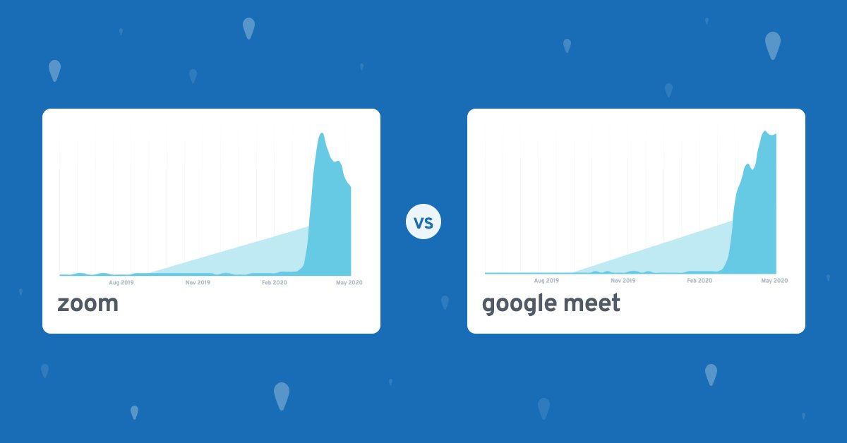
    I stumbled across a post from Explodingtopics that shows Google Meet is experiencing sustained  attention “by Google Search Volume”.

    That may not be entirely unbiased but is interesting to see.

    The data shows search volume for both Zoom and Google Meet is exploding.
    Which suggests: Google Meet’s search volume has been climbing WAY faster. Zoom’s has plateaued a bit and is even declining at the moment.

    Its possible Google’s Feature (Re-) Discovery discussed in this post – by putting overlays in other Apps may be strengthening brand awareness.


  • How a huge email app uses Coachmarks, Tips & Cards

    Inbox is slowly replacing Gmail and it takes a little getting used to because it introduces a few new concepts that are powerful but not familiar. This is a classic case of being able to guide people to understand a concept and deepen their engagement.

    If they can understand a feature, they will get more out of it, and not switch to another App!

    Coachmarks

    Targeted at first time usage of a feature, these are very intrusive but allow a lot of screen-realestate to explain the feature and point to the specific location on the screen. Here we see Bundles, Links, Pins and Snooze are all explained. The timing of the prompts were:

    1. Once I developed basic competence with the Inbox app (reading emails, sending etc)
    2. Not in one session, it was across several sessions that I didn’t keep a track of, but it appears they group them tightly so a user learns contiguously.


    Cards

    Cards are a popular metaphor in list/feed based applications because the user is interactive with cards all the time. Some examples are:
    iOS and Android Notifications: Users are familiar with pull-down, swipe away lists of cards.
    Twitter: In Twitter a tweet is effectively a “card” – so Twitter introduced advertising as a card and appears seamlessly inline with other tweets.
    Google Now/Home: Both of these flagship apps on mobile, use rich cards (titles, body, icons, images). Its a very flexible pattern that can be populated in a number of ways without getting locked into a fixed format. Just like Twitter, these Apps can “drop in” promotional or educational content without disrupting the flow.
    In Contextual we achieve cards with a positioned card-shaped popup/modal but we will probably explore how we can work with apps in their own list stream – anyone willing to use this “in-stream” pattern just let me know!

    Conclusion

    Back in 2012, Matt Cutts of Google shared how they ran 20,000 experiments per year on just one of their products. You can imagine that Google does much more than this is 2017 and its easy to conclude that if some UI metaphor exists and persists, this is because the data it “telling them” to persist.
    Google have persisted with above type of coachmark on several products: Google Docs/Drive, Maps and now Inbox – so its clear that this method is working. We can expect to see this pattern used a lot more in the future and we will come to treat it as second nature.

  • Skype’s new look mobile onboarding

    Given there are so many options these days for chat + voice, you may have already abandoned Skype. Facebook, WeChat, Slack, Hangouts are just some of the contenders and many of us have all these plus WhatsApp running concurrent threads.

    But its clear the Skype team want to change that and get back into the game, a massive installed base is shifting to the other platforms and mobile. Skype was truly awful (slow, cumbersome) on mobile and is probably in the minds of most consumers “a desktop product”. Here is some onboarding from their new Mobile App (on Android).

    skype user interface
    skype app ux

    The most common landing page in Skype is your contact list and they’ve provided a basic 2-step tip tour to teach you about the new user interface.

    1. Its a nice design to have the personal profile at the top-center but its not a common design pattern, so its smart to tell users.
    2. Moving the “call” button is a great “instant gratification” change. But Skype has to retrain old users from going to the contact first and then calling from there. This inversion is smart but teaching us in this tip is smart too.

    In Chat/Call

    Whilst commencing the call, they provide a few clues for how you can handle chat oriented activities.

    To me, this is a bit of a miss. There are at least three other relevant CTA’s on the screen, so adding a tip is only increasing the cognitive load for the user.

    Using something like Contextual you can trigger based on certain conditions.

    skype user interface

    Here is a great example of smart user education. We call this Progressive Onboarding.

    Skype has decided that after at least one call, they will help me understand how to get more value out of the product in a chat session. 

    They may have also only triggered for users who hanve not completed the “sharing photos”, “locations”, “GIFs” tasks already.

    SkypeInCallOptions

    Missed Opportunities?

    I like Skype’s new design, its reduced some of it’s bloat and the UI is more “instant” as users expect for a modern chat/voice app.

    But, there is some missed opportunities for uncovering other features in the application.

    For example, these gems are hidden behind the “+” button but we’ve not been told about them.

    Group chat: is dead easy in Facebook Messenger and WeChat, but its buried in Skype.

    New Highlight: I had no idea what a Highlight is, I still don’t know 🙂 A tip could have educated me.

    Find Bots: This feature has been a powerhouse growth factor for Slack, so Skype want to catch up – but its unlikely we can find it here. Also it sounds a little scary.

    SkypeAdvancedFeatures

    Contextual could have helped Skype walk the user through a simple explanation of each of these Advanced Features, its more opportunity for Progressive onboarding – perhaps they will target me in the future. If you want to read a good example of how Twitter progressively onboards users, check this blog post.

    Also Contextual can put small “?” tooltips next to a new or confusing feature. You can find an example video on this page.

  • “Google style” trackable carousels in Contextual

    Contextual Carousel – swipe intro to your app from Contextual – Mobile App Onboarding on Vimeo.

    I’ll admit we’ve been wrong about carousels and so we’ve now made available the ability to create rich carousels inside Contextual.

    The benefits are:

    1. graphical environment to author and preview before release
    2. Easy HTML authoring, no need to get mobile developers to hard-code specific native carousel code
    3. Tracking of user swipes – and analytics of performance against your success metrics
    4. A/B Test to test which carousels perform better
    5. Put a carousel anywhere you want – not just the home screen
    6. Easily update when you launch new releases


    Google Analytics Carousel Animated GIF

    So why did we change our mind? Simply…well…customers were asking for not just contextual tips, tours and modals but a way to catch user’s attention when they immediately open the app.

    This example on the right shows how Google combines:

    1. An initial carousel to tell some big messages
    2. A contextual coachmark to tell the user about the current screen the user has landed on.
    3. A message indicator to highlight there is news waiting.

    The positive impact of this approach is due to the famous Aristotelian “triptych” for speakers:

    • Tell them what you will tell them. (the Carousel)
    • Tell them. (the tip or Coachmark)
    • Tell them what you just told them. (this is called off-boarding, which is often referred to as “next-best-step” and I should cover in a future blog post).

    The great benefit of the Contextual carousel approach is our analytics will tell you the performance of the swipe-able carousel and you can followup with contextual tips to reinforce the message to drive usage.
    As we’ve stated elsewhere here, here and here often people just swipe through and can’t tell you what the carousel said.