Category: Continuous Onboarding

  • Empty States and UX Anti-Patterns: Best Practices for Engaging User Experiences

    Empty States and UX Anti-Patterns: Best Practices for Engaging User Experiences

    Are you throwing up roadblocks to your users before they’ve Activated in your App?

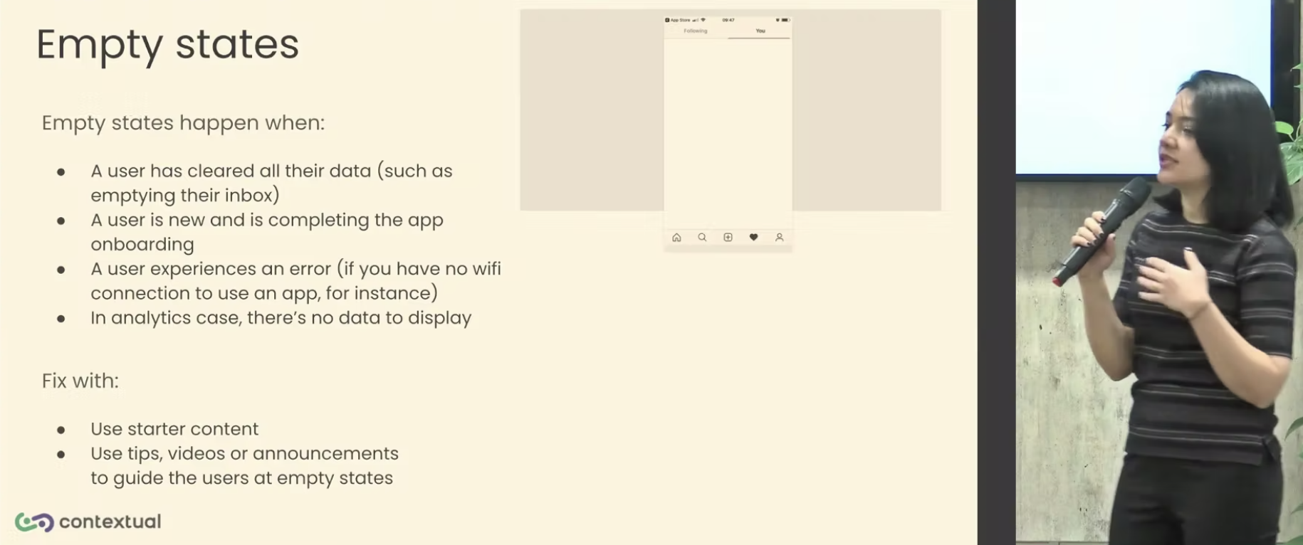
    When a user is getting started – quite often there won’t be any data for them to visualize how your product can help. This is a called an Empty State.


    What is a UX Anti-pattern?

    A UX Anti-pattern is a common mistake that is made when designing user interfaces. These mistakes can lead to poor user experiences, which can in turn lead to users abandoning your product.

    What are common examples of poor and good Onboarding experiences?

    Here are some examples of poor and good onboarding experiences:

    • Poor Onboarding: A poor onboarding experience is one that is confusing, frustrating, or time-consuming. For example, an onboarding experience that requires users to fill out a lot of forms or go through a long tutorial is likely to result in app abandonment.
    • Good Onboarding: A good onboarding experience is one that is clear, concise, and engaging. For example, an onboarding experience that uses tooltips, walkthroughs, or interactive demos is likely to result in an optimum outcome, Activation! .

    Empty States in Onboarding.

    When a user first opens your app, they may be greeted by an empty state. This is a blank screen or page that doesn’t have any content. Empty states can be a problem because they can confuse and frustrate users.


    How to Address Empty States

    There are a few things you can do to address empty states in your app:

    • Use mock data: If your app doesn’t have any data yet, you can use mock data to fill up the empty states. Mock data is fake data that looks like real data. Using mock data can help users understand what your app is about and how it works.
    • Show useful starter content: If you have some useful starter content, such as tips or tutorials, you can show it to users when they first open your app. This can help users get started with your app and learn how to use it.
    • Use tooltips: Tooltips are small pop-up windows that provide additional information about a button or icon. You can use tooltips to explain what a button or icon does, or to provide instructions on how to use it.
    • Use walkthroughs: Walkthroughs are step-by-step instructions that show users how to use a feature or function. You can use walkthroughs to help users get started with your app and learn how to use it.
    Remove Frictions

    When users are first using your app, they are likely to be hesitant to give you any information. This is because they don’t know you or your app yet. To encourage users to give you information, you need to remove as much friction as possible.

    Here are a few things you can do to remove friction:

    • Ask for the minimum amount of information: Only ask for the information that you absolutely need. If you ask for too much information, users will be less likely to give it to you.
    • Make it easy to give information: Make it easy for users to give you information. Use clear and concise forms, and make sure that the submit button is easy to find.
    • Thank users for their information: When users give you information, thank them. This will show them that you appreciate their time and effort.
    Keep the Experience Consistent

    If you have multiple platforms, such as a web app and a mobile app, it’s important to keep the user experience consistent across all platforms. This will help users learn how to use your app more quickly and easily.

    Here are a few things you can do to keep the user experience consistent:

    • Use the same design language: Use the same design language across all platforms. This will help users recognize your app and know how to use it.
    • Use the same terminology: Use the same terminology across all platforms. This will help users understand what the different features and functions do.
    • Use the same navigation: Use the same navigation across all platforms. This will help users find what they’re looking for more easily.

    By following these tips, you can create a better onboarding experience for your users. This will help you increase activation and improve user retention.

    In the video below is a presentation (snippet) from Bess and David where they cover some actual patterns and anti-patterns in Mobile App examples to compare with.


    In a followup post we will cover one popular B2B webapp (Monday.com) and summarize some patterns and ux anti-patterns we’ve come across – especially for Mobile Apps!

    https://vimeo.com/manage/videos/746752726/02af45cf24

    Webinar: How to Automate Product-Led Growth in APAC

    With MeshAI

    Tue 29th September 2022, 12:00 pm SGT (2:00pm AEST)

    • How Product Led Growth is transforming in 2022
    • Evolving your software  product’s PLG model
    • Automating PLG the who and how
    • Product-Led Go-To Market strategy
    • The PLG Automation analytics, onboarding and communications


    ux anti-pattern

    Are you looking to get more users to love your mobile and web apps?  Click on the buttons below to get your 14 day free trial or contact us for a demo! 


    Get a Demo


    Get Started


    Contact us

  • Pirate Metrics, PLG, user journey

    Pirate Metrics, PLG, user journey

    By David Jones Founder and CEO Contextual

    The wave of Product Led Growth has revolutionized the industry in recent years. When discussing Product Led Growth (PLG), it is often compared to “sales-led” approaches, the dirty little secret is that many SaaS companies presenting as PLG are in reality Sales-Led.

    In addition to Product-Led and “sales-led” approach, other prevalent strategies include marketing led, customer led, engineering led, and service led. However, in this presentation, I dare to suggest that most PLG software products rely on the tried-and-true “Pirate Metrics” (AARRR) framework. By examining key elements of PLG, we can always reframe them in terms of AARRR and their correlation to the user journey.

    To summarize, Pirate Metrics represent a funnel for fostering deeper engagement. Typically, ownership of these metrics lies with Product Management, Customer Success, and Growth teams, encompassing interconnected phases such as:

    • Acquisition: Typically owned by marketing is the user journey up to registering with your product and logging in Attracting users through various channels and acquiring them as customers.
    • Activation:. Is discussed extensively in this video. Activation is the moment where the user extracts value in the product. This can also be the first moment the user completes an action such as filling out their profile, inviting their co-workers to sign-up for the app or completing a transaction. Activation is guiding users to experience the core value of the product and ensuring a successful onboarding process.
    • Retention: Encouraging users to continue using the product and cultivating long-term engagement. This can be measured in revisits to the application, typically measured in Daily Active Uses, average session length and custom (per application) engagement metrics. Of course an important metric might be (one or recurring) monetary transactions.
    • Referral: Harnessing the power of satisfied users to advocate for the product and refer others. This includes activities where your user is inviting and engaging other users in a virtuous circle that grows Activation and Retention. This is a key part of Product Led growth where marketing and acquisition costs are significantly subsidised (or eliminated entirely by harnessing network effects of the users in the App). Whilst B2C apps like social networks are poster-children for network effects, B2B apps like Atlassian have been well documented as having a growth flywheel based on this strategy.
    • Revenue: There is no growth without revenue!  As can be seen, this can happen at one or more points elsewhere in AARRR and single or multiple times. Optimizing monetization strategies to drive revenue growth and maximize customer value is the ultimate measure of success

    So we can see that PLG is very much supported by a product design that rolls up these key User Journey components. This talk tracks the journey on a timeline.  By leveraging the power of contextual walkthroughs, contextual user onboarding, contextual mobile tooltips, and a comprehensive digital adoption platform, businesses can enhance their product adoption and effectively implement PLG strategies.

    Webinar: How to Automate Product-Led Growth in APAC

    With MeshAI

    Tue 29th September 2022, 12:00 pm SGT (2:00pm AEST)

    • How Product Led Growth is transforming in 2022
    • Evolving your software  product’s PLG model
    • Automating PLG the who and how
    • Product-Led Go-To Market strategy
    • The PLG Automation analytics, onboarding and communications


    ux anti-pattern

  • Onboarding Feedback: Product-Led Success with Your Mobile Users

    Onboarding Feedback: Product-Led Success with Your Mobile Users

    Product-led companies are praised for pouring their heart and soul into the product that ends up in their customers’ hands. 

    While the product-led approach is known to boost growth and efficiency within a business, to get there, it’s crucial to focus on the first impression your product gives to a potential user. The onboarding experience can best be perfected through the feedback of your clients, which in turn helps with reaching more users and encourages product adoption.

    As SaaS (software-as-a-service) companies are expected to deliver their products both in web and mobile formats for a better product adoption, onboarding feedback is especially helpful with mobile users. 

    Asking for client feedback on their onboarding journey while using the mobile version of a product has great benefits both for the client, as well as for your product and your company. So, why exactly is onboarding feedback important? Let’s deep dive into it!

    Onboarding feedback reduces time spent on perfecting the process

    Although it might sound counterintuitive at first, collecting client feedback on their onboarding experience actually helps your company save time on coming up with ideas for new features, better performance and many more. Especially with mobile version users, time is of essence not just for product development, but also for the client, as their attention span tends to be much shorter than that of a web user. 

    Generally speaking, the first 30 seconds after a potential user downloads your app are the most crucial ones, as your product needs to catch their attention in order to avoid trialler abandonment.

    By asking for feedback after they complete their onboarding, they help your company figure out where the product needs to be improved. 

    With a product-led growth mindset, you must make room for the clients too. Reserve them a chair in your meetings and refer to them as being part of your team. Understanding that their feedback is crucial for the improvement of your product will help you save time and stress when implementing changes.

    It helps with building a rapport with the user

    Product-led growth can be achieved if you have a strong rapport with your clients. With user engagement and communication comes product satisfaction, which leads to company growth over time. 

    Focusing on your clients and listening to the feedback they have to offer upon onboarding with your product is an investment that will always make its return into your product and company.

    As we mentioned above, clients have limited attention for your product, especially when it comes to the mobile version, where it takes a couple seconds to lose a potential user. Mobile versions allow for companies to have highly targeted interactions with their clients. By involving the user in the creation and improvement of your product, they are more likely to go through with the product adoption, as they feel that their opinions are valued by your company.

    Getting to know the client’s needs through their feedback

    As your mobile product’s time from the start of the onboarding process is limited, knowing your users’ needs is critical. With a broad clientele of new and returning users, you have to make sure you implement their feedback for a successful product adoption.

    Learn from previous feedback: returning users expect possible bugs or errors to be fixed, their needs concern reliability, while new users need to be engaged fast enough to continue using your product and complete the onboarding process. Paying attention and anticipating their problems will result in a happier client, a smoother user journey, and a better app engagement.

    Continuous onboarding equals continuous feedback

    Consider the concept of continuous onboarding to keep user satisfaction at its maximum. For example, when introducing a new feature to your app, ask the returning users to give you feedback on it. 

    The initial “Aha!” moment they had when completing the onboarding for the first time is a rewarding feeling. By helping the client achieve it again through feature discovery (and then asking for their opinion on it), you are keeping the user in a continuous onboarding state, and they will offer feedback with more enthusiasm each time. 

    If the users see that their opinion is valuable in the development process of your product, they will feel included and are more likely to take their time giving feedback on their experience.

    Mobile is the future – except it’s happening now

    Understanding that the mobile version of your product is a key feature of product-led companies will help you prioritize what’s truly important for your team and efforts. By relying on onboarding feedback from mobile users, you’re doing a huge favor for your future self and the future of your company. Involving the clients and asking for their feedback should be a top priority, as their opinion helps with optimizing your product.

    Besides the positive impact of their feedback on your product, interacting with your users through their onboarding feedback also builds a bridge between them and your company. Having returning users who rely on you, and who you can rely on is a true advantage in a sea of product-lead companies.

    To conclude, the relevance of onboarding feedback is undeniable, especially when it comes to mobile versions of SaaS products. By involving the client in perfecting your product, you gradually build a rapport with them, which has as its main benefit the mutual reliance between company and user. Moreover, you get to know the client through their feedback, which helps you predict their needs moving forward. 

    Lastly, if the users feel heard when it comes to feedback implementation, they are more likely to continue using your product, which will lead to continuous growth, which is already the goal for product-lead companies.

    Do you want to learn more about how to better capture feedback and how to make use of it in your future business procedures? Book a demo and get started with Contextual!

  • Onboarding guru Hulick on JTBD

    Onboarding guru Hulick on JTBD

    If you are a Product Manager, Designer, you have probably heard of onboarding guru Samuel Hulick. Even Customer Success people are aware of his tear-downs of early experiences in mobile and web apps. We’ve even emulated his approach with a few posts on this blog. 🙂

    In his latest “Value Paths” podcast, he laments a  misconstrued use of JTBD.

    “it is mind-boggling to me how much of Jobs To Be Done is sales and marketing-oriented rather than product-oriented”. 

    Contextual agrees with Hulick that the role of JTBD is most profitable when designing user experiences in your product. To read some of our other posts take a look, here, here and here.


    Situation, Motivation, Expected Outcome
    Source: HBR

    Hulick and his co-host (Yohann) attempt to refine JTBD with into Value Paths:“Path Design is how you get users from where they currently are all the way to the results that they care about.”

    It’s an interesting approach that attempts to corale many of the UX tasks that Product Teams undertake. Often when disciplines are new, they are a collection of activities and example-based approaches that people attempt to copy and reproduce in a cargo-cult like manner. Some activities become perennial best practice and others are just hacks that work for a short time or in a specific eco-system.

    A classic example of a hack in customer acquisition is spam – it works for a while but burns a lot of prospects and email filter systems constantly improved to stop the spam.

    In onboarding a more subtle “hack” is to try to capture ALL  the user’s details (do you really need their phone number?) at registration time before they can evaluate the product.

    Hulick: “Because if the user goes from the marketing website, to the onboarding third party plugin, to a sales survey, and then finally gets into the dashboard of your product, they might feel like they’ve gone through like seven different products along that way, where for the user it should feel like one continuous thing.”

    We’re Building Processes, Not Products

    This is a key insight: As product designers we are fixated on the features and functions of a particular module in the product. Per the example above “user registration”. All your attention and discussions about design “crowds out” that the user has a journey to achieve a result. Their trial of your product is a several A-to-B processes to assess if they “hire” your product, they will get their needs met.

    The podcast is worthy of your attention – here are some other powerful takeaways:

    “The key to path design is clarity on the end outcome (what the path results in). Every time the user engages with the product, it is within the context of the end outcome; so every interaction should be framed against it.”

    “There are infinite paths between “where users are” and “where they want to be.” Thinking of the critical pathway (the actions or stages the path must contain by necessity) is a compression algorithm — it compresses that near-infinite, unordered information into a single hierarchy.”

    You can find the Value Paths podcast:


  • Announcing the New Contextual Web Creator

    In the upcoming weeks we are releasing an update to our Chrome Extension for web apps.

    This is a great addition and actually shoots past the current mobile guide creation interface which will adopt some of the elements here. Specifically:

    • New design for a user friendly experience & navigation
    • New targeting tool for tip placement & repositioning
    • New guide settings interface with improved selection criteria process for a more streamlined experience
    • Tight point-and-click selection of targets and launchers with css/class/DOM overrides.
    • Search & filter guides easier with the new guide home screen
    • Edit guide name easily

    There are so many great features here, we’ve split it into two videos. If you’ve got any questions, hit us up on support@contextu.al or our on-site chat!

    https://vimeo.com/566908938/641fa71371https://vimeo.com/568797474/a90ded76ab