Mobile App user retention rate is <10%. That is largely attributable to not “Activating” user engagement quickly and at relevant times.
If users don’t find utility and value from the product quickly, they rarely stick around. Figures for user churn are over 70% within first 3 days.
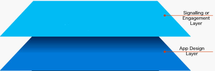
To give your users the best chance of extracting utility, there are a few common use cases we see in successful Apps. Its no coincidence these use-cases are recurring – take note!
In this post we cover 10 common app prompts that really make a difference to retention, activation and growth.
1. The ‘Get Started’ Tip
User activation is about getting the user to an “a-ha” moment as quickly as possible.
So one of the simplest and most obvious things to do is place a tip pointing at the one action to deliver “instant-gratification” returns.
e.g In a real-estate App it might be the first filtered search. In a social App it’s often sharing your first picture.
In many applications, this is called “Empty State” – the single-player mode where the App is absolutely empty until the user gets started.
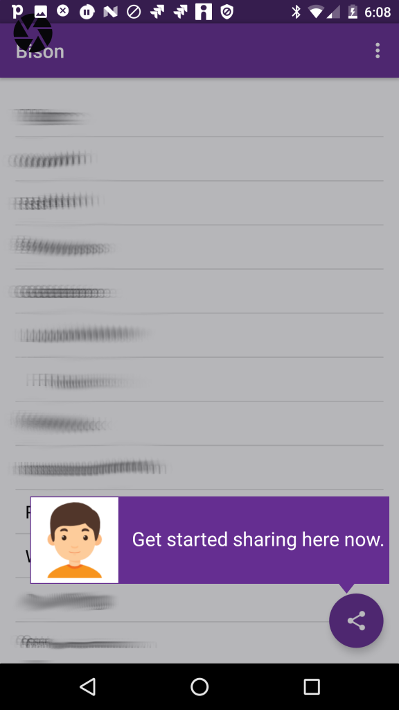
Todo-lists, CRMs, Mailboxes all have empty states. In this situation, you will probably design into the application but you may still want to iterate different A/B tests on messaging.
You design a product, you’ve been staring at it for months and you’ve developed a habit that would make Pavlov’s dogs drool. You click happily and assume that your users will automagically guess how to use it.
Not so. The value this simple understated tip is triggering the user’s first action. The tip is never seen again because the user now has started the habit!
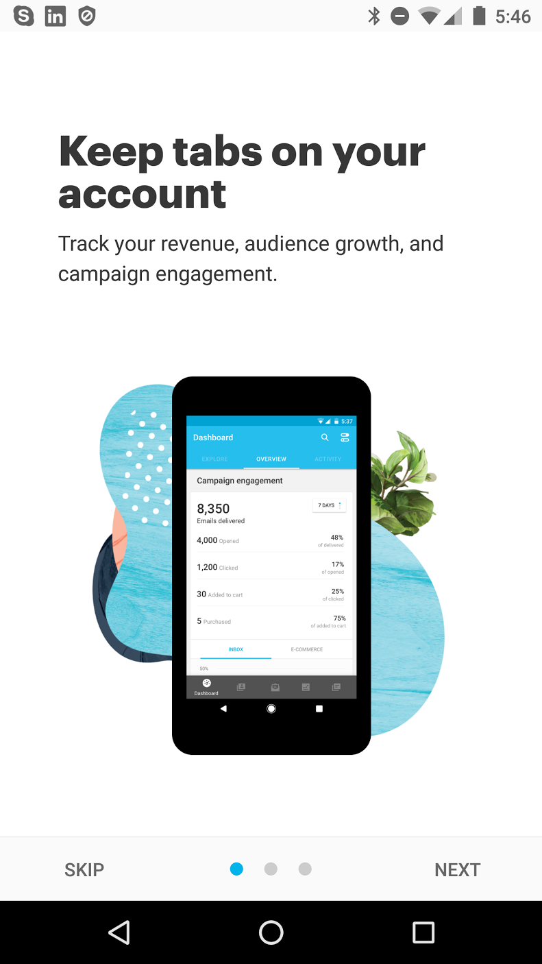
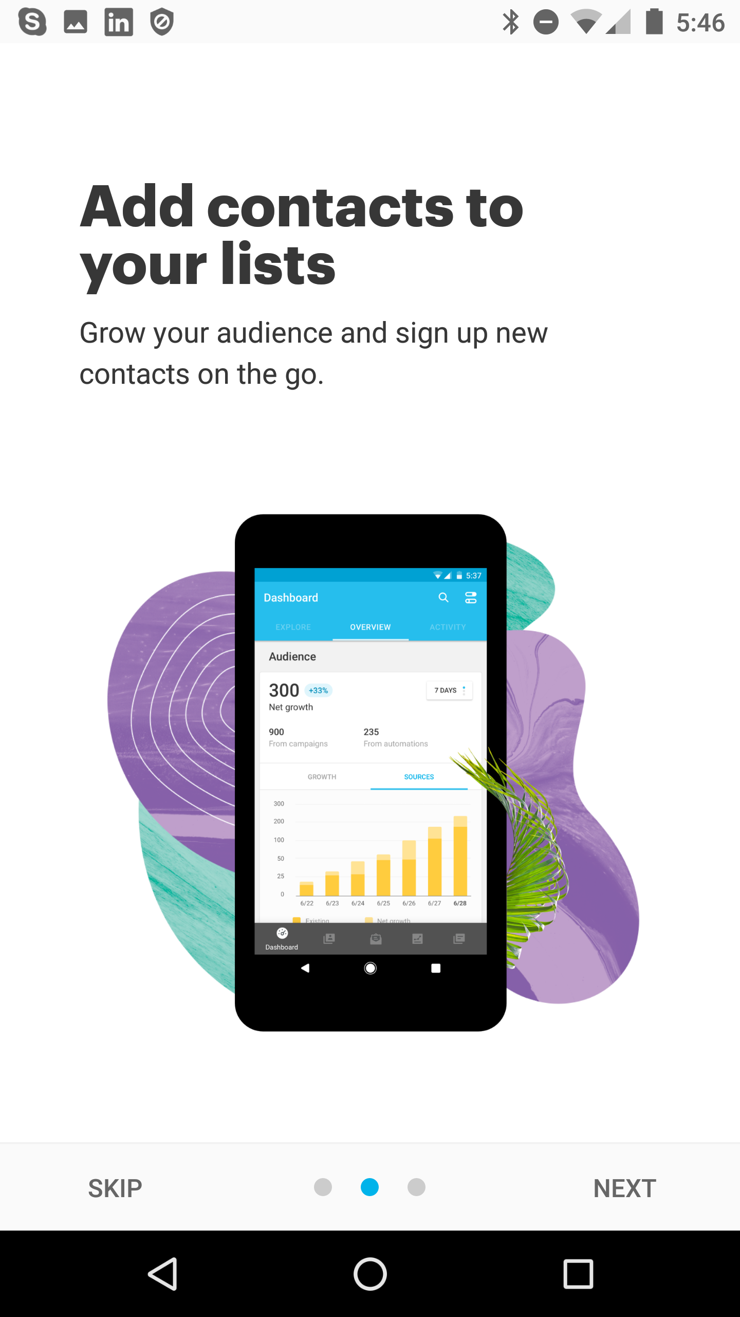
2. Feature/Intro Tour
There are different names:
tours, flows, walkthroughs
But they all mean the same thing. Building on the simple tip, you introduce the user to a set of key features and explain how to initiate those actions.
In earlier posts we’ve discussed how targeted tips in a tour is superior to using a carousel that users will forget. This little animation shows how you can advance a user during early App experiences.

3. Targeted Nudge for unused Feature
Its common for popular apps to have a loyal user base but some of the users are missing key utility available in the application.
With Contextual, you can target these users, to start using the feature. You can use an attractive prompt. That may lead to the screen in the App or kickoff a walk-through/tour.
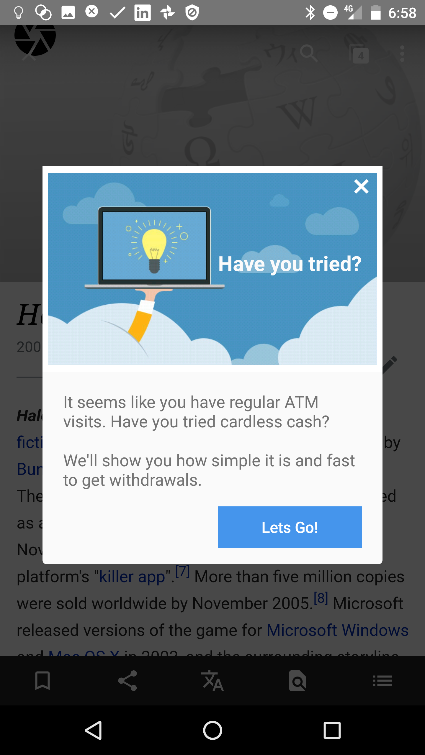
4. New Feature Announcement
Here is 2 cool simple examples:
- Skype takes a smart approach to user education by telling me I can have more fun now because they support “sharing photos”, “locations”, “GIFs” tasks. Read more here.
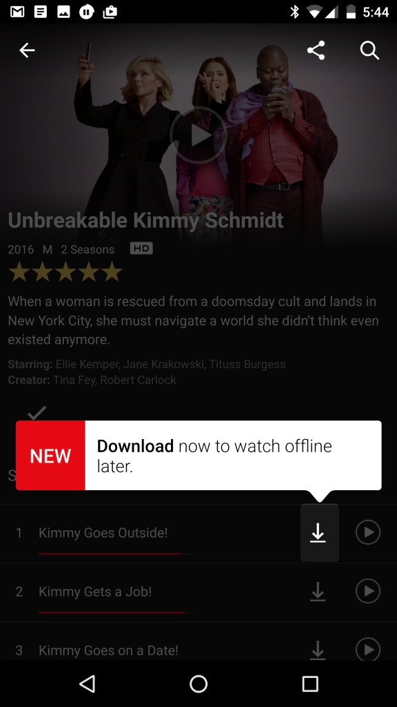
- Netflix’s 2-prong approach to prompt users to start using off-line video playing is a great re-inforcing approach. We’ve seen Slack do that too. Learn more…

")
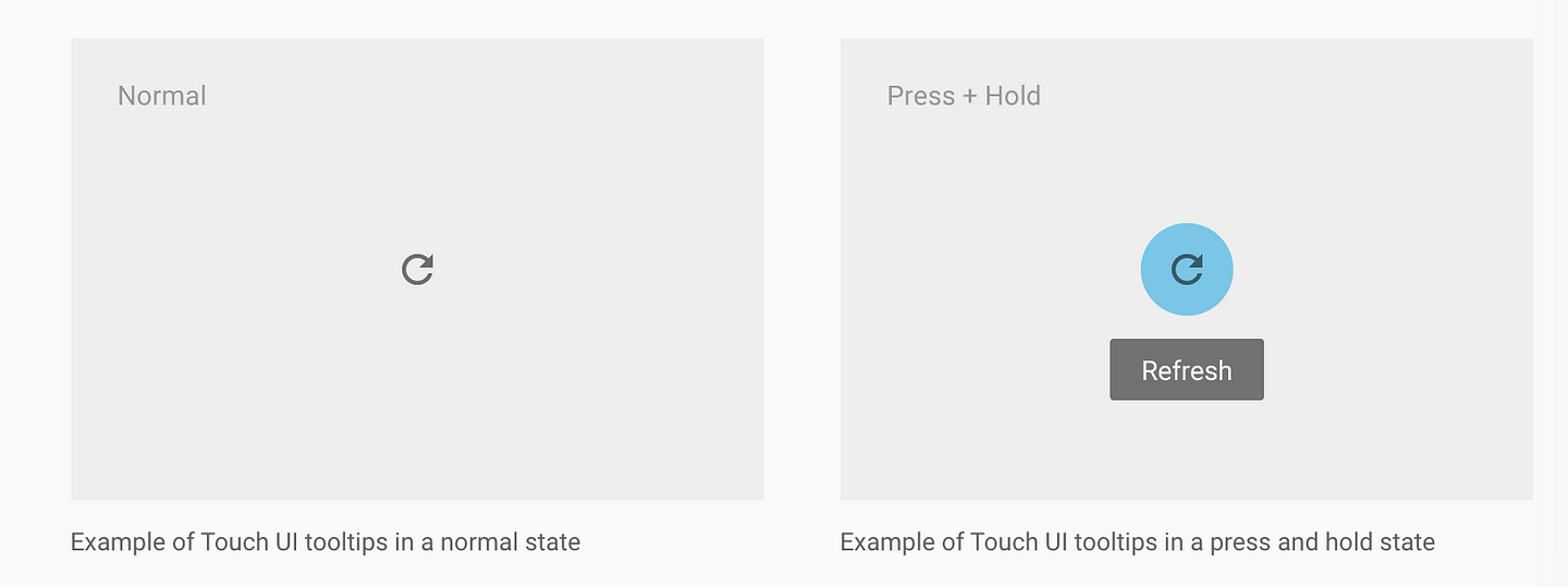
5. Launchers
As we mentioned in the last post, these valuable tip bubble app prompts can help clarify the purpose of a field or action without clogging up the screen.
The user can simply tap/click on them, help the user understand and then get out of the way.
6. Invite a friend
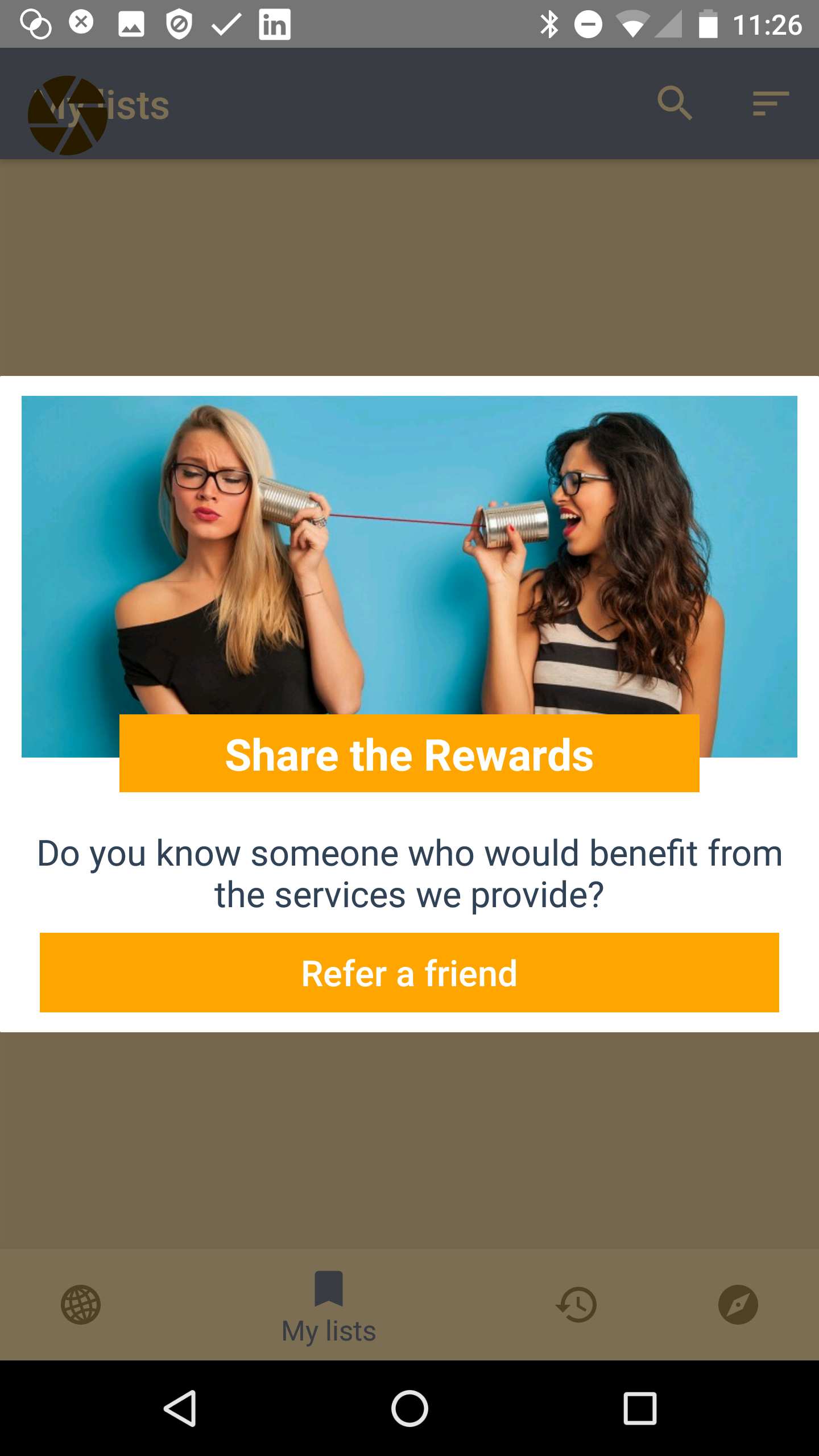
Increase your virality or k-factor with app prompts to get a team mate or friend on board the app as well. Sometimes this sharing might have a referral incentive – we’ve written before why Uber and AirBnB use shared rewards as the most effective conversion. If only the referrer gets the reward, the recipient is suspicious of their motives. Remember that Uber gives new users free credits anyway via advertising or postcard handouts, so giving them a referral credit is easily within their cost-of-acquisition calculations.
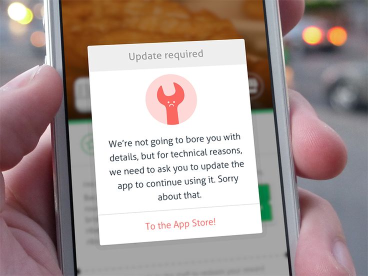
7. App updates and Service Alerts
Either by push or inApp, content, you may want to tell users something thats happening immediately that may affect them.
I like this one because its human and fun (who wouldn’t love a sad wrench!) and its a clear CTA. Notice also its a nuclear option, there is no dismiss on the modal so the user performs the CTA or presumably backgrounds the App and won’t be a live user until this step is completed.
8. Welcome Popup or Carousel
We’ve talked a lot about carousels before and our mixed feelings about them. If this is how you define “on-boarding” then you are NOT thinking about the full-user journey. BUT a welcome is good for orienting and informing the purpose of your App in terms of the user’s needs.

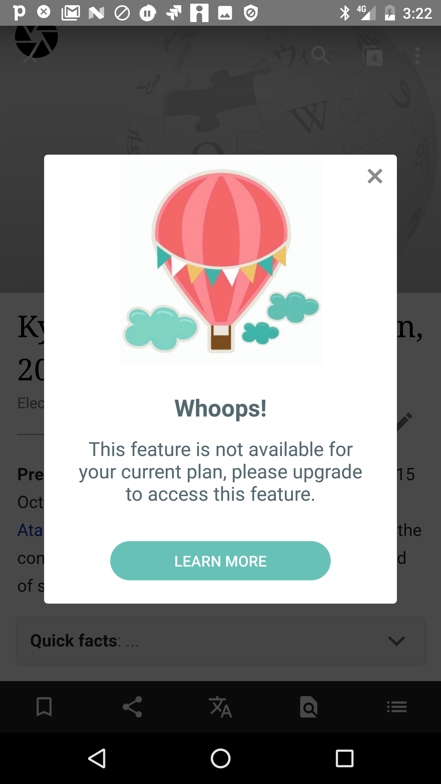
9. Upsells, Offers & Rewards
Converting Free to Paid or Upselling a plan is a key part of the the App economy. Allowing users to progressively unlock new capabilities is an action worth “testing”.
When you test you are allowing the data to tell you what converts most effectively.
A/B testing different prompts and messaging with a tool like Contextual can be done before hard-coding into the application. This “test-and-learn approach is the iteration speed Prodict Managers need to achieve growth.
10. Action Needed
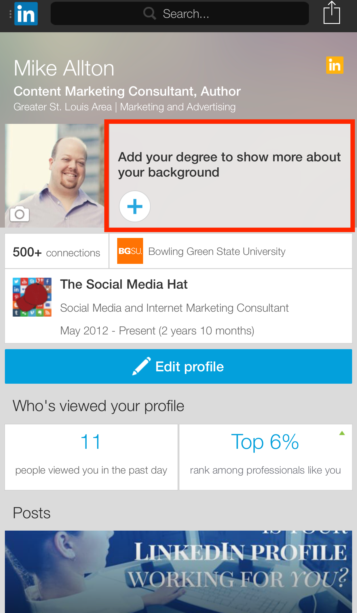
Different to the “Empty State” requirements of first-time on-boarding is driving more “sunk cost bias” into the user’s experience of the application. This sounds evil but is usually to reap returns for the users. LinkedIn is famous for driving users to complete their profile, they bread-crumbed ways that a user could enhance their profile and thus sinking more investment into the App and what it would return to the user.
The red-box (I added for emphasis) shows how LI devotes a large amount of screen real-estate embedded to guilt users to complete this task.


