Category: New Feature Announcement

  • Mobile app user onboarding walkthrough guides ever more critical as spending on non-gaming apps overtakes games for the first time ever

    Mobile app user onboarding walkthrough guides ever more critical as spending on non-gaming apps overtakes games for the first time ever

    Spending on Apps Overtakes Games on Apple’s Platform for the First Time Ever

    A strong lead indicator that consumers are depending ever more on mobile phones to conduct their day to day lives is borne out by the latest Sensor Tower Q2 2022 Data Digest: U.S. which reports that spending on Apps Overtakes Games on Apple’s Platform for the First Time Ever.

     U.S. consumer spending in non-game mobile apps “pipped” spending in mobile games for the first time ever in the second quarter of the year to $3.4 billion.

    Both traditional bricks and mortar businesses and technology led firms are increasingly realizing the potential for greater customer engagement by achieving tenancy on their customers handheld devices.

     However despite the massive amount of investment pouring into the development of apps achieving success it’s not as easy as just launching an app! Over 70% of new app installs are used just once and then abandoned and studies have shown that the drop off rate after a free trial period can be as high as 60%. [5 Tips on how to reduce Mobile user churn]

     The apps that have survived that initial install and free trial period Gauntlet of Death and become part of the latest success numbers have achieved this by helping their users achieve Activation by shortening the time to “Initial Value” via effective mobile user onboarding strategies and maintained a path of “Realised Value” through effective in-app user engagement via ToolTips, new feature announcements, in-app FAQs and User Surveys.

     Sensor Tower also reported that the preferred revenue strategy adopted by B2B and B2B2C mobile apps have also proven to have had a significant impact on these numbers.

     The comparative difference between the two sectors (with $3.3 billion spent on mobile games) puts the delta in spending between the two at a mere $100M. However, the difference in comparative growth rates with gaming apps on 20% v non-game mobile apps at 40% compound annual growth rate has non-gaming apps on a trajectory to grow to almost $15B and increase the delta in spending between the two by almost $1B in 2023.

    These numbers will place product teams and software developers of B2B and B2B2C mobile apps under even greater pressure as they seek to take advantage of this phenomenal growth.  Apps that do not have an effective contextual mobile user onboarding walkthrough strategy will struggle to claim their share.  Established mobile and web apps that do not have in-app messaging and tooltips to help guide users find new features and nudge users towards deeper engagement with existing features will lose ground to competitors.

    .

  • Web And Mobile – The Challenges Of Meeting The Customers’ Needs Across Platforms

    Web And Mobile – The Challenges Of Meeting The Customers’ Needs Across Platforms

    Do you remember a time when you pulled up the web version of an app that you usually handle on your phone? 

    Chances are, it was a different experience from what you were used to in the mobile version. Features might be in other places, and it might even look like a completely different app. It feels off. 

    You don’t want that for your own product.

    There are many areas where product-led companies face challenges on a daily basis. Reducing the gap between the experience of the web and the mobile version of an app is a common one. But the task is not so easy. 

    In this article, you will read about three roadblocks and the impact they have on product companies. If you are currently developing an app on different platforms or planning to do so in the future, this is for you. 

    Prepare yourself for testing times (pun intended) and keep on reading!

    Challenge #1: User Interactions Aren’t Linear

    Thanks to modern technology, users may interrupt their work and later pick it up where they left it. These interactions can not only be sporadic, but also scattered across platforms, giving room for frustrations on the user end. If an app is not optimized across its channels, the user experience will suffer from it. 

    When it comes to web and mobile development, a multichannel approach might harm your product’s success. Delivering a feature in the same manner on multiple channels is a company-centered strategy. 

    There is a better solution than this – the omnichannel approach. It focuses on the customer and delivering a seamless and unified experience no matter the platform they use. 

    As a product-led company, chances are, most of your customers are both web users and mobile users. You can reduce the gap between the two user experiences by adopting an omnichannel strategy. 

    Putting the customer in the center of your app will bear its fruits sooner than you think! With a smooth cross-channel user experience, product adoption and happy customers are guaranteed.

    Challenge #2: Different Platforms, Different Time Perceptions

    Time and timing are tricky aspects to perfect in software development. Especially when it comes to cross-platform planning. During web and mobile development, focusing on time perception is essential. Here’s why.

    Mobile users are notorious for being more impatient. It only takes seconds to switch between the apps on a phone. Due to this fact, users have a different set of expectations on the time spent on one task. So, don’t waste their time!

    For instance, during onboarding, don’t try to show them how many things your product can do. Focus on keeping them engaged and helping them reach their goals with your app. Mobile users have a limited attention span, so make the most of it. 

    In contrast with this, web users are much more patient. The reason behind it is very straightforward. When a user sits down in front of a computer or laptop, they are more clear-headed and focused on the task ahead of them. For them, time moves more slowly. But, as mobile apps are more often used on the go, their users’ time perception is different.

    Time holds relevance in web and mobile development. As a product manager or developer, you should always pay attention to this detail. Focus on how your app is perceived depending on which platform it’s used on. Patience is a virtue – but it’s not your job to prove that to your customers.

    Challenge #3: Introducing New Features

    Feature discovery brings unique challenges to web and mobile development. Implementing new aspects into a well-oiled machine can be tricky. You don’t want to disturb the user, but you want to show them the latest features. 

    It might seem like a hamster-wheel kind of issue. As screen real estate is precious, a great tip to implement feature discovery is popups. They help build user awareness, they work both on web and mobile apps, and don’t clog up the user interface. Besides this, popups open opportunities for continuous user onboarding.

    Cross-platform feature discovery represents a challenge in web and mobile development. As the users’ workflows differ from platform to platform, you need to cater to everyone’s needs when introducing a new feature to your product. 

    At the end of the day, it’s important to underline that by adding new features, your users can maximize their productivity within the app.

    Cross-Platform Apps Are Challenging

    Web and mobile development is a tough business. You have to cater to your customers, to their needs and wants, and to their preferred platform. 
    Let’s sum up some tips for a smoother product adoption process. 

    • The omnichannel approach can be helpful in integrating your users into the development process. This way, your product will feel cohesive across platforms. 
    • Don’t try to make your mobile users as patient as your web users. They might get frustrated.
    • Use popups for feature discovery. They are quick, they help with building user awareness, and most importantly, they help with screen real estate. 


    How to face any challenge that might arise?

    If you want to overcome similar challenges in your software development journey, book a demo and get started with Contextual! We’ll help with your product’s onboarding process, feature discovery, and many more!

  • Announcing the New Contextual Web Creator

    In the upcoming weeks we are releasing an update to our Chrome Extension for web apps.

    This is a great addition and actually shoots past the current mobile guide creation interface which will adopt some of the elements here. Specifically:

    • New design for a user friendly experience & navigation
    • New targeting tool for tip placement & repositioning
    • New guide settings interface with improved selection criteria process for a more streamlined experience
    • Tight point-and-click selection of targets and launchers with css/class/DOM overrides.
    • Search & filter guides easier with the new guide home screen
    • Edit guide name easily

    There are so many great features here, we’ve split it into two videos. If you’ve got any questions, hit us up on support@contextu.al or our on-site chat!

    https://vimeo.com/566908938/641fa71371https://vimeo.com/568797474/a90ded76ab

  • Canva: Product Management Process and Stack

    Canva: Product Management Process and Stack

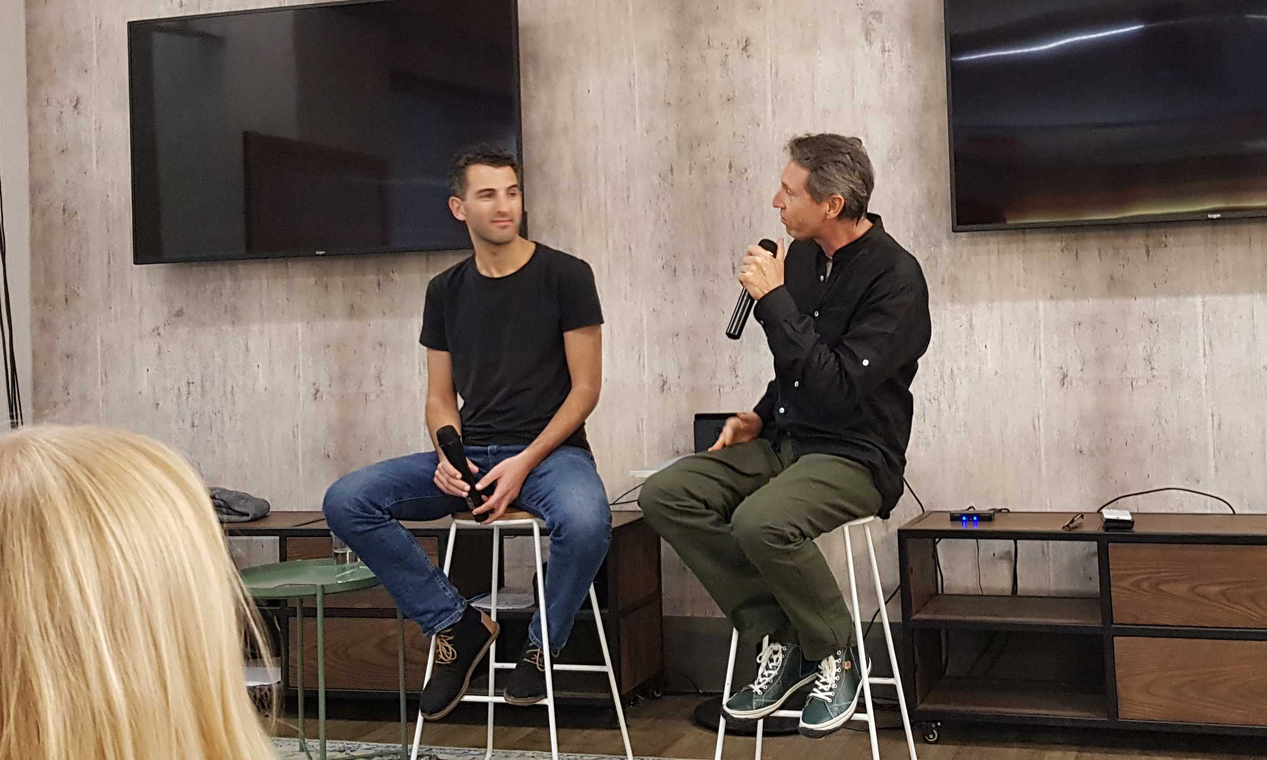
    Canva is one of the fastest growing companies around and now has 500 staff. I recently interviewed Robert Kawalsky who’s startup Zeetings, was acquired by Canva in April 2018. Robert soon took the lead for both Zeetings and Canva Presentations groups which represents a huge opportunity in Enterprise, SME and also Education.

    Our the interview (a fireside at Fishburners) covered a lot of topics – I’ve selected 5 minutes where I asked what he’s learned about Product Management processes, tools, stack inside Canva.

    https://vimeo.com/pointzi/review/335333108/b45df2b0de

    From Chaos to Clarity

    A few times in the talk, Robert referred to Canva’s method of wrangling ideas into features, he called this “Chaos to Clarity” – its a great description of the a product feature’s journey. The “Chaos to Clarity” process is:

    1. Initial Visual Lo-Fi designs – at Canva they are very visual about the way something would appear to a user. This is done in Canva. Sketches, Wireframes, Mockups.
    2. Pitch Deck for that Product/Feature – also done in Canva.

    3. Press Release for that Product/Feature – typically done in Google Docs.
    4. Strategy Document – a long form description that outlines the problem, user stories, dependencies with other products

    5. Design Document – this is the handoff from Product Team to Design/Engineering
    6. Prototype – this is typically used for putting on usertesting.com so they can verify user understanding and response.
    7. Technical Design Doc – where engineering consider the implementation requirements.

    Canva’s Product Management stack is: Canva (surprise!), Google Docs, Usertesting.com, Jira, Trello, Mode and Amplitude for analytics.

    Ideas are the lifeblood of startups and agility can easily degrade into chaos. Too much order and you have stultifying bureaucracy – the Canva process strikes a good balance of balance.

    The Full Fireside

    For those interested in Roberts’ broader journey and a success story of an acquisition of a small startup into a powerhouse unicorn, here is the full video. (its missing a few minutes from the start). 

    Are you looking to get more users to love your mobile and web apps?  Click on the buttons below to get your 14 day free trial or contact us for a demo! 


    Get Started


    Get a Demo


    Contact Us

  • How LinkedIn launches a feature

    How LinkedIn launches a feature

    I wouldn’t be alone grumbling about LinkedIn on a daily basis, but its worth mentioning what an elegent, simple job they’ve done rolling out a new feature:

    “Reactions”

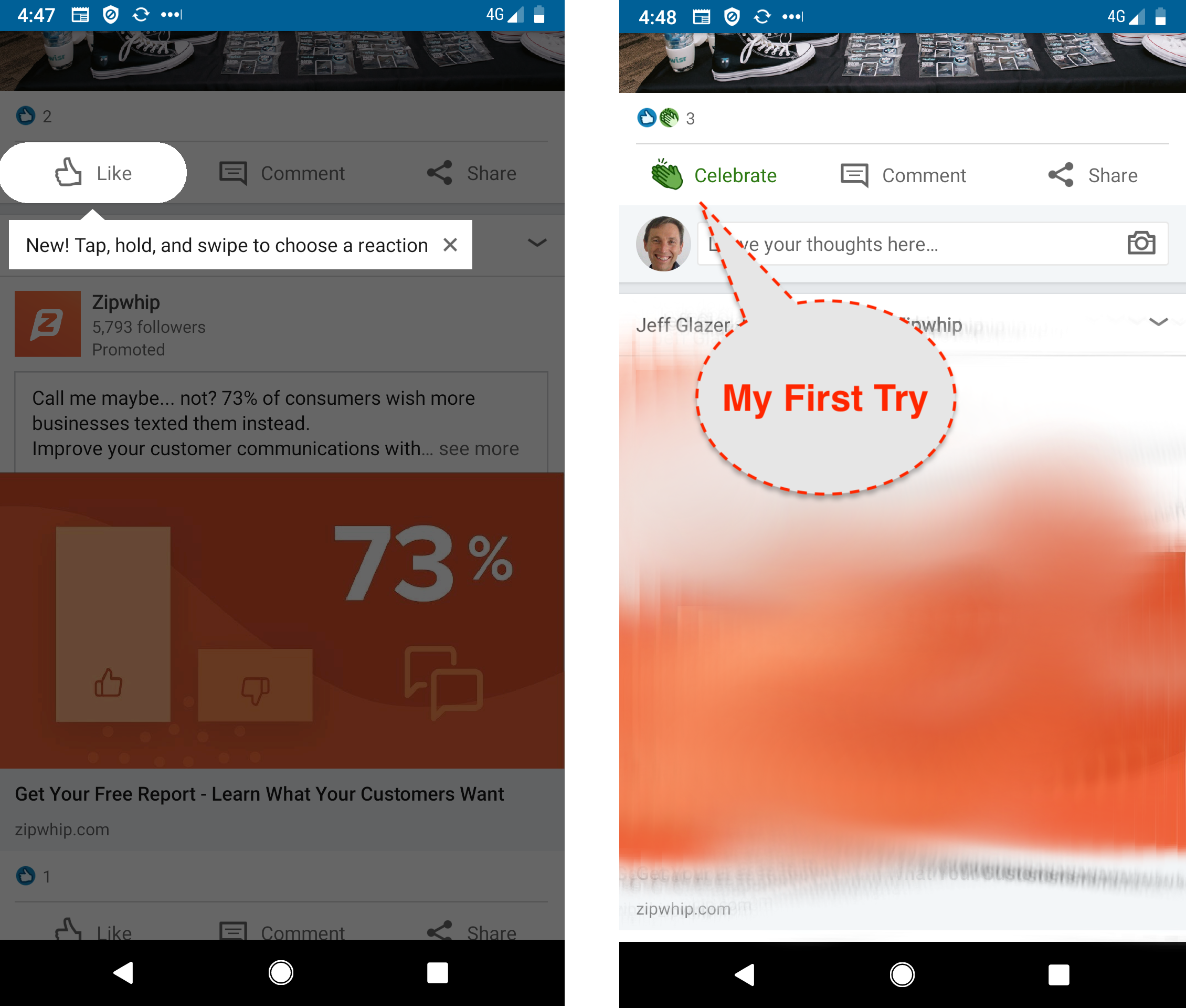
    It would be easy to underestimate the genius of this Feature Announcement. The 2 screenshots above tell the story of “my first try”.

    Screenshot 1: Contextual Tip with Cutout.

    So LinkedIn don’t spam me with a new feature either by carousel or popup, they don’t want to interrupt my usage flow. But on the other hand, we are so conditioned to just tap the “Like” that we’d never know the Reaction is just a long-press away.

    So when I’m looking at an article, they show me, teach me with just a simple tip and a few words how to express myself better than just a “Like”. Notice how little screen real-estate is taken to communicate this powerful new feature. They even give me an “X” dismiss if I don’t like it.

    Screenshot 2: Mission Accomplished.

    I’ve held down the like and selected the “Celebrate” icon because the article deserves some applause. That was super-easy but:

    a) I would never have known I could do that without the tip.

    b) The instructions were simple, clear, contextual for me to try it practically. I didn’t have to read a blog post or watch a video.

    Sleeper Feature?

    LinkedIn released the new feature on the 11th April 2019. For their Product Manager and the team working on it – it would have been a huge deal. Here is a shot of their office on release day.

    It was such a big deal, LinkedIn did 3 posts about it, here, here and here.

    It was even covered on Techcrunch! (you can’t buy publicity like that).

    I wonder what the uptake was?

    I use LinkedIn most days and never noticed the new “Reactions” in conversations in my Feed.

    Most Apps have experienced this anti-climax:

    • you slave for months,
    • QA it,
    • system test it,
    • internal test it,
    • focus group test it,
    • release it…
    • …..fizzle
    • nothing happens.

    That’s why you need Feature Announcements or Feature Discovery.

    Analytics and Targeting​

    You can guarantee that LI measures every click and nuanced gesture. I’m not sure if they have something as elegant as Contextual A/B tests 🙂

    But on review they must have acknowledged that they needed to nudge users to stop “Liking” and teach them how to “React”.

    I received my “nudge” tip on the 4th May 2019, so eventually I was targeted to be taught about this new feature. They converted me immediately and I’ve used the feature since.

    So analytics and targeting around uplift of a feature is an essential component of rolling out an engagement layer – you need to know your adoption based on education.


    Great job LinkedIn!


    Kindle and Youtube examples

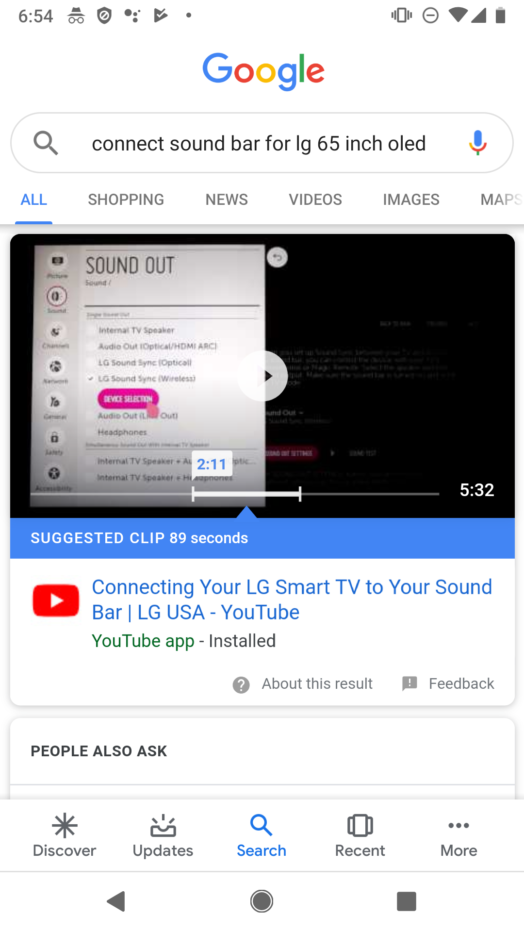
    To round out the post, here are two similar examples from big companies. Amazon Kindle and Youtube have massive teams and their ability to roll out these simple but effective tips would cost them millions per year in engineers, product managers, QA, analytics staff.

    With Contextual as an Engagement Layer platform, Apps with much smaller teams can design feature announcements, target, deploy and measure uplift at a fraction of the price.