Category: Cognitive Load

  • 6 onboarding UX emotions

    In an earlier post we covered how Eventbrite tracked anger vs delight. Today I cover 6 onboarding UX emotions your users may experience when trialling your App.

    Your user’s journey is a mix of “will this work for me?”, “how does this work”, “that didn’t work”, “aha-yes!”. For a new user it’s a roller-coaster of emotions and its made up of 20 small steps that anger or delight.

    1. What made users flock to Mixpanel but shun Kissmetrics?
    2. How did Amplitude arrive much later but still nail a huge market segment?

    I don’t have the answers – there will be many, many reasons** and even more opinions. The question is what are the 20 steps your App needs to deepen engagement where users go from:

    ACQUIRED ➡️ ACTIVATED ➡️ RETAINED ➡️ REFERRER

    Tracking and shaping emotional UX

    This chart is intended to show that:

    1. users build up “Delight” slowly over a period of time.
    2. One event along the journey  send then into a state of “Anger” . The anger has a much bigger impact than all the small delight moments. 
    3. Summary: “delightful things don’t matter if you don’t solve the critical moment”

    For Eventbrite, it was failures at payment time that produced anger. The user had searched for, selected an event, read about it, got excited, registered and then BOOM something in payment was wrong or broken. 

    Types of Emotion

    Anxiety and Uncertainty

    For the Eventbrite customer, things were even worse – the user didn’t know if they were registered or not!

    When I was at College, the programming classes were on a shared Unix system that would always crash at the worst possible time, everyone pushing to get their assignment done at the last minute was “<CTRL-S>ing their code every few seconds to make sure they didn’t lose work – stressful! 

    Would those Anxious students ever recommend or refer people to use that brand of Unix hardware? I think not.

    Once a customer has a catastrophic experience its going to be hard win their trust again.

    Overpromise Disappointment

    In the 20 small steps to engagement the user is investing time in the hope that they have the product to solve their Job-to-be-done (JTBD). The curve might look something like this:

    the internal user journey to "aha" moment is the first JTBD

    Along the time-invested curve,  the user is calibrating their experience back to stories told on:

    1. Your marketing
    2. Your website
    3. Your onboarding emails and guides
    4. What their peers or press have said about the product

    It’s easy to over-state a product’s unique value proposition in the marketing.

    We experience this ourselves:

    • the product is a self-service dashboard
    • the impression is this is a super quick process
    • some don’t realize there is an SDK (at least for mobile) and that they need their developer buy-in
    • that targeting and personalization is magic rather than data-driven
    • that the integration will match their app perfectly first-time. (Mobile Apps are often written differently and our integration sometimes needs the developers to talk to each other)

    None of this is the customer’s fault, we need to better set expectations of simple things and technical things.

    Confusion (Cognitive Overload)

    Related to uncertainty is powerlessness.

    Often users are confronted with a confusing array of crammed in features. It’s just too much and leads to confusion.

    One of my most popular posts on medium covered the risk of cognitive overload in your App. These psychological factors affect your user activation rates and how you can manage that.

    Take a look here.

    The “Vibe”

    Incompetent lawyer Dennis Denuto abandons case law and logic when arguing his clients case in legendary aussie comedy  “The Castle“.

    Dennis’ argument is that the “Vibe” is not right!

    Customers also use their “spidey-sense” when trialling your product. The spidey-sense is getting the “Vibe” of whether the product is going to work for them. Small moments in your App transmit a positive or negative Vibe to the user. This Vibe will affect activation rates.

    Gratification

    The activated user chart (above) has an initial steep climb – along that climb your user needs to experience practical results along the way.

    Gratification is a major goal. But it needs to be revealed to the user in a timeslice that is achievable. In an attention-deficit TikTok world “Instant Gratification” is your only option ????.

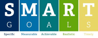
    Prioritizing your Onboarding should be coloured by JTBD and tempered through the lens of SMART goals. Give the user something achievable! Its a major dopamine rush for any user to get gratification on their key “jobs”.
    SMARTgoals_Infographic-v1

    Surprise and Delight

    Consumerisation of SaaS and B2B Apps is one of the most interesting trends. Slack, Mailchimp have added playfullness and joy into work-based applications. Its a powerful “cute” additive to the user’s experience. It signals your are not only on the top of your functionality but you have time, space and ❤ to add some fun into the application.

    BUT….as mentioned above, Delight is only impactful if you’ve resolved all the Anger points first.

    Summary

    I’ve provided 6 major emotions that a user experiences on their way to:

    1. being happy and buying your product or
    2. churning to a competitor.

    But don’t be fooled, these emotions run under the surface – don’t believe what any user says, but measure what they do!

    1. Customers make terrible product designers.
    2. Get as much feedback as possible from customer BUT you cannot take at face value.
    3. The customer’s job is to show you their pain.
    4. Your job is to translate into meaningful product solutions.
    5. You need a champion of the customer that OWN this conversion of pain to design.

    Last note: one important emotion I didn’t cover here (its pre-acquisition) is the conviction that comes from referrals and social proof about your solution. When a prospect’s friend recommend product, it’s a huge contributor to trialler positivity.

    Are you looking to get more users to love your mobile and web apps?  Click on the buttons below to get your 14 day free trial or contact us for a demo! 


    Get Started


    Get a Demo


    Contact Us

  • Onboarding $234.1M style: Monday’s activation flow

    Our readers develop and run Apps in competitive markets. Even once “safe” corporates like banks now compete with mobile-first “Neobanks” crafting Apps that are disrupting the oligarchy.

    So how do you compete with a large funded competitor? They could be a big corporate or a Blitzscaling startup. In this webinar, Scott Middleton and I examine how one blitzscaler: Monday.com ($234.1M funded)  onboards and activates users. They literally throw everything including the kitchen-sink to make you believe their product will solve your team productivity needs.

    What are the insights?

    If you don’t have 14 minutes to trawl through the takeaways, I’ll give some pointers to what we spoke about.

    1. Tough Sector

    Monday is in a cluttered “Team Productivity” segment, it’s  also B2B SaaS – one of the most profitable sectors for Apps that dominate. Incumbents/competitors include Trello (2011), Asana (2008), Basecamp (1999), Jira (2002).

    With this massive addressable market, Monday.com know:

    1. there will be plenty of triallers
    2. if they can nail the onboarding for each trialler they have a highly profitable opportunity.
    3. this underlies the intensity of onboarding and activation.
    4. they drive for Fast activation
    5. they know there is Fast/high churn potential.

    2. Reduce Cognitive Overload

    1. Contextual Tips stop cognitive overload and start the path to “Aha”, they deliberately reduce the number of options at the “top-of-funnel” so the user can only do what supports onboarding.
    2. No “empty states” (User gets visual feedback of usefulness) even when first time in the App. Many Apps leave you guessing about what things will look like once you’ve adopted the product.
    3. use subtle tooltips to explain the common use-cases. “Show-me, Don’t tell me”.

    3. Viral Acquisition

    Monday recognizes they are going to get the best lock-in when customers invite a colleague.

    So their invite stuff is aggressive – I think too aggressive but clearly they’ve kept it because its worth the risk. 

    They use modals, so I am forced to think about it and its not optional.

    IMPORTANTLY: they have a tiny, tiny “I’ll do it later” option that lets you escape the invite process and get on with your evaluation. This “Single player mode” is an example of then the company goals and trialler goals are different.

    4. Gamification and Contextual “Show-me” (Videos)

    Gamification is more subtle in B2B, tools like checklists, progress bars are silent reminders for a user to complete tasks they enhance onboarding.

    1. Progress bars are great to orient users (in their journey)
    2. Keep demo videos inside the platform and contextual)
    3. Let the user self-pace

    Click to see animation

    5. Second Session – Inbox and more checklists

    The main insight here is that Monday goes all out with contextualizing the user in their journey and what are the next steps. The “Inbox” item is pleading with me to invite teammates and create more boards.

    Its possible this message varies PER-USER depending on where they are in their unique journey (I didn’t test this).

    They’ve probably used their analytics over time to learn that multiple users and multiple board use-cases drive up the likelihood of activation and retention.

    This is expensive stuff to code and deliver but must have been worth doing to keep triallers on-track.

    6. Emails, Push Notifications

    Most Apps know that drip emails during the trialling process give you 3 big benefits:

    1. Get the user back into the App
    2. A second chance to explain possible use-cases that resonate with the user
    3. Open/Click Analytics tell you if the user is genuinely interested or just a tyre kicker.

    Monday is no exception – the email to join a webinar is genius because it allows the user to get deeper understanding that sometimes self-onboarding just can’t achieve.

    But can we afford to do all this??!!

    Monday’s $234.1M investment certainly helps to be able to build out an impressive, dense and impactful onboarding process.

    Other Apps that don’t have the funding may think this is too ambitious and unrealistic for their team and resources.

    The good news is that what the big-gorillas hard-code is now available in platforms that smaller Product Teams can make use of.

    Those apps can still:

    1. pick and choose the design techniques above.
    2. use platforms like Contextual to build onboarding elements and measure the uplift.
    3. experiment faster to see what works – don’t die wondering!
  • Mobile Tooltips: the unobtrusive UX pattern to deepen engagement

    Remember Clippy? Perhaps you’d rather not!

    Clippy was Microsoft’s “Office Assistant” and became universally derided. Here are 5 reasons why people hated Clippy:

    1. Obtrusive – power users hated Clippy because it had patronizing suggestions.
    2. Distracting – the image at right (without the gun) is literally Clippy looking bored and wanting you to stop your job and pay attention to it. As we’ve talked about before, JTBD (jobs to be done) is how a product manager should think of a user’s flow
    3. Always there – he(?) sat on top of Word/Excel taking up screen realestate
    4. Killed your flow – this hilarious Quora answer lampoons how it would take 30 seconds to hijack you writing a sentence.

    How to be unobtrusively useful

    We’ve blogged before about how tips need to be unobtrusive. In particular if a web “desktop design” approach is shoe-horned into a mobile App, the patterns conflicts with a user’s “Jobs To Be Done” (JTBD) imperative.

    The best way to deliver unobtrusive user guidance via tips is:

    Contextual

    Unlike Clippy, tips should show when relevant to users.

    Audience: We have customers in Health and Telecoms that have older customers that prefer guidance whereas Milenialls will click/touch/swipe a thousand things until it works. I’m not being “age-ist” – its just a fact.

    Trigger: Apps should only show the tip to the correct audience and stage of user journey. If a user has already user a feature, then they shouldn’t be seeing tooltips explaining what they know. If a user is about to commence a complex task for the first time, then offer to help them!

    Simple & Distinct

    In my recent popular article at uxdesign.cc, the idea of “Cognitive Overload” was discussed and how App Product Managers should design to reduce this overload. In this article we suggest that launchers and tips need to be perceived as a layer on top of the application but not compete for screen real-estate.

    In this simple tip, Youtube taught me something new – that I can pinch the screen. It obeys two simple rules that we think are important:

    • Get the Job Done (JTBD)
    • Get out of the way

    Note how simple this tip is, it can be dismissed by simply touching.

    mobile tooltips mobile tooltips - example youtube

    Also, these two Youtube tips are similar but also point to a clickable screen element (the bell button and the drop-down filter). Notice how “cognitively” the tip looks very different to the rest of the App. Its very easy for the user to distinguish the tip from the App content – in fact they’ve interesting used the same colour in round badges over channels as discussed in my previously mentioned post.

    The lesson is that Google: one of the largest tech companies on the planet has figured out that this design pattern of: simple, distinct, coloured tips converts their users to adopt the recommended features. Google would have massive teams of analytics, data scientists to come to that conclusion and we should take notice!

    Data Driven

    Which is a nice segue that puts substance to our first recommendation of “Contextual”. All tooltips need to justify their existence and Product Managers need to know what uplift they get on feature usage, engagement or other success metrics. We’ve written other posts on A/B split tests to verify that your in App education is data driven and working. Our two main points are:

    • Measure the success of tooltips – we’ve seen uplift range from 20-80% for new features. Pick your metric and compare against your Apps default state.
    • No Code – using tools like Contextual, the ability to deploy tooltips is codeless, no more Appstore releases or fighting for resources on the Product Roadmap. This is critical, you need to iterate fast!

    Significant New FeaturesGoogle Maps add a Pit-Stop

    Its worth mentioning a slightly different style tooltip that Google also shows for significant feature additions. Many Apps will throw this up as a popup or carousel page when the user opens the App – but that’s lazy and google does a great job here of contextualizing this new feature mid-task.

    The inclusion of title, icon and “GOT IT” button are simple but significant to catch the users attention that this is significant. In particular, the use of a button allows the Product Manager to use analytically see who dismissed by the button or clicked elsewhere (or outside) the tip. In Contextual, this gives measures of “Accept” and “Reject” to measure how positive the response was for the tooltip.

    Summary

    Clippy got it wrong but was a brave piece of help technology for products (Word and Excel) that had become very feature rich (bloated?) and complicated to use. Microsoft had to solve the problem of surfacing features and their approach is what you should avoid – especially in Mobile apps!

    Clippy Best Practice
    Obtrusive
    Distracting
    Always there
    Killed your flow
    Job Centric (JTBD)
    Simple
    Contextual
    Get out of the way
  • Has Material Design nailed Mobile Tooltips?

    I received a question from a recent uxdesign.cc post on Cognitive Overload in mobile app design. (It was a variant of my last post here).

    Has Material Design already answered the need for reducing cognitive overload?

    Material Design is a unified system that combines theory, resources, and tools for crafting digital experiences.

    This initiative from Google (and gift to the world) is widely embraced but Apple is sticking with their own Human Interface Guidelines (and the battery efficient Flat Design). I won’t go down the rabbit hole of comparison but predictability, elegance and delight in design are all great cognitive tools for reducing negative human-computer interactions. (Also it didn’t hurt that Google clobbered Apple by having wide-spread tools and libraries for both web and mobile).

    Material Design’s strength was sticking with a cognitive design balanced with device performance, processing power and battery efficiency — an acknowledgement that human perception uses light to interpret the physical world.

    BUT — where Material Design stops short is that it solves “the current moment”. Its really a design tool, NOT a user experience tool.

    It does not consider the user journey and the contextual nature of a design for the current user’s needs.

    Material Design’s Approach to Mobile Tooltips

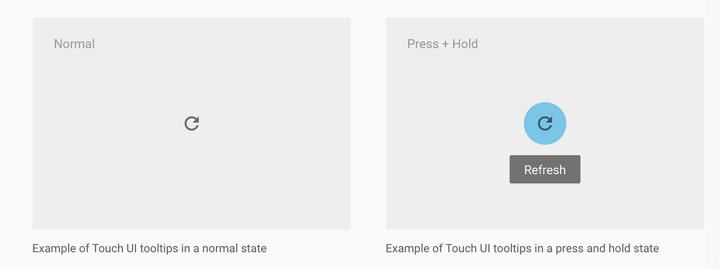
    They take a well-meaning of hiding tips (similar to desktop where its hover that delivers the tip). The advocate the long-press (press-and-hold).

    The problem for long-press is that:

    a) mortals don’t know that gesture, only UX nerds.

    b) confused use. Historically long press) gesture on a mobile devices mimics the secondary button press on a computer mouse. Traditionally it gave you the same alternative options as the secondary mouse click on a computer. So long-press for tips is competing with another function. Frankly, allowing the user to access “less, commonly used functions” is a far better pattern. “Help” could be one of the options provided.

    c) gesture dissonance: the user has to drop their uncertainty of clicking the button in order to learn what the button does — wtf?!!!

    d) Perhaps the greatest challenge is that nobody knows how to communicate it (contrast with the “Like” button that was self-marketing). Swiping could be illustrated in a sketch and also mimicked existing human behavior of swiping or dismissing something no longer needed.

    e) not many apps use it. I long-pressed a bunch of Google Apps and can’t get a tooltip to show. Naturally if Apps don’t use it, then user’s won’t use it.

    IOW — Long-press for mobile tips are dead. Sorry material.io 🙁

  • The peculiar lure of launchers for App engagement

    Cognitive overload in mobile Apps is a real problem for designers. My general rule-of-thumb for a well-designed mobile App is to assume the user’s IQ is halved.

    This is not intended as malicious or critical of users, its a recognition that mobile apps serve people on the run, getting out of cars, crossing streets – so that splits their attention and IQ.

    So if a “desktop design” approach is shoe-horned into a mobile App, the cognitive overload conflicts with a “Jobs To Be Done” (JTBD) imperative.

    So great Apps have layer of content and a layer of guidance. This is where Launchers play a role.

    You’ve seen…


    One of the most common tool-tips is universally understood, its usually small, unobtrusive but in a moment of confusion, the user knows there is access to more information.
    Of course the other variation of this is the standard button.
    The benefit of a button is that obviously its known as a clickable element but the downside is the screen-estate and conflict with the App’s own features. Perhaps the button starts to look more like the application and that probably not what you want.

    This pattern is also now understood by everyone, even your grandmother. Specifically This is Netflix telling me, or even urging me, to find our what special gift is awaiting me when I touch the badge.

    In fact, Slack took it a step further by actually icon-ing messages as gifts 🙂

    Now in 2016/2017 has emerged “the Hotspot” what might eventually be remembered as helpful as the HTML <blink> tag! (they are usually more subtle than this).

    This new indicator is pretty compelling and is used as an alternative to throwing up a mandatory tip when you enter the page.

    The great cognitive benefit is that the pulse means:

    • I’m more important than a tooltip
    • Come back to me when you are ready
    • but you won’t miss me!

    Usually these pulses settle down to be simple dots, so our brain makes the connection that help is available without being distracted by the pulse.

    Deceptively simple

    One of my all-time favourite acts of design genius beats anything that Jony Ive came up with.

    Can you guess what it is?

    Wait for it…..

    The Facebook like is deceptively simple, but it punched directly through to human reward systems. That little icon has injected more dopamine into human blood streams than ever before!

    Simple but Powerful

    So little icons might seem lightweight or trivial, but the congnitive connection that matches “Job To Be Done” to a simple icon is both:

    1. cognitively efficient (remember our low-IQ users)
    2. efficient use of real-estate
    3. stands separate to your App’s functionality.

    The Magic of Launchers

    In summary, launchers are like a great waiter at a great restaurent….A launcher never over-services, never shouts, is available when needed and delivers the good.

    • Get the Job Done
    • Get out of the way
    • Measure the success
    • No Code

    UPDATE:

    One of our advisor’s Henry Cho* wrote me with the following insightful comments on the post:

    It’s touching on affordance and status indication.

    and

    you are saying that there will be a tension between overloading users cognitively and providing system status and call-to -action.

    and

    Be to clear and paradoxically the message can add to cognitive overload. Too subtle and the message is not conveyed to the user and engagement forfeit. 
    There is another element to add to this which I think you are well placed to support. Temporality, meaning the way that you signal can change over time, triggered by time or user interaction. 

    In these comments, Henry nails the key issues we aim solve about contextual engagement. I’m going to grill him more about what “Temporality” means to him 🙂

    ** Henry is a leader in Mobile UX and been involved in one of the most highly regarded banking applications. He’s currently Head of UX and AI at Upwire and you can follow him on at @hankatronic