Category: Feature Onboarding

  • Carousels for Feature Discovery ????

    The Commonwealth Bank of Australia is* the 71st most powerful company and 43rd largest bank in the world.

    Their mobile app has won many design prizes and they have huge resources to pour into it. This post looks at some excellent Feature Discovery, Feature Onboarding they use in parts of the App.

    If you’ve read other posts, you know we are skeptical of having a carousel at the start of the App. Simply put it is a barrier to the user’s Job-to-be-done.

    However, we’ve always thought its an excellent way to explain concepts and key points about a subset of the Apps features. Commbank does a great job here.

    Cardless Cash Example

    Using the App, a bank customer can walk up to an ATM machine with a special one-time PIN and get cash out, the use-cases for this are:

    • convenience
    • not getting mugged at the ATM of your wallet
    • you can send the code to a family member or friend and they can access that
    • you’ve lost your card etc.

    When banks started rolling out this capability millions were spent on implementation and then they found nobody was using it.
    This is an extreme case of what many Product Manager experience:

    1. the team works hard on a feature
    2. they release it into the product
    3. crickets and tumbleweeds.

    So next the Product Manager walks over to marketing and asks for an email to be sent out announcing this fabulous new feature. So they wait a week or two and the email is sent. Crickets and tumbleweeds.
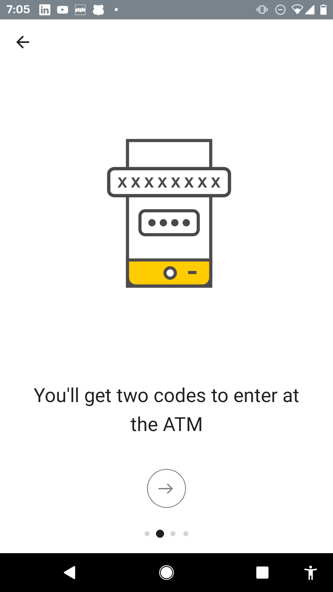
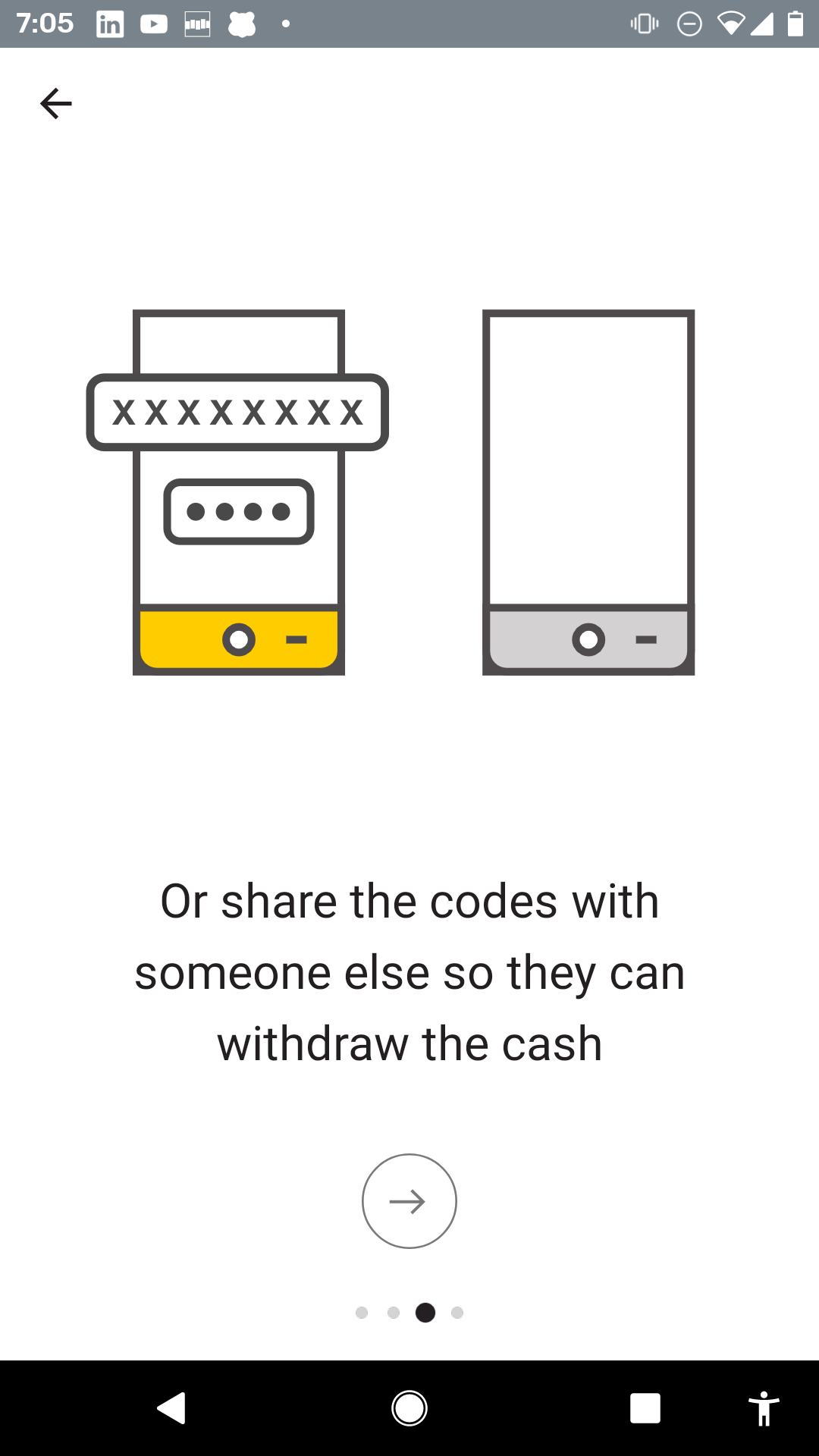
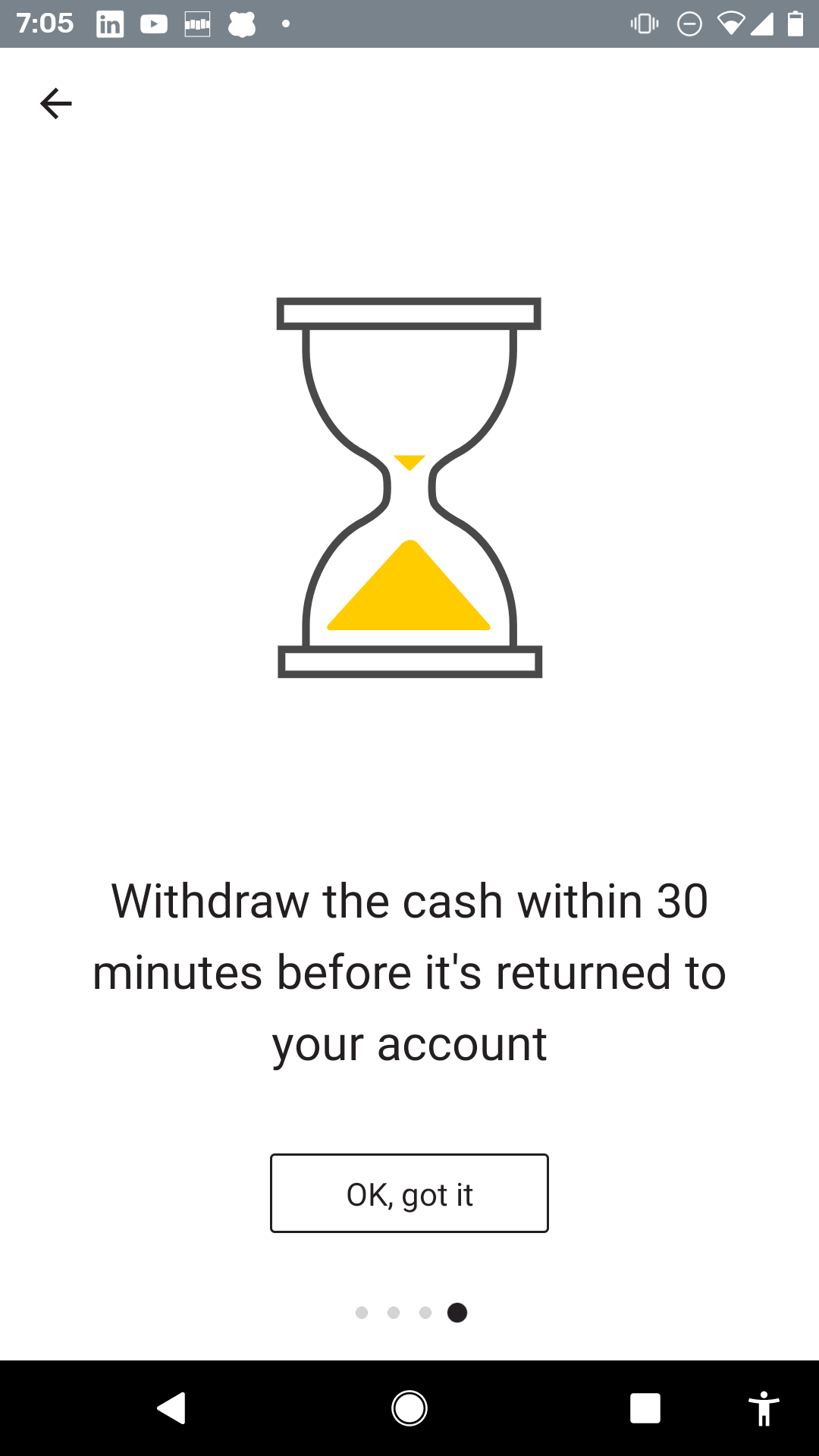
    Here is how Commbank get users familiar with Cardless Cash.
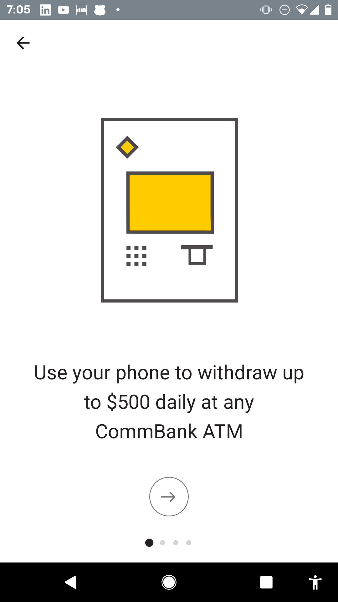
    cba-cardless-cash-1
    cba-cardless-cash-2
    cba-cardless-cash-3
    cba-cardless-cash-4

    So the interesting thing here is that Commbank:

    1. doesn’t show this when I open the app, only when I go to that part of the App for the first time.
    2. They tell me about the benefits and the journey to get the cash. They don’t tell me how to use the UI.
    3. They may still later use tips to help me with using this part of the App but they don’t overwhelm me now.
    4. It’s a clean introduction that helps people over the barrier of doing something new and different.

    Portfolio example

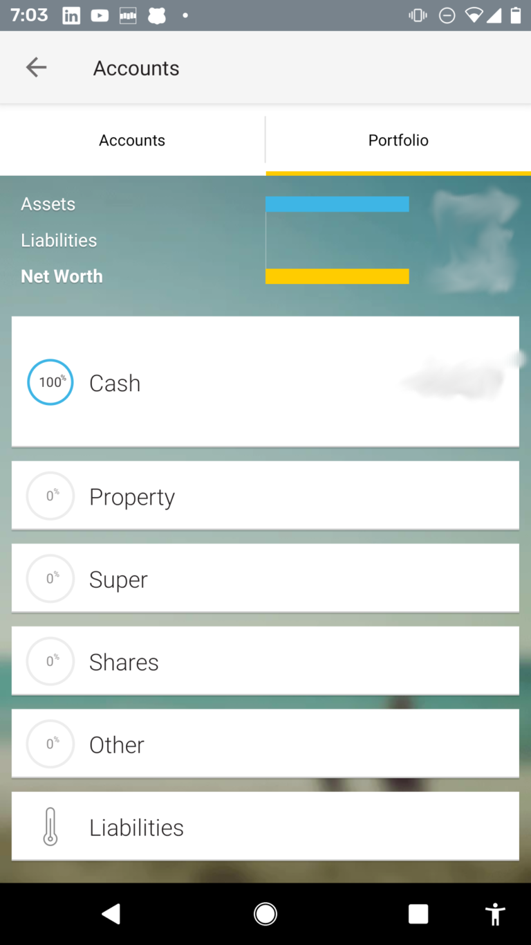
    Portfolio is a cool tool that allows a bank customer to record other assets. Clearly Commbank wants people to use that feature and the Portfolio tab is BIG and Obvious. The curious user can’t help but touch that tab.

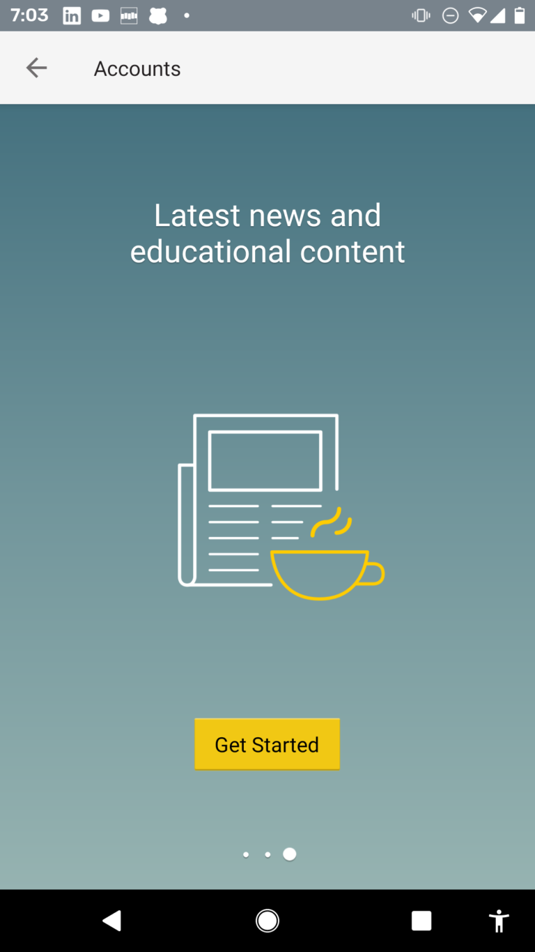
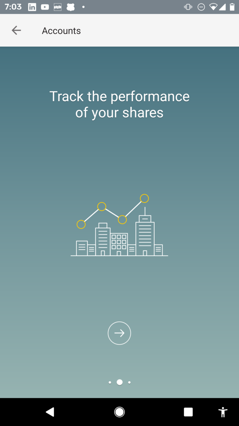
    The first time on Portfolio, the user sees this 3 step carousel that explains the top-level-benefits.

    It is weird the design is different to the Cardless Cash carousel – even the CTA button is different. But the design is sophisticated and resonates well for a user that has more assets.
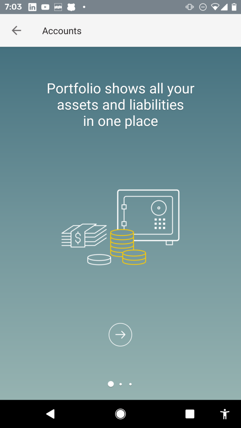
     

    cba-portfolio-1
    cba-portfolio-2a
    cba-portfolio-3
    cba-portfolio-4

    In summary, these deep features are not thrown in the user’s face first-time, when they become curious they are given a very human introduction – I think its quite nice and is a “just-in-time” approach.

    Your company may not be the 71st most powerful organization in the world, but you can achieve these types of carousels and target to specific personas, users or first time a user enters a part of your application – you can do this with Contextual and once the SDKs are integrated you don’t need to bug your developers to implement – these carousels are code-free!


    ** with current COVID-19 creating havoc on financial markets, their rank may be up or down!

    Are you looking to get more users to love your mobile and web apps?  Click on the buttons below to get your 14 day free trial or contact us for a demo! 


    Get Started


    Get a Demo


    Contact Us

  • Google continuous onboarding in 2019

    In earlier posts we’ve looked at what Google has done to introduce new features and deepen engagement – we call this continuous onboarding. This post is an update that shows the following key characteristics:

    • Google consistently use tips, popups and feature tours.
    • Tips are ALWAYS simple.
    • Tips are ALWAYS contextual
    • Popups and Tips seem to target the user who hasn’t yet used a specific product feature.

    Lets dive in…..

    Advanced Gmail Features

    Gmail is a mature product and after the closure of Google Inbox some of the top features are being imported into the new cleaner Gmail UI. 

    1. “Schedule when to send” – this simple contextual tip explains to the user in one-shot the new functionality. Easy and Done!
    2. Dynamic email – this is more complex and a pretty new feature. The “Learn more” button takes me to a deeper explanation. The “Got it” is what users expect from a popup tip to dismiss it.
    3. Google’s choice of a simple style indicates that they know that the vast majority of the population will understand these little visual elements. They don’t try to be too sexy or clever, this would just distract from the education mission. Google’s tips are consistently in this blue colour.

    The calendar tip is not exactly from Gmail but its closely coupled with the gmail UI. In this case the:

    • Again, its simple and contextual to point at the new button that I’d not previously used.
    • The blue colour is in the button but it still echoes the recognition common across their tip UI.
    • The tip has a dimmed background to standout.

    Previous
    Next

    Youtube Channel Membership

    Wow, this is an interesting new feature in Youtube!

    It looks like Youtube are taking on Patreon but I’d have never know unless this tip popped up because generally I just click “SUBSCRIBE” and don’t really notice what else is needed.

    Again, despite Youtube being fairly autonomous to Google, the style of tip, placement follows the same style elements:

    • Google tip blue.
    • Title (bold)/Description.
    • Use of “Got it”
    • No use of dismiss or “X” buttons.
    • The blue appears brighter to compete with the intense red of the SUBSCRIBE button.

    Google Docs – Word editing.

    Google wants to take Microsoft Office’s (once) safe userbase. The new feature introduction of co-existence with Office’s documents is a powerful feature that they want to promote. 

    So this popup is not shy about their message – very different to Google’s other low-key feature announcements tips – the popup is a significant announcement. Two things to note:

    1. The blue button will launch the tour below. The text explains what will happen.
    2. The “X” dismiss button is clear.
    3. The user only has 2 possible responses and Google’s analytics will know exactly how each user responded to the prompt. This is how Contextual works – allowing Product Teams to infer different conclusions and behaviours from what buttons the end-user clicks.

    Clicking the (yes, you guessed it – blue) button above leads to explain a few key features.

    NOTE: they don’t attempt to explain Google Docs. They only explain the NEW Microsoft Office integration features such as Managing Versions, what format and Conversion.


    Previous
    Next

    If the top popup was too subtle, sometimes Google also uses their bug splash coachmark to announce the new feature.

    The Best Practices

    You can guarantee that Google knows that this type of contextual education is a key step in continuous onboarding. The simple takeaways (with complex data backed reasons) are observable in these recent Tips, Tours and Popups in Gmail, Calendar, Youtube and Google Docs.

    The Google Best Practices for tips are:

    • targeted at users
    • has a predictable design and colour that won’t confuse users.
    • doesn’t have any flashy colour schemes buttons or widgets that distracts from the education mission
    • doesn’t use more buttons necessary than is needed for the job
    • buttons look like links (presumably to simplify render on a broad range of devices)
    • allow the user to engage with the tip or to easily dismiss
    • their response is captured and measured.

    There is also examples in Google Photos, Google Assistant and several other products that also use the blue contextual tip – look out for them the next time you are using their products!

  • How LinkedIn launches a feature

    How LinkedIn launches a feature

    I wouldn’t be alone grumbling about LinkedIn on a daily basis, but its worth mentioning what an elegent, simple job they’ve done rolling out a new feature:

    “Reactions”

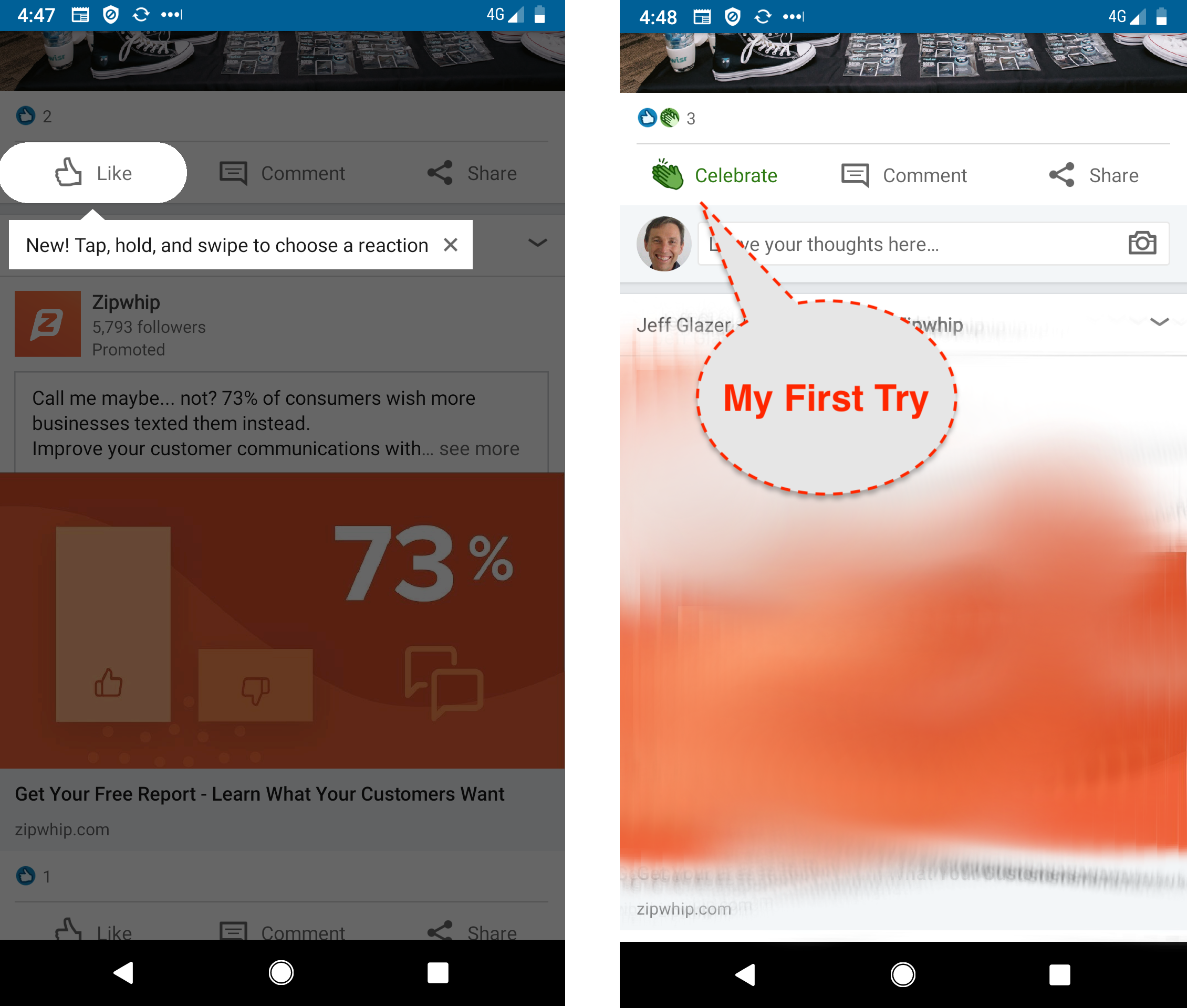
    It would be easy to underestimate the genius of this Feature Announcement. The 2 screenshots above tell the story of “my first try”.

    Screenshot 1: Contextual Tip with Cutout.

    So LinkedIn don’t spam me with a new feature either by carousel or popup, they don’t want to interrupt my usage flow. But on the other hand, we are so conditioned to just tap the “Like” that we’d never know the Reaction is just a long-press away.

    So when I’m looking at an article, they show me, teach me with just a simple tip and a few words how to express myself better than just a “Like”. Notice how little screen real-estate is taken to communicate this powerful new feature. They even give me an “X” dismiss if I don’t like it.

    Screenshot 2: Mission Accomplished.

    I’ve held down the like and selected the “Celebrate” icon because the article deserves some applause. That was super-easy but:

    a) I would never have known I could do that without the tip.

    b) The instructions were simple, clear, contextual for me to try it practically. I didn’t have to read a blog post or watch a video.

    Sleeper Feature?

    LinkedIn released the new feature on the 11th April 2019. For their Product Manager and the team working on it – it would have been a huge deal. Here is a shot of their office on release day.

    It was such a big deal, LinkedIn did 3 posts about it, here, here and here.

    It was even covered on Techcrunch! (you can’t buy publicity like that).

    I wonder what the uptake was?

    I use LinkedIn most days and never noticed the new “Reactions” in conversations in my Feed.

    Most Apps have experienced this anti-climax:

    • you slave for months,
    • QA it,
    • system test it,
    • internal test it,
    • focus group test it,
    • release it…
    • …..fizzle
    • nothing happens.

    That’s why you need Feature Announcements or Feature Discovery.

    Analytics and Targeting​

    You can guarantee that LI measures every click and nuanced gesture. I’m not sure if they have something as elegant as Contextual A/B tests 🙂

    But on review they must have acknowledged that they needed to nudge users to stop “Liking” and teach them how to “React”.

    I received my “nudge” tip on the 4th May 2019, so eventually I was targeted to be taught about this new feature. They converted me immediately and I’ve used the feature since.

    So analytics and targeting around uplift of a feature is an essential component of rolling out an engagement layer – you need to know your adoption based on education.


    Great job LinkedIn!


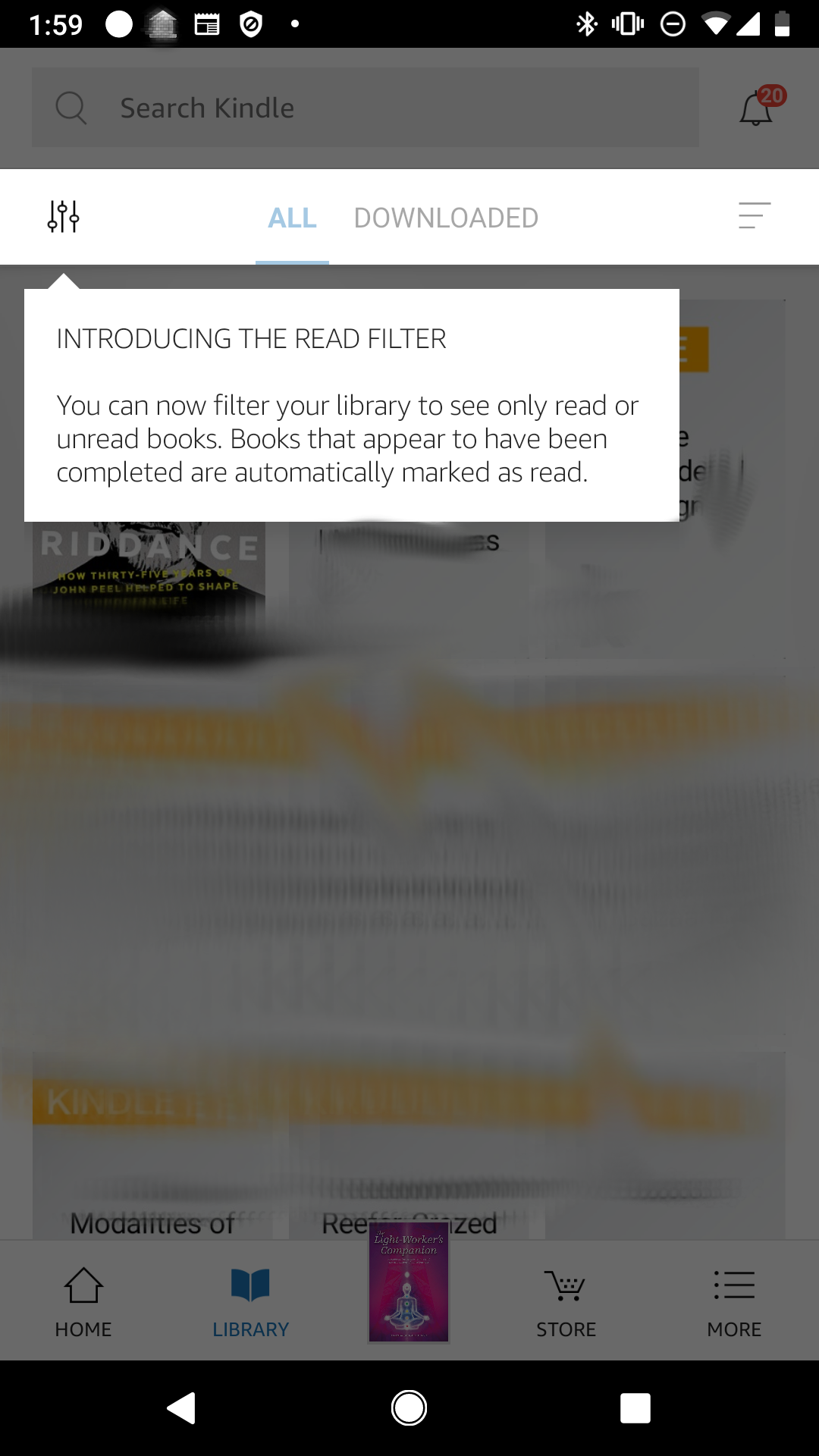
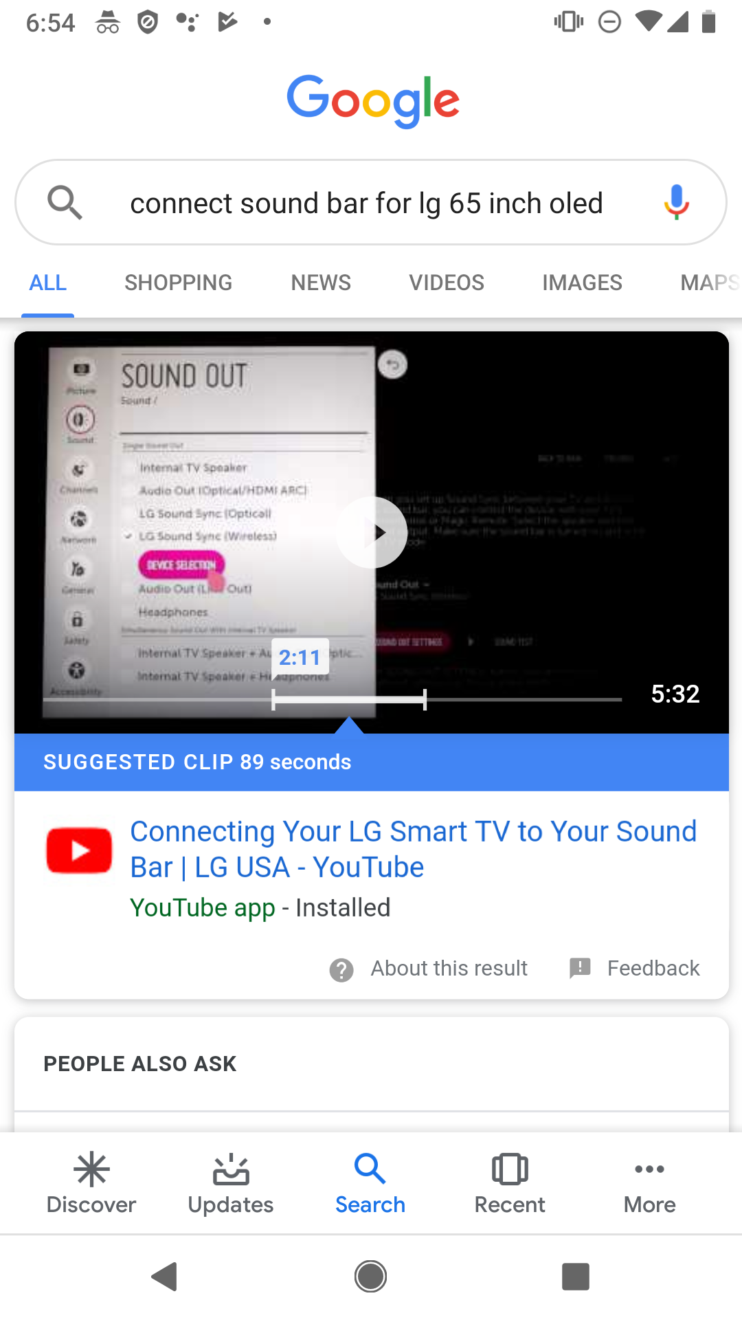
    Kindle and Youtube examples

    To round out the post, here are two similar examples from big companies. Amazon Kindle and Youtube have massive teams and their ability to roll out these simple but effective tips would cost them millions per year in engineers, product managers, QA, analytics staff.

    With Contextual as an Engagement Layer platform, Apps with much smaller teams can design feature announcements, target, deploy and measure uplift at a fraction of the price. 


  • How Google Home educates on a new user interface

    Our house is one of those connected places and we chose Google Home as the backbone. Around the house are lightbulbs that turn-on and off with voice commands.

    We also have several audio and video Chromecasts that do things like play the current episode of “the innocents” on voice command. All this is done via 4 Google Home minis placed in rooms.

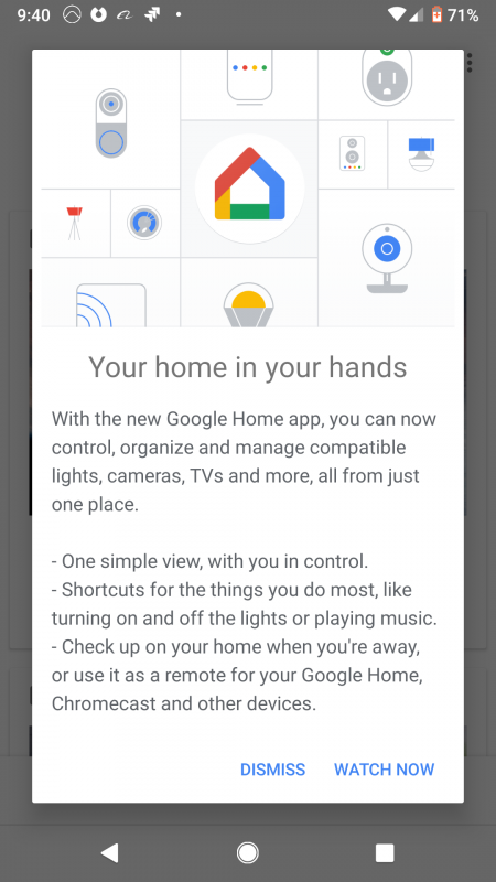
    I rarely go into the Google Home app, but I was setting up a new light-bulb and the App had updates. The Product Managers at Google obviously wanted to tell me more about the changed – we call this “Feature Onboarding” – here is what it looked like.

    Google-home-popup

    The cool thing about this is that they’ve targeted me on first use of the upgrade and told me about the interface.

    The top image is attractive and contains common items for lightbulbs, switches, lamps that you hookup in the App.

    The wording is a bit dense for my liking (users are usually in a rush to get to the features) but it hits the major UI and feature points.

    The call-to-action is simple, either “DISMISS” or “WATCH NOW” – it was a little confusing to me what “WATCH NOW” meant, often Apps use “LEARN MORE…” but I guess it sets expectation that it would be an easy video to consume.

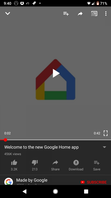
    So I clicked and here is what I got.

    Google-home-youtube-video

    Video is a great way to educate users as its a “show me, don’t tell me” solution. You can see here that Google have set the video to 42 seconds, so they want to hit the big points and not waste your time. I think of this as getting the message across and then getting out of the way.

    Google have big teams that can do these popups and target them at the right users at the right time.

    This is also simple to do with platforms like Contextual and your App can do things from simple tips, to embedding videos – then measure the uplift with analytics.

  • How Facebook educates users about their new “upvote” feature with popups

    Facebook is trialling a new feature to counteract Fake News**, where you can “up” or “down vote” users comments, the idea being to support better conversations within Facebook community.

    I had noticed the new feature a few days ago but hadn’t really thought much of it. It wasn’t until I was surfing Facebook last night that the pop up below came up on my screen.

    Now to be honest, I had no idea what the up and down arrows were until Facebook kindly informed me through a simple yet informative pop up.


    It got me thinking that if one of the biggest companies in the world uses pop up tips to introduce new features then tips must really be effective!

    This is a perfect case of what the leaders are doing today, trickles down through the hip startups (like Pipedrive, Netflix, Canva) and later becomes commonplace a few years later.

    This is where Contextual comes in, we make it easier for companies :

    • That don’t have the mega budgets of companies like Facebook
    • That are time and resource poor
    • To be able to create tips just like the facebook example in minutes..
    • While  also allowing you to track how much of an impact the “Pop up Tip” had

    Let’s look at three points why this “InApp Popup” was successful at educating me:

    1. Timing: I had enough time to notice the feature and think about it (not that I really knew what the arrows did), before Facebook explained to me what it was and how to use it.
    2. Simplicity of the design: Facebook has used simple colours that match the colour scheme of the app, it only took me 30 seconds to read it and it was simple to understand.
    3. Placement: of the pop up was strategically placed so that it didn’t block the whole screen and the user can clearly see the new feature behind the pop up.

    This is all possible within the Contextual Dashboard where you can create helpful tips for your mobile app users without any code.

    In Contextual you can also set triggers or the target for “Pop up Tips”  just like this facebook example, you can see this in the video where we target users that “have not voted”.

    Here is a quick demo of how you could create a similar pop up using Contextual.

    https://vimeo.com/269127310

    ** To read more about the up/down vote feature, check out this Slate article.