Our house is one of those connected places and we chose Google Home as the backbone. Around the house are lightbulbs that turn-on and off with voice commands.
We also have several audio and video Chromecasts that do things like play the current episode of “the innocents” on voice command. All this is done via 4 Google Home minis placed in rooms.
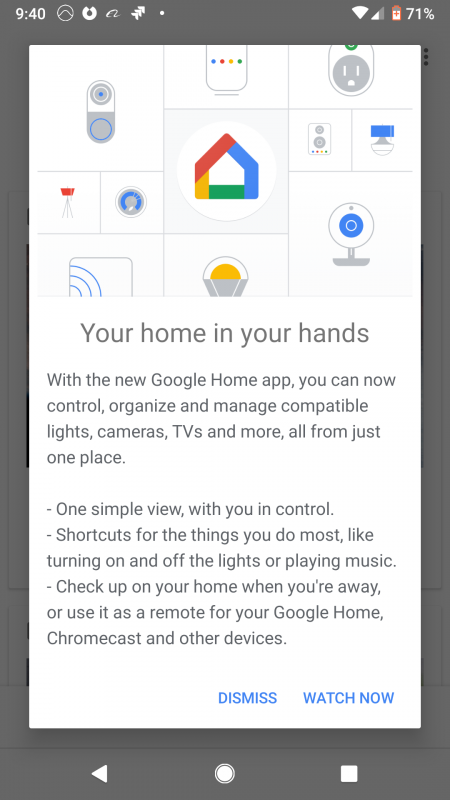
I rarely go into the Google Home app, but I was setting up a new light-bulb and the App had updates. The Product Managers at Google obviously wanted to tell me more about the changed – we call this “Feature Onboarding” – here is what it looked like.

The cool thing about this is that they’ve targeted me on first use of the upgrade and told me about the interface.
The top image is attractive and contains common items for lightbulbs, switches, lamps that you hookup in the App.
The wording is a bit dense for my liking (users are usually in a rush to get to the features) but it hits the major UI and feature points.
The call-to-action is simple, either “DISMISS” or “WATCH NOW” – it was a little confusing to me what “WATCH NOW” meant, often Apps use “LEARN MORE…” but I guess it sets expectation that it would be an easy video to consume.
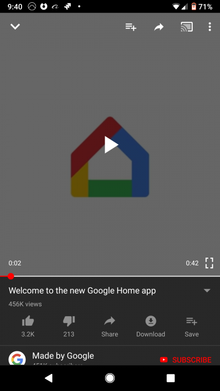
So I clicked and here is what I got.

Video is a great way to educate users as its a “show me, don’t tell me” solution. You can see here that Google have set the video to 42 seconds, so they want to hit the big points and not waste your time. I think of this as getting the message across and then getting out of the way.
Google have big teams that can do these popups and target them at the right users at the right time.
This is also simple to do with platforms like Contextual and your App can do things from simple tips, to embedding videos – then measure the uplift with analytics.


