Category: Feature Onboarding

  • iPad, Tablets coming or going in workplace Apps?

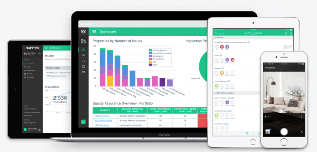
    iPad and Tablet apps are going strong in Retail POS, Retail Shop Assistants, Field Service Applications, Healthcare and design niches.

    There are many great examples doing well, just to name a few:

    Retail https://tulip.com/
    https://myagi.com/
    Field/Workforce https://happy.co/ (Inspections)
    https://www.handshake.com/ (Sales Orders)
    https://safetyculture.com/ (Safety/Quality Audits)
    https://www.deputy.com/ (Rostering and Tasks)
    Health vitalpac (now systemc) (Clinical Patient Care)
    POS many, many including
    http://kounta.com/
    http://vend.com/

    One compelling reason for success is once you put an app on a customer device you get lockin. Its psychologically more compelling than a mere web SaaS App.
    SOE vs BYOD

    Tablet Apps are being deployed because of the benefits of:

    1. the aforementioned “lockin”
    2. Better UI and input models
    3. UI speed
    4. Offline capabilities
    5. Shared viewing experience with the customer

    Problem is….this has practical BYOD vs SOE challenges:

    1. This requires a hardware investment and a commitment to administration of company property (SOE).
    2. Employees would prefer to just carry one device…their own device (BYOD).
    3. Practically, for many other use-cases, if it won’t fit in your pocket, then it won’t be used.

    The result is: most of these Apps have to support both Portrait Phones and Landscape tablets.

    Fat Apps and Feature Onboarding

    Tablet Apps have a form-factor that allows them the “feature richness” of Desktop Web Apps.

    More features are possible on the form-factor but don’t really work on the phone – things get cramped.  Luckily responsive design methods, tools are widespread for developers – particularly for Native Apps but also for React Native.

    When an App is in Tablet Landscape mode, you can show more features and let the user know they are available. This is a good reason to to do “Progressive Onboarding” to introduce feature when a user is ready.

    Enterprise Apps

    One of the largest under-reported growth areas in Apps is the enterprise “intranet”. This ancient term was popular in the ’90s and early 2000s because companies were rolling out more solutions around their own business processes that were accessed via browser rather than proprietary Windows Apps or Terminal sessions.

    History now repeats and splits into two types:

    • Internal Apps (written by or for the company)
    • SaaS Apps (written by a vendor that solves a broad business application – e.g Salesforce, Jira, Workday etc)

    Both classes also split again into three types:

    • Web Only
    • Web and Mobile (like the examples at the top)
    • Mobile Only

    A whole class of development agencies have emerged that primarily monetize the “Mobile Only” model – as consumer Mobile Apps proved notoriously difficult to make money on and retain users, developers earned their place providing business solutions for enterprise Apps.

    Existing web development shops have mostly tried to deliver mobile-web and hybrid apps, that is getting a lot better as React Native gives a better Javascript coded experience than Cordovea/Phonegap.

    My expectation is that we will see a lot more Tablet enabled applications with React Native under the hood, Contextual is well-progressed to support that. I’m not sure what is happening with Xamarin, its still active but a lot of developers must be thinking that React Native is going to look better on their CV and companies will see more support options from the market. Visual Studio (Microsoft’s development environment/IDE) has some support for React Native and a community supplied bundle here.

    Product Managers should keep tabs on React Native support and do some small test projects to see where the gaps are. One of the gaps is broad SDK support for tools already being used in their native deployments.

    Phablet vs Tablet

    However, in 2017, developers and customers tell me they saw a drop as Phone screens (iPhone 8+, iPhone X, Nexus 6 ‘phablet’ etc) got larger and higher resolution.

    Consumers love tablets but they already have one at home where they use it for lean-back use-cases like Video and News.

    Tablet sales dropped 8.5% in the first quarter of 2017 compared to last year. Apple’s iPad dropped 13.5% in sales compared to 2016.

    Because of the SOE vs BYOD tension in the workplace, many employers don’t have a compelling need to hand out iPads in the workplace because the Phablets are doing a pretty-good-job for most intranet applications and tablet form-factor retreats to the use-cases showcased in the first paragraph.

    I’ve also heard Microsoft Surface increasing in popularity in the enterprise as many companies undergo the generational change from Windows desktops/laptops to the Surface hybrid experience.

    So I expect that:

    1. iPads and  tablets in the workplace will be niche applications and
    2. ReactNative will be a dominant emerging enterprise development platform. This becomes even more true if the Windows trend gets traction – and why wouldn’t it?

    The elephant in the room is that Apple is merging iOS and OS/X and the iPad Mini didn’t get refreshed in 2017. You’d have to expect that Apple wants to counter Microsoft Surface with something unified for all enterprise Applications. Something like an iPad Pro with detachable keyboard.

  • Open Source Onboarding Carousel

    Using Open Source components is a great way to get beautiful code elements into your App. We extended the Contextual platform to allow the popular “Paper Onboarding” carousel – it’s attractive and had a decent amount of flexibility.

    The cool thing about Paper Onboarding is that it’s material design slider. Here is how Ramotion (its authors) describe it:

    Paper Onboarding is a simple and easy to use onboarding slider for your app. bottom.

    By allowing this to be added in our point-and-click dashboard where you can preview on the web and on your devices.

    We made one initial thing even easier:

    You just need to provide content for each slider page – a main icon, text, and small round icon for the bottom

    We made this so you didn’t need any extra developer code.

    Ramotion's Paper Onboarding Example

    We had some additional goals that we thought would be super awesome for our customers

    1. Be able to use images that are hosted remotely
    2. Allow changes to the carousel without needing to do an Appstore release.
    3. Target different carousels at different users
    4. Have carousels in different parts of an App (not just the home screen).

    Here is how it looks in the Contextual Dashboard.


    On Android, its automatically built in – nice.

    On iOS, to add the open source Paper Onboarding to Contextual and get all the above benefits you just need to add:

    platform :ios, '8.0'
    use_frameworks!
    pod "pointzi"
    pod "paper-onboarding-pointzi"
    end

    So its, super-easy to get started and then have all the dynamic benefits.

    To learn more about the open-source checkout the awesome work from the folks at Ramotion on Github.

    https://github.com/Ramotion/paper-onboarding

    and

    https://github.com/Ramotion/paper-onboarding-android

  • How a huge email app uses Coachmarks, Tips & Cards

    Inbox is slowly replacing Gmail and it takes a little getting used to because it introduces a few new concepts that are powerful but not familiar. This is a classic case of being able to guide people to understand a concept and deepen their engagement.

    If they can understand a feature, they will get more out of it, and not switch to another App!

    Coachmarks

    Targeted at first time usage of a feature, these are very intrusive but allow a lot of screen-realestate to explain the feature and point to the specific location on the screen. Here we see Bundles, Links, Pins and Snooze are all explained. The timing of the prompts were:

    1. Once I developed basic competence with the Inbox app (reading emails, sending etc)
    2. Not in one session, it was across several sessions that I didn’t keep a track of, but it appears they group them tightly so a user learns contiguously.


    Cards

    Cards are a popular metaphor in list/feed based applications because the user is interactive with cards all the time. Some examples are:
    iOS and Android Notifications: Users are familiar with pull-down, swipe away lists of cards.
    Twitter: In Twitter a tweet is effectively a “card” – so Twitter introduced advertising as a card and appears seamlessly inline with other tweets.
    Google Now/Home: Both of these flagship apps on mobile, use rich cards (titles, body, icons, images). Its a very flexible pattern that can be populated in a number of ways without getting locked into a fixed format. Just like Twitter, these Apps can “drop in” promotional or educational content without disrupting the flow.
    In Contextual we achieve cards with a positioned card-shaped popup/modal but we will probably explore how we can work with apps in their own list stream – anyone willing to use this “in-stream” pattern just let me know!

    Conclusion

    Back in 2012, Matt Cutts of Google shared how they ran 20,000 experiments per year on just one of their products. You can imagine that Google does much more than this is 2017 and its easy to conclude that if some UI metaphor exists and persists, this is because the data it “telling them” to persist.
    Google have persisted with above type of coachmark on several products: Google Docs/Drive, Maps and now Inbox – so its clear that this method is working. We can expect to see this pattern used a lot more in the future and we will come to treat it as second nature.

  • The Design of Everyday Onboarding

    I never know where to post these days and FOMO tells me I should be doing more on Medium, so over there is a post called The Design of Everyday Onboarding

    In the post I discuss a “down the rabbit hole” experience from this morning where I had nested tips from LinkedIn and Google within a few minutes.

  • Product Managers beware App Feature Complexity

    When it comes to adding features to your App, Mobile App Product Managers would be millionaires if they got paid each time as opinionated colleague or even the developers said:

    “how hard would it be…”

    and

    “can’t you just…”

    I was reading a post from Kris Gale, VP Engineering at Yammer, on the First Round Capital blog about “The One Cost Engineers and Product Managers Don’t Consider”. Kris was saying that Product Managers are the main culprit, but systemically the expectations are much broader, especially in small to medium size/maturity companies. I’ve been in teams of developers where the (awesome) “Product Manager” got the nickname of “Dr No” (punning on the James Bond villain) for fighting against “one more feature”.

    The problem for each new feature is the cumulative complexity of:

    1. Initial development and QA of the feature
    2. Decisions on targeting and visibility of the feature
    3. User education about the feature
    4. Measurement of uptake/engagement of the feature
    5. Fixing bugs and UI improvements for the feature
    6. Release management and announcing of bug fixes
    7. Skills transfer on staff turnover of developer and QA staff wrt this feature
    8. And if you are in an Enterprise:
      • Internal signoff and communication
      • Additional reporting, review for compliance, security
      • Lots of meetings!
      • Education and impact to customer support center
      • Probably greater staff turnover
    Ancient Product Manager grappling with the hydra of feature complexity
    Ancient Product Manager grappling with the hydra of feature complexity

    Contextual gives 3 great benefits to removing complexity:

    1. Completely REMOVE the complexity of adding user education to your App. By creating a layer of user communication without code, the Product Managers get autonomy to iterate and experiment without adding to complexity.
    2. Reduce the impact of #1, #2, #3, #4, #6 of actually implementing and managing new features.
    3. For Enterprises, radically reduce the meetings, reporting, signoff for getting user education done.

    So “Contextual” attacks the Progressive Onboarding challenge, not just for new features but deepening engagement for specific existing features that a segment of users have not engaged with.

    Here is a great quote from the FR post:

    Among the most dangerously unconsidered costs is what I’ve been calling complexity cost. Complexity cost is the debt you accrue by complicating features or technology in order to solve problems. An application that does twenty things is more difficult to refactor than an application that does one thing, so changes to its code will take longer. Sometimes complexity is a necessary cost, but only organizations that fully internalize the concept can hope to prevent runaway spending in this area.

    We believe the FR post makes important points from a development manager perspective but discusses one part of the problem: refactoring and engineering debt**. We’ve shown there are other related complexity resource drains that should be costed and solutions found.

    You can find the FR article here.

    ** there is a some UI comments that really can be summarized that Occam’s Razor should be applied go UI decisions.