Category: Modals

  • Announcing the New Contextual Web Creator

    In the upcoming weeks we are releasing an update to our Chrome Extension for web apps.

    This is a great addition and actually shoots past the current mobile guide creation interface which will adopt some of the elements here. Specifically:

    • New design for a user friendly experience & navigation
    • New targeting tool for tip placement & repositioning
    • New guide settings interface with improved selection criteria process for a more streamlined experience
    • Tight point-and-click selection of targets and launchers with css/class/DOM overrides.
    • Search & filter guides easier with the new guide home screen
    • Edit guide name easily

    There are so many great features here, we’ve split it into two videos. If you’ve got any questions, hit us up on support@contextu.al or our on-site chat!

    https://vimeo.com/566908938/641fa71371https://vimeo.com/568797474/a90ded76ab

  • Reminding users of a screen’s purpose

    You know that whilst carousels are cute, that most users just swipe through them ignoring the message. So its interesting to see how Twitch provide an inApp popup to remind the user in a more contextual way.

    If you are NOT a gamer and if you don’t know Twitch, then you are really missing out on the future of entertainment. Its definitely worth downloading and trying to figure out what the hell is going on!

    Take a look at these neat first-time popups.


    These are cool, they:

    • show in the right place right time
    • stand out with a cool design
    • easily get out of the way once you’ve glanced at the message.
    • dont block the context of the screen

    This seems much more useful and contextual than the following two screenshots that are shown in the start-time carousel.

    These carousel pages are cute but:

    1. they don’t really show the page what they really look like
    2. they stand in front of the register/login page which is a huge cognitive barrier the user has to get through. Signing in on mobile sucks and the user will have forgotten what the carousel said once they figure out user name, lookup or think back to the last time they used their unique (hehe) password.

    So its really hard to know why they showed these screens at all on the carousel, it just seems wasteful. The habit and expectation of carousels is very ingrained until Product Managers realize there is a cleaner, more contextual way to onboard users.

  • 10 Common App Prompts That Convert

    Mobile App user retention rate is <10%. That is largely attributable to not “Activating” user engagement quickly and at relevant times.

    If users don’t find utility and value from the product quickly, they rarely stick around. Figures for user churn are over 70% within first 3 days.

    To give your users the best chance of extracting utility, there are a few common use cases we see in successful Apps. Its no coincidence these use-cases are recurring – take note!

    In this post we cover 10 common app prompts that really make a difference to retention, activation and growth.

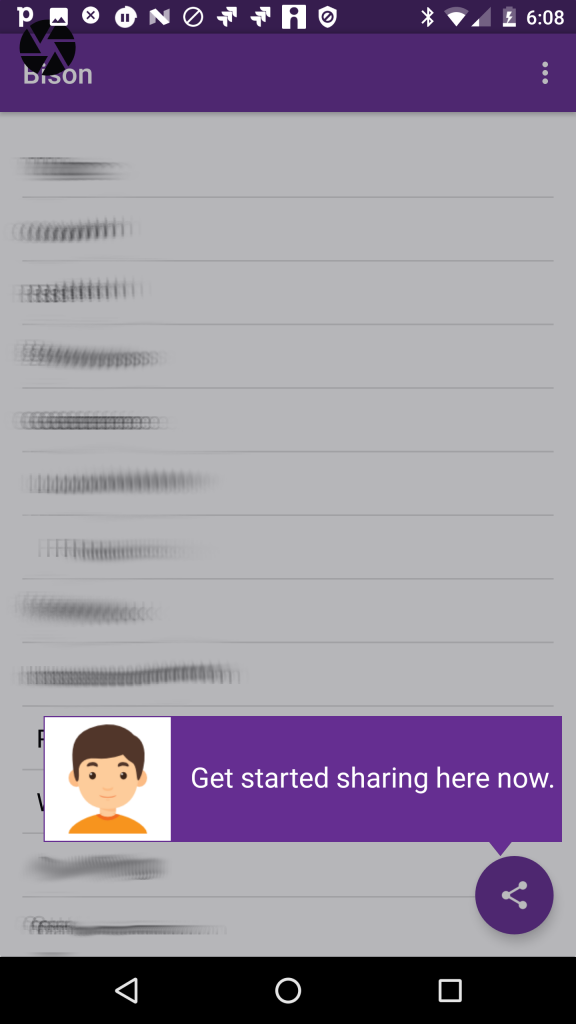
    1. The ‘Get Started’ Tip

    User activation is about getting the user to an “a-ha” moment as quickly as possible.

    So one of the simplest and most obvious things to do is place a tip pointing at the one action to deliver “instant-gratification” returns.

    e.g In a real-estate App it might be the first filtered search. In a social App it’s often sharing your first picture.

    In many applications, this is called “Empty State” – the single-player mode where the App is absolutely empty until the user gets started. 

    common app prompts - get started tip

    Todo-lists, CRMs, Mailboxes all have empty states. In this situation, you will probably design into the application but you may still want to iterate different A/B tests on messaging.

    You design a product, you’ve been staring at it for months and you’ve developed a habit that would make Pavlov’s dogs drool. You click happily and assume that your users will automagically guess how to use it.

    Not so.  The value this simple understated tip is triggering the user’s first action. The tip is never seen again because the user now has started the habit!

    2. Feature/Intro Tour

    There are different names:

    tours, flows, walkthroughs

    But they all mean the same thing. Building on the simple tip, you introduce the user to a set of key features and explain how to initiate those actions.

    In earlier posts we’ve discussed how targeted tips in a tour is superior to using a carousel that users will forget. This little animation shows how you can advance a user during early App experiences.

    common app prompts - guided tour

    3. Targeted Nudge for unused Feature

    Its common for popular apps to have a loyal user base but some of the users are missing key utility available in the application.

    With Contextual, you can target these users, to start using the feature. You can use an attractive prompt. That may lead to the screen in the App or kickoff a walk-through/tour.

    common app prompts - tour

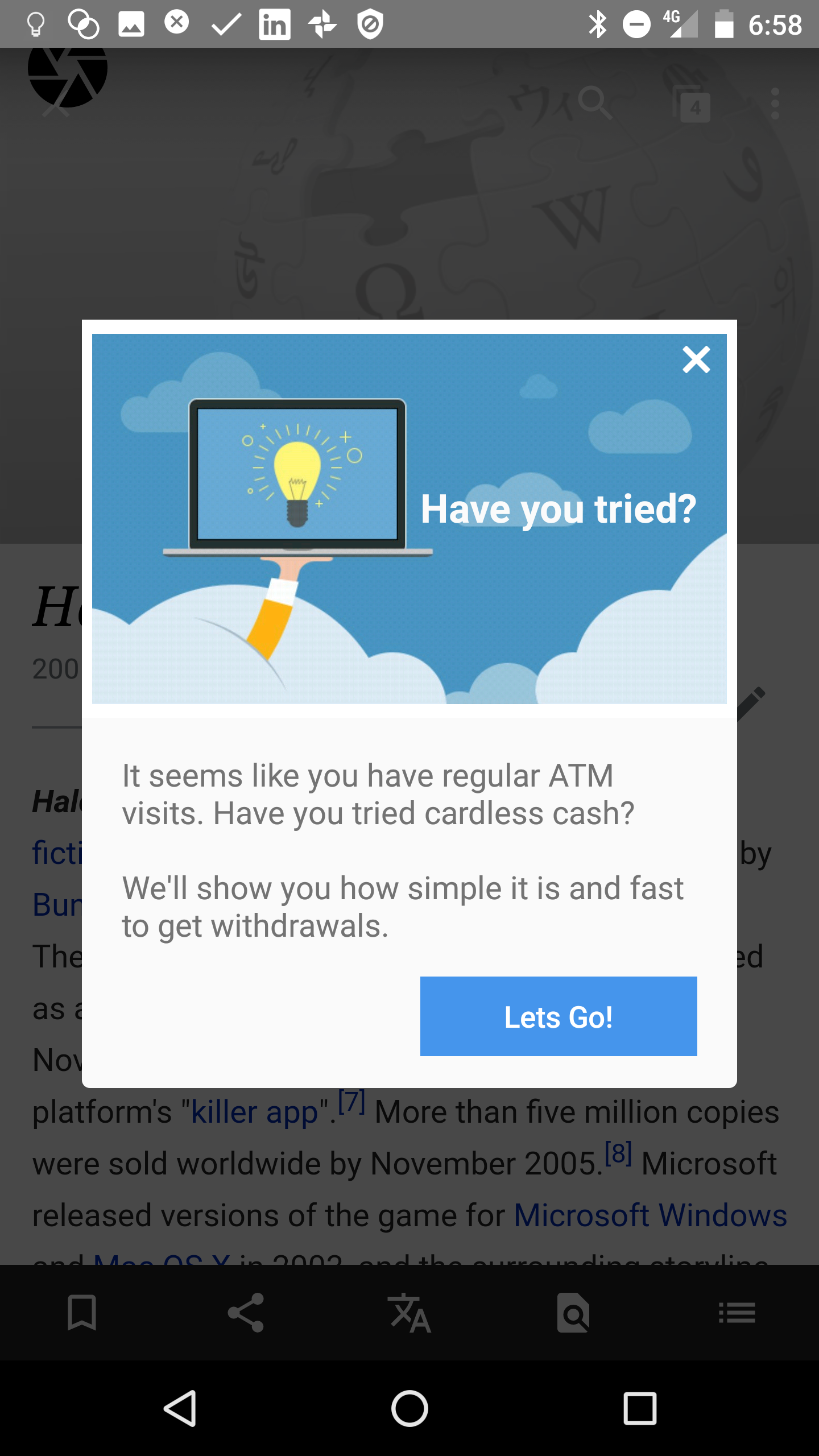
    4. New Feature Announcement

    Here is 2 cool simple examples:

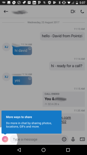
    1. Skype takes a smart approach to user education by telling me I can have more fun now because they support  “sharing photos”, “locations”, “GIFs” tasks. Read more here.
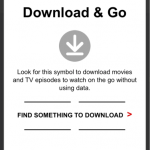
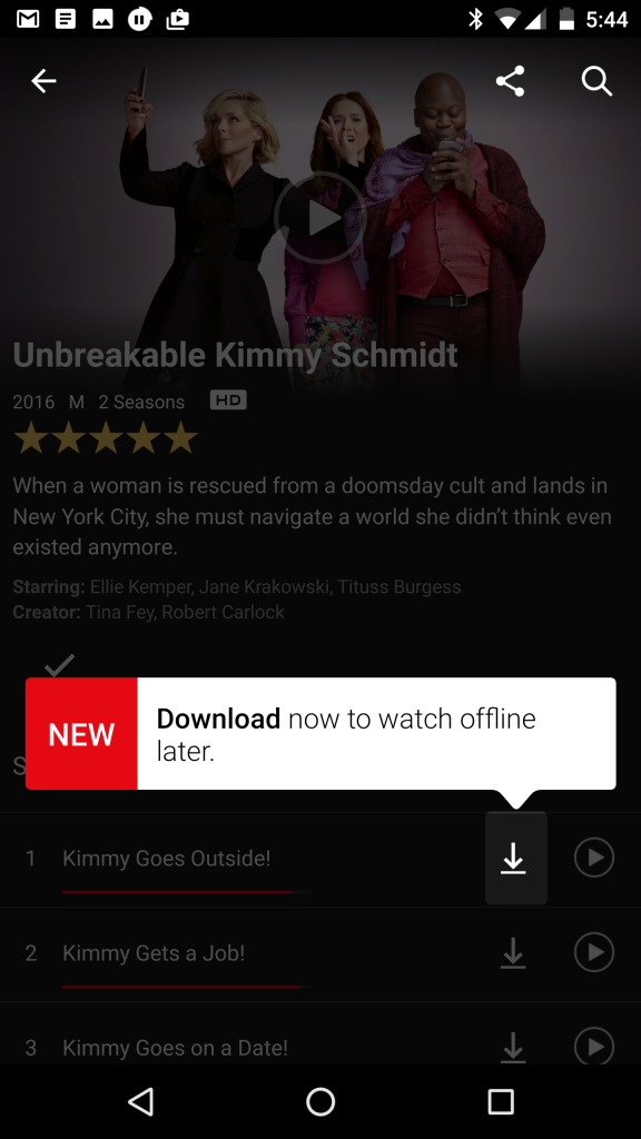
    2. Netflix’s 2-prong approach to prompt users to start using off-line video playing is a great re-inforcing approach. We’ve seen Slack do that too. Learn more…

    SkypeInCallOptions
    LD_1 (2)
    common app prompts - new feature

    5. Launchers

    As we mentioned in the last post, these valuable tip bubble app prompts can help clarify the purpose of a field or action without clogging up the screen.

    The user can simply tap/click on them, help the user understand and then get out of the way.

    6. Invite a friend

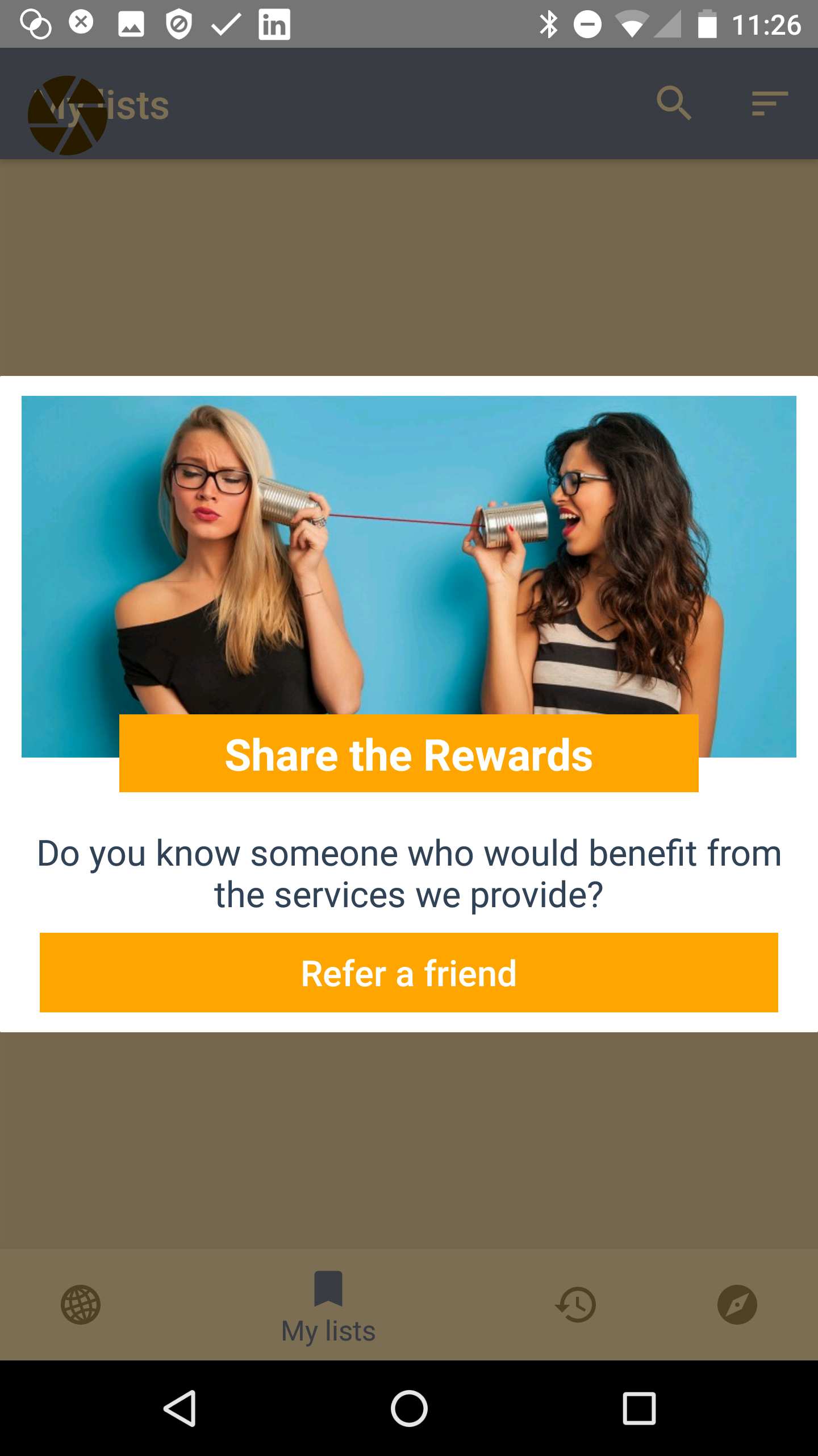
    Increase your virality or k-factor with app prompts to get a team mate or friend on board the app as well. Sometimes this sharing might have a referral incentive – we’ve written before why Uber and AirBnB use shared rewards as the most effective conversion. If only the referrer gets the reward, the recipient is suspicious of their motives. Remember that Uber gives new users free credits anyway via advertising or postcard handouts, so giving them a referral credit is easily within their cost-of-acquisition calculations.

    7. App updates and Service Alerts

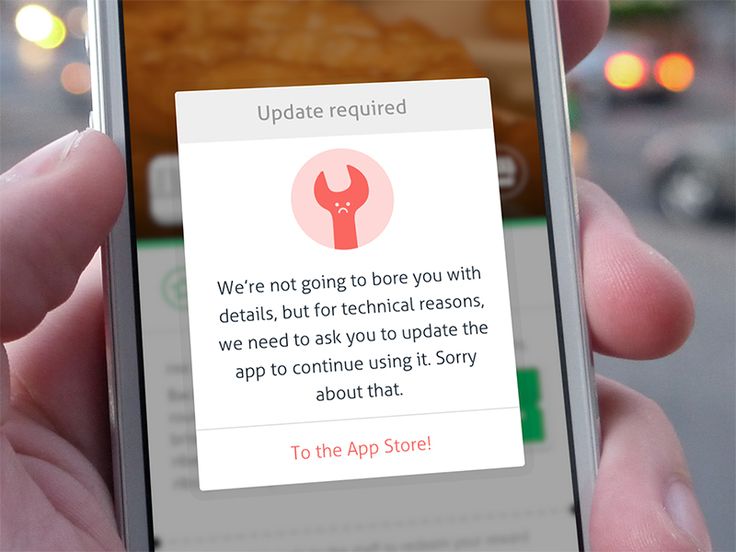
    Either by push or inApp, content, you may want to tell users something thats happening immediately that may affect them.

    I like this one because its human and fun (who wouldn’t love a sad wrench!) and its a clear CTA. Notice also its a nuclear option, there is no dismiss on the modal so the user performs the CTA or presumably backgrounds the App and won’t be a live user until this step is completed.

    8. Welcome Popup or Carousel

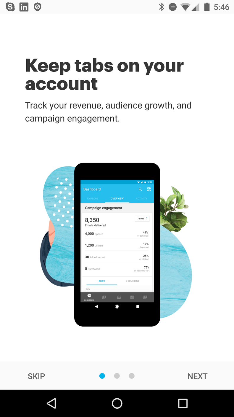
    We’ve talked a lot about carousels before and our mixed feelings about them. If this is how you define “on-boarding” then you are NOT thinking about the full-user journey. BUT a welcome is good for orienting and informing the purpose of your App in terms of the user’s needs.


    9. Upsells, Offers & Rewards

    Converting Free to Paid or Upselling a plan is a key part of the the App economy. Allowing users to progressively unlock new capabilities is an action worth “testing”.

    When you test you are allowing the data to tell you what converts most effectively.

    A/B testing different prompts and messaging with a tool like Contextual can be done before hard-coding  into the application. This “test-and-learn approach is the iteration speed Prodict Managers need to achieve growth.

    10. Action Needed

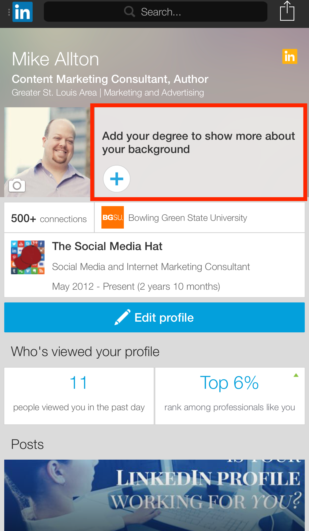
    Different to the “Empty State” requirements of first-time on-boarding is driving more “sunk cost bias” into the user’s experience of the application. This sounds evil but is usually to reap returns for the users. LinkedIn is famous for driving users to complete their profile, they bread-crumbed ways that a user could enhance their profile and thus sinking more investment into the App and what it would return to the user.

    The red-box (I added for emphasis) shows how LI devotes a large amount of screen real-estate embedded to guilt users to complete this task.

  • Are you listening to user intent?

    Are you trying to break into the music streaming sector? It’s tough to get in with huge investment already wrapped up in it and some massive players dominating the scene.. It’s probably just as competitive as your sector, right? ????

    We’re going to look at one player from the mobile music streaming sector. Meet “Deezer.”

    You may not have heard of them against Spotify, Pandora and the Apple/Google services, but Deezer has been around for awhile now on Desktop, Mobile and TV devices (I have it on a Western Digital HDMI box). Their App is pretty nice and its approach to curated lists is solid.

    Working on Contextual makes us more aware of when Apps do “feature onboarding” in both good and bad ways. One member of our team is an avid Deezer user and pays for the Premium service. Despite being in the “listening” business, the way Deezer’s user experience is organized shows us that it’s not always easy to listen to user feedback.

    What does poor listening look like?

    Deezer prompts on Android for the user to join the family plan like this:


    Fair enough! These reasons look good and we respect that the family plan is the latest “Hot Hot Hot!!!” upsell technique that all these services use. But…this person doesn’t need the family plan and touches “cancel.” That’s okay, you win some, you lose some!

    Except…everytime this user opens the App he gets the same prompt! This has been going on for weeks and makes Deezer look rather clueless about the negative user experience:

    – It seems hard-coded based on the user’s plan
    – It seems to ignore his intent – what were they thinking!???
    – It’s insensitive to his response
    – It’s alienating a faithful paying customer

    So many Apps use their own homebrewed tips and modals, which is cool but they don’t think to tie the UX to analytics or App behavior.

    Why does this happen??

    In a competitive landscape like mobile music streaming, does Deezer really want to alienate a paying customer? Do you? Here is a possible scenario you’ve experienced at your company that explains why the Deezer example can easily happen to even the best of Apps:

    Marketing has been given the objective to drive sales to this new business model, and the Product and Development teams are keen to support this and get this new promotion or feature out FAST and onto people’s phones. The problem is their capability to develop a homebrewed solution is limited because it doesn’t have the underlying maturity to do this in a way that listens user intent. Instead, they end up irritating their brand new users!

    4 ways Deezer could improve

    So this is what we’d recommend as a solution to this problem:

    1. Get smart with audiences
    Obviously, the Deezer user has moved into a new audience segment – from: “family plan prospect,”
    to: “family plan rejected in January 2017 (or X days ago) more than 2 times.”

    All tips, modals and “feature onboarding” should be targeted at specific audiences. Using a scatter-shot approach and continually offering a feature or offer that users do not want is the in-App equivalent of spam.

    2. Triggers
    When a person opens your App, they have a goal, such as Play a song, Book a Taxi, Buy a product.

    The whole reason you are lucky enough to have your App on this person’s phone is because you have a utility they want.

    So…why the hell would you prompt them when they open the App? Deezer goes one step beyond this bad scenario and prompts on re-foregrounding 🙁

    The best time to prompt a user is:

    Contextually – in a way that’s related to actions they’ve just taken, and right AFTER a happy experience. Let the user have their dopamine shot from your awesome App utility, THEN ask them to help you back. Especially when you want to ask for App ratings as well!

    3. Constructive Nagging (interpreting intent) Mobile users are busy so asking once is not enough. We get that… everyone gets that.

    Make sure to track the number of times the users dismisses your prompt. Try a different channel like push notifications or email. With a platform like Contextual, the open REST/JSON API means those other “out-of-band” events can be part of your audience selection.

    But remember to listen and get out of the way!
    Once the user has dismissed the modal and moved to a new customer audience, this means they have moved on. You should too! Platforms should record the analytics of each user’s interaction and remove the modal from the user experience.

    4. Implement  “Smart Listening” with intelligence and action

    Rather than build a homebrewed solution that has no intelligence and cannot adapt to user responses, Apps can now implement smart onboarding of featues. Contextual simplifies the complexity of:

    – Onboarding and Feature Onboarding Metrics (analytics)

    – Intent interpretation

    – Triggers

    – Automation

    – Measurement

    This is a much smarter approach to feature promotion than rushing code into your latest version just to get the job done. It will take awhile for these platforms to mature to do all the things you might want to hard-code. The benefit to you (and your users) is the agility to provide beautiful tips, tours and modals without the complexity and delay in getting them in front of the user.