Category: popup

  • App Leader’s Tips and Popups

    App Leader’s Tips and Popups

    How is it that some apps nail user engagement? What looks so easy is the result of a lot of product measurement and fine tuning.

    The reason why mobile tips, tooltips and guides work is because designers often hide features away to avoid clutter. What you can show on a sidebar (or top menu) in a Desktop App is often not best to show on mobile due to limited screen real-estate or differing layout.

    Successful Apps always work by optimizing feature uptake. Successful Apps eventually add more features that need explanation – this post we have a look at what tips and guides some big players have been doing in 2021. (all of these screencaps are from just the last week or two).

    Twitter

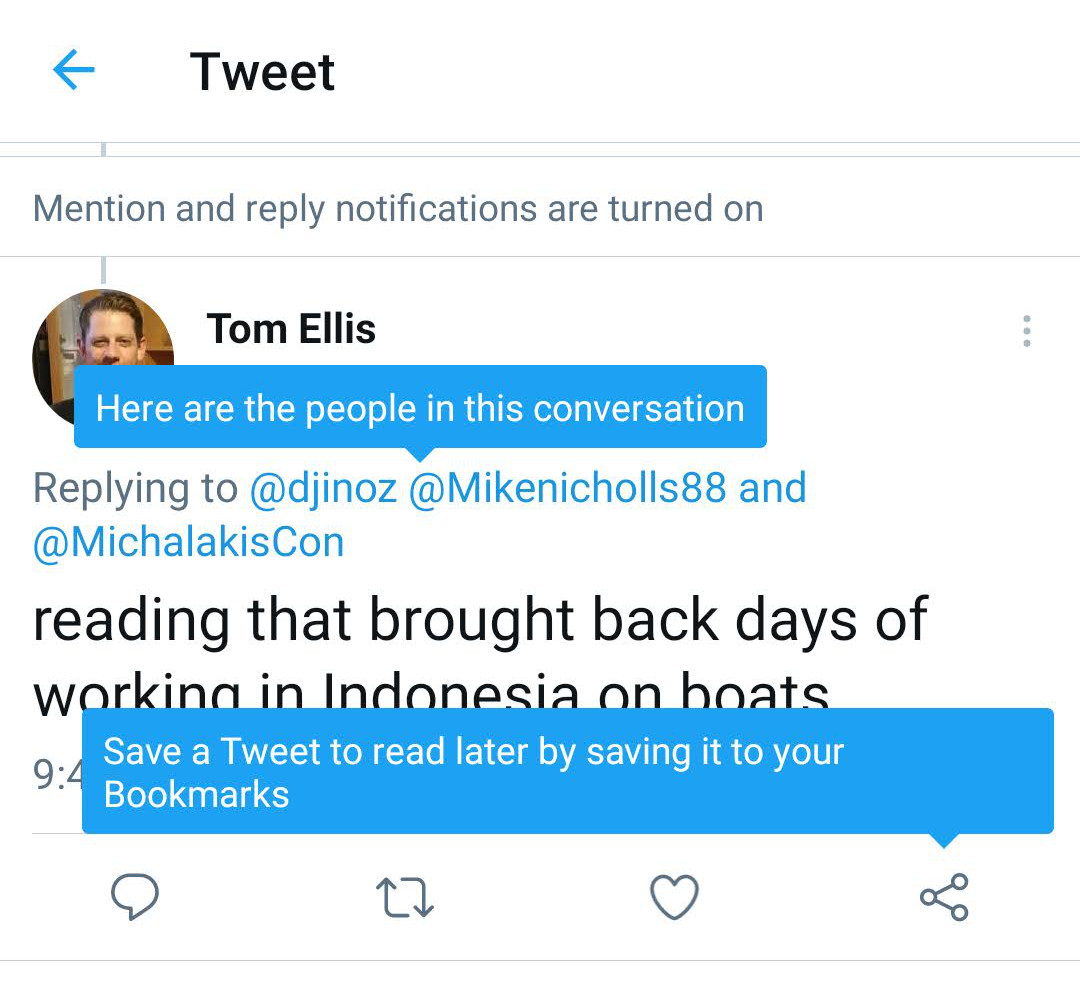
    You could forgive the twitter team for sitting back, sipping on a Sightglass latte. Or perhaps you imagine them freaking out about Clubhouse and rushing to launch Twitter Spaces. But some part of the team are quietly optimizing user’s understanding of how the app works.

    As you can see here, they are testing 2 tips at once. I didn’t think about the bookmark idea before, so kudos to them.

    Twitter-Tip-Example

    Google Calendar

    A nice new feature would not be known by users unless accompanied by a Feature Announcement – the call-to-action “Go to settings” is a perfect example of giving the user the option to uptake that feature. You can do this easily with Contextual and you can measure the uptake.
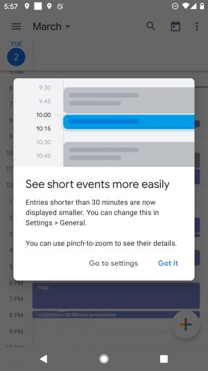
    Gcal-Popup-Example

    eBay

    eBay benefit if they can encourage us to save our searches. You know you will get inApp reminders, price-drops, emails all based on your stated-interest.

    A latte sipping product manager might think that the “❤️ Save this search” is prominent enough but kudos to this product manager for leaving nothing to chance.
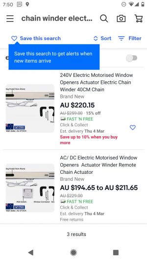
    eBay-Tip-Example

    Calendly

    Calendly may not be as big as the other Goliath’s but you can see Feature Announcements are a great way to deepen the usage of the product. Regardless of whether its mobile apps or mobile web, tips can help users comprehend all the capabilities of your App. As I mentioned in the starting paragraphs: in mobile much is hidden and that is exactly why tips, tours, guides are even more powerful – targeted to right-user-right-time.
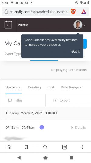
    Calendly-Tip-Example

  • Google continuous onboarding in 2019

    In earlier posts we’ve looked at what Google has done to introduce new features and deepen engagement – we call this continuous onboarding. This post is an update that shows the following key characteristics:

    • Google consistently use tips, popups and feature tours.
    • Tips are ALWAYS simple.
    • Tips are ALWAYS contextual
    • Popups and Tips seem to target the user who hasn’t yet used a specific product feature.

    Lets dive in…..

    Advanced Gmail Features

    Gmail is a mature product and after the closure of Google Inbox some of the top features are being imported into the new cleaner Gmail UI. 

    1. “Schedule when to send” – this simple contextual tip explains to the user in one-shot the new functionality. Easy and Done!
    2. Dynamic email – this is more complex and a pretty new feature. The “Learn more” button takes me to a deeper explanation. The “Got it” is what users expect from a popup tip to dismiss it.
    3. Google’s choice of a simple style indicates that they know that the vast majority of the population will understand these little visual elements. They don’t try to be too sexy or clever, this would just distract from the education mission. Google’s tips are consistently in this blue colour.

    The calendar tip is not exactly from Gmail but its closely coupled with the gmail UI. In this case the:

    • Again, its simple and contextual to point at the new button that I’d not previously used.
    • The blue colour is in the button but it still echoes the recognition common across their tip UI.
    • The tip has a dimmed background to standout.

    Previous
    Next

    Youtube Channel Membership

    Wow, this is an interesting new feature in Youtube!

    It looks like Youtube are taking on Patreon but I’d have never know unless this tip popped up because generally I just click “SUBSCRIBE” and don’t really notice what else is needed.

    Again, despite Youtube being fairly autonomous to Google, the style of tip, placement follows the same style elements:

    • Google tip blue.
    • Title (bold)/Description.
    • Use of “Got it”
    • No use of dismiss or “X” buttons.
    • The blue appears brighter to compete with the intense red of the SUBSCRIBE button.

    Google Docs – Word editing.

    Google wants to take Microsoft Office’s (once) safe userbase. The new feature introduction of co-existence with Office’s documents is a powerful feature that they want to promote. 

    So this popup is not shy about their message – very different to Google’s other low-key feature announcements tips – the popup is a significant announcement. Two things to note:

    1. The blue button will launch the tour below. The text explains what will happen.
    2. The “X” dismiss button is clear.
    3. The user only has 2 possible responses and Google’s analytics will know exactly how each user responded to the prompt. This is how Contextual works – allowing Product Teams to infer different conclusions and behaviours from what buttons the end-user clicks.

    Clicking the (yes, you guessed it – blue) button above leads to explain a few key features.

    NOTE: they don’t attempt to explain Google Docs. They only explain the NEW Microsoft Office integration features such as Managing Versions, what format and Conversion.


    Previous
    Next

    If the top popup was too subtle, sometimes Google also uses their bug splash coachmark to announce the new feature.

    The Best Practices

    You can guarantee that Google knows that this type of contextual education is a key step in continuous onboarding. The simple takeaways (with complex data backed reasons) are observable in these recent Tips, Tours and Popups in Gmail, Calendar, Youtube and Google Docs.

    The Google Best Practices for tips are:

    • targeted at users
    • has a predictable design and colour that won’t confuse users.
    • doesn’t have any flashy colour schemes buttons or widgets that distracts from the education mission
    • doesn’t use more buttons necessary than is needed for the job
    • buttons look like links (presumably to simplify render on a broad range of devices)
    • allow the user to engage with the tip or to easily dismiss
    • their response is captured and measured.

    There is also examples in Google Photos, Google Assistant and several other products that also use the blue contextual tip – look out for them the next time you are using their products!

  • How Facebook educates users about their new “upvote” feature with popups

    Facebook is trialling a new feature to counteract Fake News**, where you can “up” or “down vote” users comments, the idea being to support better conversations within Facebook community.

    I had noticed the new feature a few days ago but hadn’t really thought much of it. It wasn’t until I was surfing Facebook last night that the pop up below came up on my screen.

    Now to be honest, I had no idea what the up and down arrows were until Facebook kindly informed me through a simple yet informative pop up.


    It got me thinking that if one of the biggest companies in the world uses pop up tips to introduce new features then tips must really be effective!

    This is a perfect case of what the leaders are doing today, trickles down through the hip startups (like Pipedrive, Netflix, Canva) and later becomes commonplace a few years later.

    This is where Contextual comes in, we make it easier for companies :

    • That don’t have the mega budgets of companies like Facebook
    • That are time and resource poor
    • To be able to create tips just like the facebook example in minutes..
    • While  also allowing you to track how much of an impact the “Pop up Tip” had

    Let’s look at three points why this “InApp Popup” was successful at educating me:

    1. Timing: I had enough time to notice the feature and think about it (not that I really knew what the arrows did), before Facebook explained to me what it was and how to use it.
    2. Simplicity of the design: Facebook has used simple colours that match the colour scheme of the app, it only took me 30 seconds to read it and it was simple to understand.
    3. Placement: of the pop up was strategically placed so that it didn’t block the whole screen and the user can clearly see the new feature behind the pop up.

    This is all possible within the Contextual Dashboard where you can create helpful tips for your mobile app users without any code.

    In Contextual you can also set triggers or the target for “Pop up Tips”  just like this facebook example, you can see this in the video where we target users that “have not voted”.

    Here is a quick demo of how you could create a similar pop up using Contextual.

    https://vimeo.com/269127310

    ** To read more about the up/down vote feature, check out this Slate article.

  • Reminding users of a screen’s purpose

    You know that whilst carousels are cute, that most users just swipe through them ignoring the message. So its interesting to see how Twitch provide an inApp popup to remind the user in a more contextual way.

    If you are NOT a gamer and if you don’t know Twitch, then you are really missing out on the future of entertainment. Its definitely worth downloading and trying to figure out what the hell is going on!

    Take a look at these neat first-time popups.


    These are cool, they:

    • show in the right place right time
    • stand out with a cool design
    • easily get out of the way once you’ve glanced at the message.
    • dont block the context of the screen

    This seems much more useful and contextual than the following two screenshots that are shown in the start-time carousel.

    These carousel pages are cute but:

    1. they don’t really show the page what they really look like
    2. they stand in front of the register/login page which is a huge cognitive barrier the user has to get through. Signing in on mobile sucks and the user will have forgotten what the carousel said once they figure out user name, lookup or think back to the last time they used their unique (hehe) password.

    So its really hard to know why they showed these screens at all on the carousel, it just seems wasteful. The habit and expectation of carousels is very ingrained until Product Managers realize there is a cleaner, more contextual way to onboard users.