Category: Tips

  • The 4 ways Dating Apps seduce with Progressive Onboarding

    Those of you who have experienced online dating will know quality connections are not easy to find! When a ‘spark” appears there is usually a flurry of messages, one more intimate than the last, as each person progressively disclosures a little bit more about themselves. Some people know the art of progressive disclosure  so well, that they can quickly create a connection that might take months or weeks in the real world!

    If you have used a Dating Apps (even a sneak peek), you will also know that Dating Apps use their own type of progressive disclosure (aka progressive onboarding), to make sure the App becomes extremely habitual.

    So what can Dating Apps teach us about the art of seducing users??

    Progressive Onboarding Tip 1: Create a seducing first-time experience.

    When you download a Dating App like OKCupid or Bumble, the first actions are to login in with your Facebook account, upload a photo and start swiping. These Apps want to bring you to the buzz of “a match” as quickly as possible. There are no busy onboarding carousels describing the product benefits or how to use the App, they know, this all gets in the way of the first time user experience.

    Dating Apps don’t want to overwhelm users with all features and possibilities and prefer to give users “instant gratification”. They make it as easy as possible for the user start swiping, then use progressive disclosure to show uses the more advanced features of the App at a later stage.

    This is how Bumble does it – download, login, swipe!

    progressive onboarding with bumble app

    Even after the first the swipe, you have no idea about the features of the App, what is free or isn’t or how to customise searches or experience. That’s all a mystery at this stage and they just want you to play!

    Progressive Onboarding Tip 2: Only ask users to pay after they have received value

    Progressive disclosure is the best way to show people the basics first. After they understand the core value of the App and are hooked, show them the higher value paid features. Your chance of getting a user to upgrade to paid features is much higher after they have had an awesome first-time experience.

    This is how Bumble asks people to pay for more valuable features.

    The Bumble App, puts women in control, as only women can initiate a conversation with a match. The men cannot start a conversation with a woman, they can only show interest, by liking.  After the female user has achieved some matches and visits her queue, it is then disclosed that she can upgrade her subscription to see everyone that has liked her.

    Very clever and so much cleverer than explaining the paid features upfront, which is a less effective practice that many less mature Apps use.

    This Bumble use case is a great example of disclosing real-time user education about paid features when the user is ready and motivated to hear about them.

    progressive onboarding with bumble dating app

    Progressive Onboarding Tip 3: Let their users loose to learn about the App

    One way to think about progressive disclosure is to only show the information that is relevant to the task that a user wants to focus on. When you think about onboarding in this way, it puts the onboarding journey in the hands of the user rather than the App developers. We call this self-paced onboarding, where the users learn about the App by experiencing the Ap at their own pace.

    Let’s look at another great seducer – OKCupid, and how they get feature activation by showing users how to be more productive in the App.

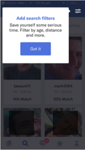
    In this case, a user after experiencing the App for some time is shown the Search Filter feature. OKCupid has decided to not show this important feature to users in the early stages of their journey. They have opted to delay this piece of user education until the user has been engaged and active for some time, and enjoying the experience of finding matches and chatting with potential dates.

    Segmenting users “who have not used the search function” and presenting a tip to show users where to find the search function, is a great way to provide contextual education. It is simple, relevant and is valuable as it focuses the user on the benefit – save time and find better quality matches.

    progressive onboarding with okcupid dating app

    Progressive Onboarding Tip 4: Help users understand the features they are paying for!

    In the online dating world, everything happens fast. So when a user agrees to pay for access to subscriber features, it’s important they understand what they have access to and how to use the features. Reminding users of the value of features is a strategy used by OKCupid as a way to demonstrate the exclusive benefits of being a subscriber.

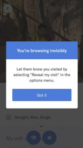
    For example, OKCupid paid users, have the benefit of secretly viewing profiles. This means they have the option to let someone know that they showed interest by visiting their page. In this example, education is triggered and targeted to a segment of users – “paid users” who have never performed the “reveal my visit” option.

    Triggering a tip in real-time is so much effective and relevant compared to education outside of the App via email or push notifications that users rarely read. The “Got it” button, also means the OKCupid can measure the effectiveness of the education, and attribute feature usage to an education campaign.

    How can Contextual improve your Apps progressive onboarding?

    In the dating world, progressively disclosing interesting information is so much more attractive than doing a download of your history. The same goes for user onboarding, and the leading Dating Apps show us the art of seduction – giving the user an instant experience of a match, then progressively showing users how to improve their experience over time.

    The Contextual platform makes it super easy for all Apps to have this superpower.  With Contextual, all Apps can create tips, tours and modals to progressively disclose important features to a user without getting in the way of the user’s experience.
    This is all done without code or waiting for an App release.

    Make your App more attractive and:
    – Push feature usage to segments without code
    – Take the guesswork out of feature engagement
    – Avoid having to code for the tip to disappear once the App is open or the user has engaged
    – Get data in and out of the platform with a REST/JSON API and target the right users in real time

  • Twitter’s Tip-driven feature discovery

    On-boarding and Feature Discovery

    I’ve been on Twitter since 2008 but recently I exercised the nuclear option on my phone (243 apps installed is an occupational hazard) and Twitter got blown away with everything else.
    I hadn’t miss Twitter’s incessant neediness to catch my attention and didn’t reinstall it (or Facebook) for a while but (despite my enhanced happiness) I just reinstalled it (but not Facebook ????) and took note of how they on-boarded me.

    Twitter is pretty close to what is considered a B2C App. But it’s popularity exceeded its usability for years.  It was like learning MS-DOS commands and all to just tell people what you had for breakfast. ????????

    So for years it was never a truly B2C success because it’s quirky MS-DOS style only attracted “power users” and social media consultants (ok no need for sarcasm…). In more recent years they’ve truly embraced the need to be less cryptic and make the app useable to a broader set of the population.

    So I reinstalled the App and here is what I noticed:

    Getting a new user to “A-Ha!” (Core Utility)

    News

    On 15th Jan 2009 when Janis Krums (@jkrums) tweeted – “There’s a plane in the Hudson” – everyone finally grokked that twitter’s killer feature was instant access to raw un-curated news and that any citizen journalist could now break something important like the Arab Spring.

    Eventually Twitter productized that and its its one of the first Tip you see when using the App. Its a killer.

    Refresh

    No – Steph Curry is not wearing a nice blue hat. This popup Tip is a key “a-ha” reminder for Twitter’s tweet  refresh function.“Spring Refresh” has been around for a few years but Twitter is not leaving it to chance that a new user may not know they can get new Tweets by pulling the list down.


    Notifications

    Obviously following people is a key function for Twitter stickiness – people want to know when their friends were Tweeting (about breakfast). But for years you never knew when someone actually tweeted that you cared about. So about 2 years ago, Twitter let you curate the people you are ACTUALLY interested to hear from. This Tip is a crucial driver of App Opens for Twitter and a crucial value enhancer for the user. No longer did I need to open the App and scroll through a bajillion tweets just to know Rui was live.
    This Tip is an enhancer surfacing a killer feature.


    LOLCATS

    Animated GIFs are a win for virality and having a laugh – so its natural that Twitter wants to make this easy as IMGUR to get great GIFs.

    Twitter makes a smart move here to let people know about the feature. This will increase usage and they reap the viral benefits.


    Misunderstood Features

    People in the early days had to decipher the MS-DOS style logic of Twitter’s early design. I’ve heard it said that your power users will treat your App like an Operating System and try to figure out the features.

    This is a classic case of early-adopter behavior before an App “crossed the chasm”. The early users had to decipher how to:

    • DM (private messages got learned the hard way! BTW it was “d <username>)
    • When to use “RT” for a retweet.
    • And other cryptic things like the difference between @ and .@ and
    • when to hashtag # and when to @ when some event/company had both!

    So these 2 variants of a Tip are good examples of how they hid that complexity but people still needed to understand who the @ reply is going to. This nicely placed tip…in context, tells a new user exactly who should see your witty pithy reply.


    Explaining New Features


    I thought I knew Twitter….this tip surfaced a feature I didn’t know about:

    • Tips work even for B2C Apps and
    • Power Users can still learn a new trick. 🙂

    No persona based on-boarding. Why not?

    As I mentioned earlier, being a consistent user since 2008 and having logged in with that same username (@djinoz) then Twitter absolutely should be able to suppress newbies tips for me each time I install a new device.

    It’s dumb they repeat this. I guess they think its “mostly harmless”.


    Summary

    Twitter has raised billions and at the time of writing this post, they have 12 open positions in “product and design”. Its clear that giving the user the best experience has inspired the tips that I’ve shown above.

    Again, this shows us that the biggest of the big are using data-driven intelligence to decide that tips give engagement uplift and deeper connection with a product’s features. Think about this for your App. Or perhaps you’d like a role at Twitter – I’ve pasted a few of these San Francisco based jobs below.

  • Google’s Progressive On-boarding with Tips/Tours

    We sometimes hear developers or product managers say – “tips” are a sign your UI has failed.

    But Google, with the biggest B2C interactive audience (if you include search) globally, use tips and modals very creatively.

    You would think that Google have:

    • Some of the best Product Managers and Product Designers
    • Unlimited budget
    • Analytics to know what inApp education creates uplift
    • An experiment-driven culture
    • Decision makers who are nothing but data-driven

    So the logical conclusion is that “Progressive On-boarding” is an initiative across many Google products, and it is successfully driving deeper engagement. Otherwise, they wouldn’t do it, right?

    So let’s examine a few of the tips, tours, modals that Google has used in their mobile products in the last 6 months.


    Google Maps

    The Opportunity:  Google recently introduced en-route destinations but I bet you didn’t know. They used a tip to promote the new feature.

    They did it the right way. The wrong way is more of a 2015 style “dumb” approach used by most Apps – throwing up a “What’s New” carousel for existing users when they open the App. This blocks the user from the utility that Maps exist to provide. Dumb.

    Google Maps add a Pit-Stop

    Context:  Google keeps out of the way and lets you set your primary destination – this is Map’s main navigation use-case. So they don’t interfere with that. But after the trip is underway, this tip was shown.

    On this day we had a passenger to be dropped off at a train station, so we added this to our route and the default route was changed to support this. Smart!

    Wow Factor: by being contextual and delivering enhanced utility it is now burned into my brain that is a normal method of using Maps in navigation mode.

    Get out of the way: Look at the tip design:

    1. It assumes I’m in motion and keeps the message simple
    2. Uses common language. By using pit-stop it speaks to a driving brain
    3. Pictorial to support the message
    4. Does not force a response. By using “Got It” the user can respond to the action or get on with the job. They don’t even need to use a swipe gesture that might be more dangerous driving ????


    More Google Maps – tips as promotions

    Google Maps Uber Promo
    So we know tips are great for education, but also tips can be contextual delivery methods for offers. We’ve seen a few media Apps introduce offers in the context of the UX – it’s a light-weight context-based approach, that does not consume developer resources or steal from screen real-estate to drive an upsell.

    Selecting your navigation method is an interesting interstitial for Google to promote their partnership with Uber:

    • Perfect position
    • Perfect timing
    • Uber branding
    • Call-to-Action with reward.

    I’ve got more Maps examples for another time….


    Youtube

    We’ve already shown how Netflix encourages off-line viewing of videos. This is obviously a method for increasing consumption and usage of their service. Here we see 2 Youtube variants: top and bottom – one with a bold title. We also see some of the buttons are changing, so it’s possible they can A/B alter the App render on-the-fly.

    Youtube offline variant 1

    Youtube offline variant 2


    So this is a good lesson that Youtube is trying different variants to see what creates conversion – after seeing these I started to download audio books over the home wifi to listen to while commuting.


    Youtube Subscriptions Re-discovery

    This tip is on the subscriptions Youtube page. “Channels” are your fave subscriptions. But Youtube recommendation engine overwhelms you and you never get back to your favorite content. It just gets lost. This simple tip reminds me I can see all my channels and skip the recommendation engine that is taking 90% of the screen.

    Youtube-Channel-Reminder

    This tip is an example of a great reminder how App features get buried and you need to help user re-discover them.


    Google Docs/Drive

    This suite of products has a lot of utility and designed for everyone from the casual user to displacing MS-Word and Excel in the workplace.

    Originally I was intended to include examples in this post but its way too meaty that I’ll devote a later post to it.


    Google Home

    This is an important initiative by Google to tough it out in the battle for IoT in your home. Google Chromecast became Google Cast and attacks Apple TV and AirPlay which had significant start and usability advantage.

    But the big game will be more devices under your control like Nest, Amazon’s range of Alexa devices and a raft of smaller sensors and controllers like LIFX lights.

    In the example, Home is showing a more directed initial onboarding experience. The goal is to get you to Wow! AND THAT IS YouTube or Netflix on your telly.

    Google Home Manage Your Devices

    To get users to connect their Cast devices is the most important 5minutes in the journey. So this coach mark modal is a FORCEFUL method that we’ve seen on a few Google Products. It allows the user to see App content but it’s a strong driver for an outcome based flow that leads to Wow!. Interesting characteristics:

    • No obvious escape from the flow.
    • There is no “dismiss”, everything focuses the user on clicking that button top-right.
    • In reality touching outside the overlay causes the “dismiss” – at Contextual we call this “touch-in” and “touch-out” and our users can control how an end-App-user can dismiss or follow a call-to-action.
    • The App user can see content, so they are not blocked from the end-goal, but they know they have a “job-to-be-done” to get that value. Contrast this with (a few years ago) the Path App:
    • At the time people said it was beautiful, BUT…
    • It was (about) a 6 step process that was designed to get you to a Wow. But the steps were linear and you had no idea in 5 steps what the happy experience was supposed to be!
    • Now Apps realize that they need to drip-feed happy experience so they can trade an onboarding step with user happiness (motiviation)


    Progressive On-boarding is the new Best Practice

    These examples shows how Apps with high engagement still need help to allow users to discover or re-discover features. The magic is in the simplicity and innocuous presence and deliberate motivation → to drive deeper engagement and utility of the App. At Contextual we think that Best Practice is shown by these giants but can be delivered to smaller companies with a platform designed for:

    • Helping Product Manager and Product Designers Experiment easily
    • Uplift focussed analytics to know what Experiments are getting results
    • Foster an Experiment-driven process to deepen customer stickiness/retention
    • Affordable
  • 5 reasons why mobile app tooltips are coming

    The dreaded new feature carousel (that we discussed the downsides of in our last post) is disappearing. Newer apps have caught on and user onboarding is being done via simple tooltips that aim to educate users on a new feature or next step. By hitting them while they’re already engaged in the App, onboarding happens more organically.


    This is a trend that just makes sense when you look at mobile design – web Apps have shown us “this stuff called education just works.” A progressive approach to educating users leaves nothing to chance – it’s not rocket science.
    Let’s get real – we know users (like most smartphone owners) have the attention of a goldfish!

    Spurring a user to take specific actions in your App before they lose interest makes complete sense. Facebook gets this.

    Facebook makes use of simple tips as a best practice to help users discover feature improvements and new actions. If you are a Facebook user, you’ve no doubt seen this dozens of times and experienced how Facebook naturally integrates the changes for a seamless user experience.


    Many super-popular Apps are now making tips part of the everyday experience. But it’s not easy to implement a simple mobile app tooltip. Why? Tips usually compete with an aggressive release schedule and we know developers don’t want to code uninteresting stuff above cool new features. At Contextual, we’ve been working to build a platform that makes it super easy for Product Managers to create a mobile tip and bypass all the internal obstacles to user education.

    The 5 reasons why mobile app tooltips are coming to Mobile

    1. It no longer takes a team to create a simple tip
      A developer wants to design a tip or onboarding flow but it requires multiple skills and multiple stakeholders to have their fingerprints on the wrench 
      1. Product managers who are focused on App Engagement goals.
      2. Developers who have to code and implement tips.
      3. Data Team who measures and segments your customer base.
      4. Marketers who want to make sure messages are consistent.
      5. Project Managers to glue it all together and manage sprints, releases and announcements.
    2. Aaaarrggghhh – for a small tooltip test you would need an army to wrestle 5 people for consensus on the:
      WHAT, HOW, WHO, WHEN, WHY?
      So how do we take the noise out of creating a tooltip?
      Product managers can now use tools like Contextual to run internal iterations on tips, tours and modals without distracting developers, and then take it to the Marketing team and show them the tip right there on their own phone. Marketing wants a few words changed, so the Product Manager updates it on the spot. Performance measurement no longer has to be done by the Data Team generating custom reports. Rather, the Product Manager can see which onboarding experiments beat the current design.
    3. The delusion that “we only design self-explanatory software” is fading
      1. Nearly all Apps launch with little or no onboarding, and in some cases there is a real belief that  “we are superhuman and only design and release Apps that users intuitively get.” We’ve all met the design purists – these superhumans are rare and usually come in two varieties:The super developer – the mobile equivalent of full-stack, these guys are awesome and do awesome things. They believe all Apps can be engineered to be self-explanatory. We hope this is true and it may be true for some single purpose applications. But the problem is:
        It takes a lot of development iterations to find the best result.
        • You need lots of measurement skills to confirm that users get it.
        • There are Apps like Uber which started as a “single-purpose” App, but now with Uber Eats has multiple use cases. So you really need feature onboarding as you can’t code for cross-functional tests.

    Product Managers at $$$Billion Unicorns – Sometimes these guys are trapped inside a “not invented here” culture and at minimum they need to have a team of developers and analytics folks to work day and night for a simple tooltip.
    We are breaking down the delusion.

    Let’s get real – even a single-use App like Instagram uses simple mobile app tooltips to help users understand “how to save privately to your profile.” This type of tooltip is about building user trust and personalization.


    1. Purists exist at less than 1% of Apps on the market. The rest of us need help creating an awesome first-time experience, and breaking through any friction users might be having in understanding App or feature enhancements.
      It’s a total fantasy to assume that a user loves your App so much they will pursue self-discovery of features and new actions! It just doesn’t happen – remember the goldfish analogy!!
      Contextual is a platform that allows Product Managers to experiment with tooltip education and iterate fast to promote feature adoption and greater user personalization.
    2. Onboarding no longer needs to get killed in a budget crunch
      Onboarding is often an after-thought. When we’ve spoken to mobile developers and agencies developing apps for customers, they often say:
      “The customer wants it but does not think deeply about it. They’ve seen it in other Apps and think it’s a “must-have” but they don’t invest much on the quality”
      When the budget is running over in an outsourced development approach, this is usually one of the first items to get killed from the project. The result is either a poor or non-existent onboarding experience.
      Boring, Boring, Boring. Developers hate doing this type of code. It’s not interesting to code and its not part of the core utility (which they are under pressure to get right).
      Even if it’s done poorly, the cost impact on the project may be anywhere from $2K-$10K. Then it’s stuck in stone with no measurement attached to it and requires App releases to even change a word.
      OK, so how do we make it less expensive and more efficient?
      By adding a platform like Contextual to manage onboarding tip, tours and experiments, the cost is removed from the developers’ engagement (giving them more quality code time). This also results in giving the App Owner (the customer’s Product Manager) a platform to be agile over time.
    3. It’s no longer too hard to segment the audience and display persona-based education

      Often Apps have nice segmentation in their backend or analytics platform, but engineering hasn’t instrumented the App to behave differently for these Audience Personas. With no segmentation, tooltips are typically blasted at everyone. That sucks.
      Ok, how does Contextual help?
      Segmentation with Contextual can be based on usage or even data from your backend. It’s an easy way to push feature usage to segments because nothing has to be coded. With Contextual you can:

    The design and delivery of tooltips is in the hands of the Product Manager
    A key barrier to implementing and testing user education is getting access to developer resources and then convincing the team to put it on the product roadmap. With more education appearing in the Apps we use every day, users will begin to understand their value and appreciate the education “nudge” to deepen and improve their experience.
    Contextual makes it so easy for Product Managers
    With Contextual, the developer’s work is a one-off integration, and they are released from tooltip design. This workload moves to Product Managers or Marketers.
    Developers are then left to focus on features and Product Managers can focus on feature engagement to improve the return from all the development effort that goes into building better products!

    Are you looking to get more users to love your mobile and web apps?  Click on the buttons below to get your 14 day free trial or contact us for a demo! 


    Get Started


    Get a Demo


    Contact Us