Category: video

  • Customer Support is  a Product Managers untapped design resource.

    Customer Support is a Product Managers untapped design resource.

    Call it: Customer Success, Customer Care, Customer Support, Tech Support, HelpDesk – these teams and people are the first line of feedback from customer and the reality is they carry a lot of data from the intimacy and volume of interactions.

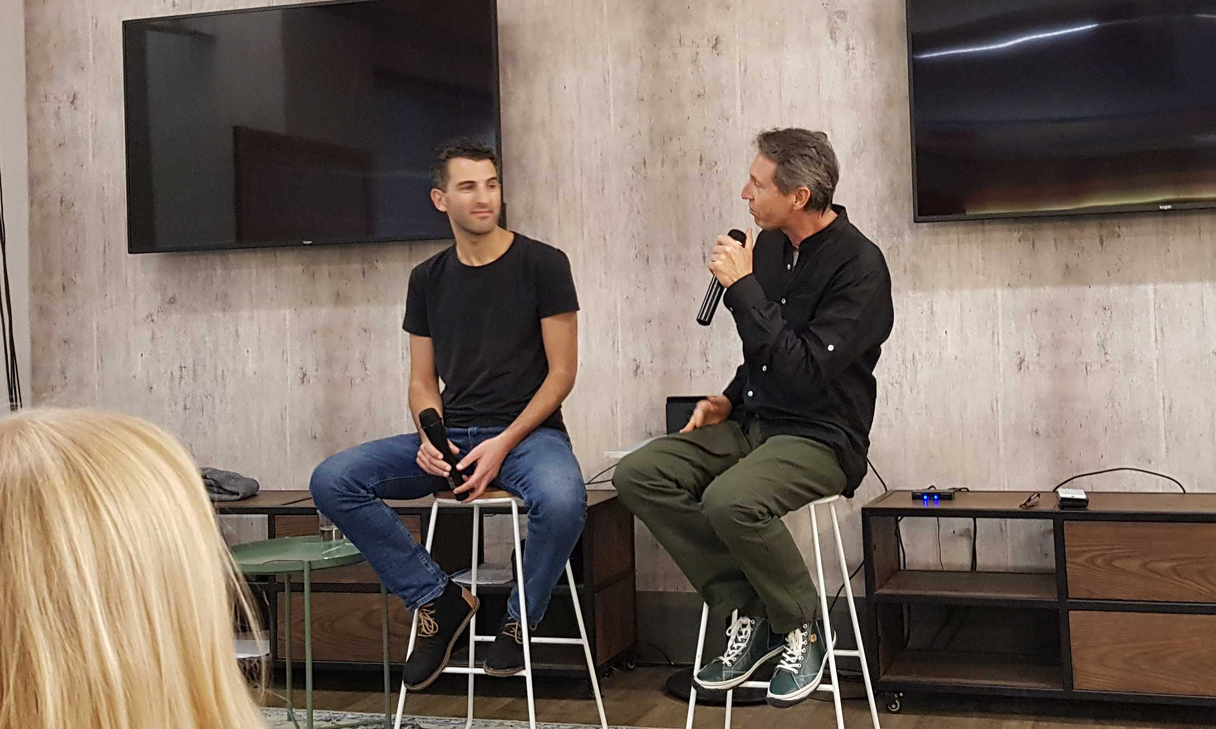
    In this Fireside Rachael Neumann (former director of Customer Experience Strategy at EventBrite and now Head of Startups AWS ANZ) talks about the psychological or emotional user experience.

    After an anecdote about how she discovered a different way to implement a product feature, I challenged Rachael about whether she was actually doing the Product Manager’s job.

    Rachael made an important point:

    “But it’s very powerful when you have someone who sits between customer and product because two things happen. If you just have a customer team:

    • they tend to be seen as a cost center instead of a strategic center.
    • They tend to be the first function that is off-shored and
    • they tend to be kind of pushed off to the side and
    • BUT they are basically speaking to hundreds or thousands of customers a day creating rich rich datasets that are never captured mined or used.

    And on the other side you have product managers who all think that they’re Steve Jobs and that they can create products from the vision of their mind…..and never shall the two meet.”

    Rachael’s comment is fairly incendiary but rings true – as teams get larger the Product Management function gets busy with backlog, internal meetings, analytics and lots of other inward-facing actions.

    The original methodology of Customer Development interviews is largely abandoned as its one of the least pleasant thing  to do AND its not usually incented with KPIs.

    What Lens do you use to view your Product? Design or Emotion?

    Careful, this is a trick question – your customer is only going to view THEIR experience of your product through their EMOTION.

    Rachael’s comment “speaking to hundreds or thousands of customers a day creating rich rich datasets that are never captured mined or used” has 3 ramifications:

    1. devaluing this data is a lost opportunity.
    2. your analytics platform never communicates heat or anger of the customer.
    3. qualitative human input  from your CS team is a valuable dimension that you’re tools simply cannot capture.

    In the next post we’ll dive deeper into this statement about customer anger.

    But for now, consider whether you are interacting with customers enough and feeling their heat. Is it possible that Product people are introverts and will naturally arrange their day with tasks that avoid hand-to-hand contact/combat with customers.

  • Eventbrite tracked anger and delight in UX

    Eventbrite tracked anger and delight in UX

    In the last post, we covered how Rachael Neumann’s role at Eventbrite’s Customer Experience/Success saved building the wrong feature. In the same talk the idea of assessing a customer’s anger through a journey is a fascinating and fresh lens to review your design.

    The normal process is to map the user journey with flow charts or post-it notes and treat things very functionally.
    Instead, Rachael prefers to review each step in the process through an emotional or psychological lens.
    Specifically ask the questions:

    • what is the emotional state of the user at each stage?
    • What is the potential to delight and potential to anger?

    • have you built up good will?

    • there are moments in the journey where there is a high tolerance for stuff going wrong.

    • The idea is to maps steps in your user’s journey on a 2D axis like this.

    This kind of empathy for the customer’s emotional state was quite revolutionary to me and is valuable coming from [effectively] the “customers champion” – whereas inward-facing Product Managers might just map this as binary pass-fail states.

    Its a great lesson for Product Managers to take note of and to learn more from their Customer Success, Customer Support teams.

    “Not all moments are created equal”

    Check out the video for the full context and more great advice.

    Other gems of wisdom

    Aligned with the points made above were some gems:

    1. “delightful things don’t matter if you don’t solve the critical moment are a terrible experience”.
    2. Customers make terrible product designers.
      • Get as much feedback as possible from customer BUT you cannot take at face value.
      • The customer’s job is to show you their pain.  Your job is to translate into meaningful product solutions.
    3. You need a champion of the customer


    “Customer-Driven Product/Design  Loop”

    If you’ve read “Lean Startup” you understand the principle but it was great to hear that Eventbrite actually treated this as a “muscle” to be developed. To be high velocity in:

    • method to measure the temperature of a particular “moment”
    • what are my hypothesis about the things I can change
    • implement the change
    • measure again and see how you did
  • Canva: Product Management Process and Stack

    Canva: Product Management Process and Stack

    Canva is one of the fastest growing companies around and now has 500 staff. I recently interviewed Robert Kawalsky who’s startup Zeetings, was acquired by Canva in April 2018. Robert soon took the lead for both Zeetings and Canva Presentations groups which represents a huge opportunity in Enterprise, SME and also Education.

    Our the interview (a fireside at Fishburners) covered a lot of topics – I’ve selected 5 minutes where I asked what he’s learned about Product Management processes, tools, stack inside Canva.

    https://vimeo.com/pointzi/review/335333108/b45df2b0de

    From Chaos to Clarity

    A few times in the talk, Robert referred to Canva’s method of wrangling ideas into features, he called this “Chaos to Clarity” – its a great description of the a product feature’s journey. The “Chaos to Clarity” process is:

    1. Initial Visual Lo-Fi designs – at Canva they are very visual about the way something would appear to a user. This is done in Canva. Sketches, Wireframes, Mockups.
    2. Pitch Deck for that Product/Feature – also done in Canva.

    3. Press Release for that Product/Feature – typically done in Google Docs.
    4. Strategy Document – a long form description that outlines the problem, user stories, dependencies with other products

    5. Design Document – this is the handoff from Product Team to Design/Engineering
    6. Prototype – this is typically used for putting on usertesting.com so they can verify user understanding and response.
    7. Technical Design Doc – where engineering consider the implementation requirements.

    Canva’s Product Management stack is: Canva (surprise!), Google Docs, Usertesting.com, Jira, Trello, Mode and Amplitude for analytics.

    Ideas are the lifeblood of startups and agility can easily degrade into chaos. Too much order and you have stultifying bureaucracy – the Canva process strikes a good balance of balance.

    The Full Fireside

    For those interested in Roberts’ broader journey and a success story of an acquisition of a small startup into a powerhouse unicorn, here is the full video. (its missing a few minutes from the start). 

    Are you looking to get more users to love your mobile and web apps?  Click on the buttons below to get your 14 day free trial or contact us for a demo! 


    Get Started


    Get a Demo


    Contact Us

  • How Google Home educates on a new user interface

    Our house is one of those connected places and we chose Google Home as the backbone. Around the house are lightbulbs that turn-on and off with voice commands.

    We also have several audio and video Chromecasts that do things like play the current episode of “the innocents” on voice command. All this is done via 4 Google Home minis placed in rooms.

    I rarely go into the Google Home app, but I was setting up a new light-bulb and the App had updates. The Product Managers at Google obviously wanted to tell me more about the changed – we call this “Feature Onboarding” – here is what it looked like.

    Google-home-popup

    The cool thing about this is that they’ve targeted me on first use of the upgrade and told me about the interface.

    The top image is attractive and contains common items for lightbulbs, switches, lamps that you hookup in the App.

    The wording is a bit dense for my liking (users are usually in a rush to get to the features) but it hits the major UI and feature points.

    The call-to-action is simple, either “DISMISS” or “WATCH NOW” – it was a little confusing to me what “WATCH NOW” meant, often Apps use “LEARN MORE…” but I guess it sets expectation that it would be an easy video to consume.

    So I clicked and here is what I got.

    Google-home-youtube-video

    Video is a great way to educate users as its a “show me, don’t tell me” solution. You can see here that Google have set the video to 42 seconds, so they want to hit the big points and not waste your time. I think of this as getting the message across and then getting out of the way.

    Google have big teams that can do these popups and target them at the right users at the right time.

    This is also simple to do with platforms like Contextual and your App can do things from simple tips, to embedding videos – then measure the uplift with analytics.