Blog

  • Contextual Native Carousels now available

    The animation below show  how easy it is to now deliver beautiful carousels in Contextual without:

    1. needing to write code, just add our SDK
    2. needing to do an Appstore Release!

    You can also A/B Test different carousels to targeted groups to test which gives the best results.

    In this video you can see it takes seconds to :

    1. craft a 2-screen carousel
    2. select an image from our library or pick your own
    3. change the text
    4. preview it on a real device

    Some other great controls are:

    • Full control over font type, color, background color
    • Beautiful swipe colour transition between screens
    • Buttons can customized for each slide (see down the bottom it changes from “Skip” to “Done”
    • No particular limit on carousel screens. But we recommend no more than 3, otherwise you’ll drive your users crazy!
    • Multiple images per screen.
  • How a huge email app uses Coachmarks, Tips & Cards

    Inbox is slowly replacing Gmail and it takes a little getting used to because it introduces a few new concepts that are powerful but not familiar. This is a classic case of being able to guide people to understand a concept and deepen their engagement.

    If they can understand a feature, they will get more out of it, and not switch to another App!

    Coachmarks

    Targeted at first time usage of a feature, these are very intrusive but allow a lot of screen-realestate to explain the feature and point to the specific location on the screen. Here we see Bundles, Links, Pins and Snooze are all explained. The timing of the prompts were:

    1. Once I developed basic competence with the Inbox app (reading emails, sending etc)
    2. Not in one session, it was across several sessions that I didn’t keep a track of, but it appears they group them tightly so a user learns contiguously.


    Cards

    Cards are a popular metaphor in list/feed based applications because the user is interactive with cards all the time. Some examples are:
    iOS and Android Notifications: Users are familiar with pull-down, swipe away lists of cards.
    Twitter: In Twitter a tweet is effectively a “card” – so Twitter introduced advertising as a card and appears seamlessly inline with other tweets.
    Google Now/Home: Both of these flagship apps on mobile, use rich cards (titles, body, icons, images). Its a very flexible pattern that can be populated in a number of ways without getting locked into a fixed format. Just like Twitter, these Apps can “drop in” promotional or educational content without disrupting the flow.
    In Contextual we achieve cards with a positioned card-shaped popup/modal but we will probably explore how we can work with apps in their own list stream – anyone willing to use this “in-stream” pattern just let me know!

    Conclusion

    Back in 2012, Matt Cutts of Google shared how they ran 20,000 experiments per year on just one of their products. You can imagine that Google does much more than this is 2017 and its easy to conclude that if some UI metaphor exists and persists, this is because the data it “telling them” to persist.
    Google have persisted with above type of coachmark on several products: Google Docs/Drive, Maps and now Inbox – so its clear that this method is working. We can expect to see this pattern used a lot more in the future and we will come to treat it as second nature.

  • onboarding: the precursor to viral growth

    “Progressive On-boarding” is introducing new and unused features to users and one important part of a journey is to incentivize them to become a “sharer” or evangelist of your App/product – most Apps only get this when the user is:

    • acquired
    • activated/onboarded
    • retained

    Some readers will recognize this as the first 3 steps of Dave McClures’ AARRR – Pirate Metrics for Startups (I hope we can still appreciate DMC’s contribution in late-2017)

    Retention is the most important pre-cursor to “virality” (or Referral, DMC’s last “R”),  an App developer’s natural end goal is to create a product that is so addictive that people use it regularly, find it indispensable, and keep coming back even after drop-offs in initial usage activity. This is the type of app that becomes integrated into a person’s daily routine – like using Instagram, Dropbox, or Spotify.

    How does onboarding build retention?

    Onboarding is instrumental in getting users to build self-reinforcing behaviors, specifically they:

    • introduce and help understand the feature
    • get the user to experience the “a-ha” moment for that feature
    • track with analytics to have completed a goal or they may get tips/walkthroughs to guide them again.

    Some examples of self-reinforcing behaviors are:

    • The more data a user invests in a product, the harder it can be to leave it. Who wants to import 100s of documents over from Evernote to a competitor, for example? Users want to feel happy that they made the right decision from the jump.
    • The more time that’s invested in using a product, the more reflexive the daily habit to use it becomes
    • The two things above create an emotional connection between the user and the product. You’ll see this when users start posting and blogging on social media about how they can’t live without the app – this is how you get free brand ambassadors!


    viral loop

    So Retention leads to Referral

    If your goal is to build a viral loop around the core of your product, then the first step is to think about how you can make it easy for users to find, onboard, activate themselves with your App, and then share it with their friends.

    Some steps and considerations to keep in mind:

    Timing of sharing

    • Keep out of the user’s way until they’ve had a happy experience. With Contextual you can target an audience at the right time of the user’s journey, then show them a tip or popup suggestion.
      • Your UI should hide the share until it’s relevant.
      • Example: Spotify makes it super-easy to share your current song,  because songs make us happy (evokes a positive response).
      • Spotify also passively shares your playlist to your FB timeline. This doesn’t make me happy as a user, but it’s free advertisement for them!
    • Make it a simple one-click action to share while the user is experiencing that endorphin rush or “activated” experience.
      • Experiment with highlighting the share button or do some push campaigns to incentivize sharing.
      • Use your analytics to understand where best to test how and when to share. Contextual has some powerful analytics that allow you to look backwards for click events in the last 30 days even if you didn’t realize it was important. (we also support others like Segment).


    Make it really easy to share widely

    In the example above the awesome HelloFresh have a very subtle sharing button. It obey’s the rules of:

    • “keep out of the way”
    • “Make it a simple one-click”

    But is it motivating users to share enough? What could be more viral than food? Just by sending a picture of the recipe will drive installs and views. That’s building the self-reinforcing behavior, here are just a few use-cases:

    “Here’s what we are having tonight!”

    “Will I do this for Saturday night with the Smiths?”

    “This looks incredible!!! 🙂  “

    hello fresh share tip

    What would the viral uplift be if HelloFresh simply targeted engaged non-sharers with a simple tip like this. Simple tips can increase the uplift of a “goal” or “success metric” by 20-80% – its certainly worth a try to do targeted, contextual tips!

    This is a classic case where targeting users who’ve not shared before can be targeted.
    In Contextual, this would look something like this:
    dashboard


    Some other considerations

    • Is your App running on a phone or on a tablet? Is the user “on-the-go” or is it a “lean-back” experience? Minimize the steps to get to sharing for each situation.
    • Does each use of your app build upon the previous experience? (Do you have markers or “tags” that track a user’s journey).
    • Pre-tick the share list with all contacts or relevant/recommended contacts.
    • Enable search on the contacts list so the user can easily share to specific people.
    • Provide the option to manually enter additional email addresses.
    • Make it possible to share on multiple networks at once.
    • Consider the fundamental value proposition you are presenting to your users
      • Are you enabling them to more easily connect with their friends and social networks? Are you saving them time or money? Are you making their day/lives more efficient somehow?
      • Is your value prop unique enough to cut through all the other competing noise?
      • Reward often and variably – this keeps the urge to share going and encourages daily connections since inviting friends becomes a core process in your app. Check out why variable rewards matter from here or just get Nir Eyal’s book – it’s good ????
      • Clearly define and promote your value proposition early on in your marketing messaging, and connect these back to the core idea of what your product delivers
    • Consider where new users can discover your viral loop and set the process off
      • Do it for free – App Store Optimization, online marketing, website integration, newsfeeds, your website homepage, and blogs are all great “on-ramps”
      • Spend a little – paid advertising, traditional marketing campaigns, SEO
      • Try incentive campaigns to encourage existing users to invite friends. Use push notifications or in-App feeds to get the message out.
  • Mobile Tooltips: the unobtrusive UX pattern to deepen engagement

    Remember Clippy? Perhaps you’d rather not!

    Clippy was Microsoft’s “Office Assistant” and became universally derided. Here are 5 reasons why people hated Clippy:

    1. Obtrusive – power users hated Clippy because it had patronizing suggestions.
    2. Distracting – the image at right (without the gun) is literally Clippy looking bored and wanting you to stop your job and pay attention to it. As we’ve talked about before, JTBD (jobs to be done) is how a product manager should think of a user’s flow
    3. Always there – he(?) sat on top of Word/Excel taking up screen realestate
    4. Killed your flow – this hilarious Quora answer lampoons how it would take 30 seconds to hijack you writing a sentence.

    How to be unobtrusively useful

    We’ve blogged before about how tips need to be unobtrusive. In particular if a web “desktop design” approach is shoe-horned into a mobile App, the patterns conflicts with a user’s “Jobs To Be Done” (JTBD) imperative.

    The best way to deliver unobtrusive user guidance via tips is:

    Contextual

    Unlike Clippy, tips should show when relevant to users.

    Audience: We have customers in Health and Telecoms that have older customers that prefer guidance whereas Milenialls will click/touch/swipe a thousand things until it works. I’m not being “age-ist” – its just a fact.

    Trigger: Apps should only show the tip to the correct audience and stage of user journey. If a user has already user a feature, then they shouldn’t be seeing tooltips explaining what they know. If a user is about to commence a complex task for the first time, then offer to help them!

    Simple & Distinct

    In my recent popular article at uxdesign.cc, the idea of “Cognitive Overload” was discussed and how App Product Managers should design to reduce this overload. In this article we suggest that launchers and tips need to be perceived as a layer on top of the application but not compete for screen real-estate.

    In this simple tip, Youtube taught me something new – that I can pinch the screen. It obeys two simple rules that we think are important:

    • Get the Job Done (JTBD)
    • Get out of the way

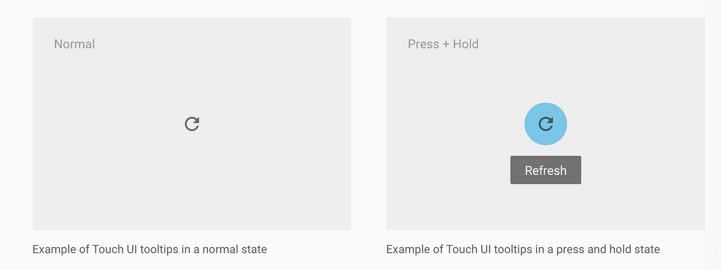
    Note how simple this tip is, it can be dismissed by simply touching.

    mobile tooltips mobile tooltips - example youtube

    Also, these two Youtube tips are similar but also point to a clickable screen element (the bell button and the drop-down filter). Notice how “cognitively” the tip looks very different to the rest of the App. Its very easy for the user to distinguish the tip from the App content – in fact they’ve interesting used the same colour in round badges over channels as discussed in my previously mentioned post.

    The lesson is that Google: one of the largest tech companies on the planet has figured out that this design pattern of: simple, distinct, coloured tips converts their users to adopt the recommended features. Google would have massive teams of analytics, data scientists to come to that conclusion and we should take notice!

    Data Driven

    Which is a nice segue that puts substance to our first recommendation of “Contextual”. All tooltips need to justify their existence and Product Managers need to know what uplift they get on feature usage, engagement or other success metrics. We’ve written other posts on A/B split tests to verify that your in App education is data driven and working. Our two main points are:

    • Measure the success of tooltips – we’ve seen uplift range from 20-80% for new features. Pick your metric and compare against your Apps default state.
    • No Code – using tools like Contextual, the ability to deploy tooltips is codeless, no more Appstore releases or fighting for resources on the Product Roadmap. This is critical, you need to iterate fast!

    Significant New FeaturesGoogle Maps add a Pit-Stop

    Its worth mentioning a slightly different style tooltip that Google also shows for significant feature additions. Many Apps will throw this up as a popup or carousel page when the user opens the App – but that’s lazy and google does a great job here of contextualizing this new feature mid-task.

    The inclusion of title, icon and “GOT IT” button are simple but significant to catch the users attention that this is significant. In particular, the use of a button allows the Product Manager to use analytically see who dismissed by the button or clicked elsewhere (or outside) the tip. In Contextual, this gives measures of “Accept” and “Reject” to measure how positive the response was for the tooltip.

    Summary

    Clippy got it wrong but was a brave piece of help technology for products (Word and Excel) that had become very feature rich (bloated?) and complicated to use. Microsoft had to solve the problem of surfacing features and their approach is what you should avoid – especially in Mobile apps!

    Clippy Best Practice
    Obtrusive
    Distracting
    Always there
    Killed your flow
    Job Centric (JTBD)
    Simple
    Contextual
    Get out of the way
  • Has Material Design nailed Mobile Tooltips?

    I received a question from a recent uxdesign.cc post on Cognitive Overload in mobile app design. (It was a variant of my last post here).

    Has Material Design already answered the need for reducing cognitive overload?

    Material Design is a unified system that combines theory, resources, and tools for crafting digital experiences.

    This initiative from Google (and gift to the world) is widely embraced but Apple is sticking with their own Human Interface Guidelines (and the battery efficient Flat Design). I won’t go down the rabbit hole of comparison but predictability, elegance and delight in design are all great cognitive tools for reducing negative human-computer interactions. (Also it didn’t hurt that Google clobbered Apple by having wide-spread tools and libraries for both web and mobile).

    Material Design’s strength was sticking with a cognitive design balanced with device performance, processing power and battery efficiency — an acknowledgement that human perception uses light to interpret the physical world.

    BUT — where Material Design stops short is that it solves “the current moment”. Its really a design tool, NOT a user experience tool.

    It does not consider the user journey and the contextual nature of a design for the current user’s needs.

    Material Design’s Approach to Mobile Tooltips

    They take a well-meaning of hiding tips (similar to desktop where its hover that delivers the tip). The advocate the long-press (press-and-hold).

    The problem for long-press is that:

    a) mortals don’t know that gesture, only UX nerds.

    b) confused use. Historically long press) gesture on a mobile devices mimics the secondary button press on a computer mouse. Traditionally it gave you the same alternative options as the secondary mouse click on a computer. So long-press for tips is competing with another function. Frankly, allowing the user to access “less, commonly used functions” is a far better pattern. “Help” could be one of the options provided.

    c) gesture dissonance: the user has to drop their uncertainty of clicking the button in order to learn what the button does — wtf?!!!

    d) Perhaps the greatest challenge is that nobody knows how to communicate it (contrast with the “Like” button that was self-marketing). Swiping could be illustrated in a sketch and also mimicked existing human behavior of swiping or dismissing something no longer needed.

    e) not many apps use it. I long-pressed a bunch of Google Apps and can’t get a tooltip to show. Naturally if Apps don’t use it, then user’s won’t use it.

    IOW — Long-press for mobile tips are dead. Sorry material.io 🙁