Category: Product Manager

  • Onboarding guru Hulick on JTBD

    Onboarding guru Hulick on JTBD

    If you are a Product Manager, Designer, you have probably heard of onboarding guru Samuel Hulick. Even Customer Success people are aware of his tear-downs of early experiences in mobile and web apps. We’ve even emulated his approach with a few posts on this blog. 🙂

    In his latest “Value Paths” podcast, he laments a  misconstrued use of JTBD.

    “it is mind-boggling to me how much of Jobs To Be Done is sales and marketing-oriented rather than product-oriented”. 

    Contextual agrees with Hulick that the role of JTBD is most profitable when designing user experiences in your product. To read some of our other posts take a look, here, here and here.
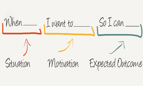

    Situation, Motivation, Expected Outcome
    Source: HBR

    Hulick and his co-host (Yohann) attempt to refine JTBD with into Value Paths:“Path Design is how you get users from where they currently are all the way to the results that they care about.”

    It’s an interesting approach that attempts to corale many of the UX tasks that Product Teams undertake. Often when disciplines are new, they are a collection of activities and example-based approaches that people attempt to copy and reproduce in a cargo-cult like manner. Some activities become perennial best practice and others are just hacks that work for a short time or in a specific eco-system.

    A classic example of a hack in customer acquisition is spam – it works for a while but burns a lot of prospects and email filter systems constantly improved to stop the spam.

    In onboarding a more subtle “hack” is to try to capture ALL  the user’s details (do you really need their phone number?) at registration time before they can evaluate the product.

    Hulick: “Because if the user goes from the marketing website, to the onboarding third party plugin, to a sales survey, and then finally gets into the dashboard of your product, they might feel like they’ve gone through like seven different products along that way, where for the user it should feel like one continuous thing.”

    We’re Building Processes, Not Products

    This is a key insight: As product designers we are fixated on the features and functions of a particular module in the product. Per the example above “user registration”. All your attention and discussions about design “crowds out” that the user has a journey to achieve a result. Their trial of your product is a several A-to-B processes to assess if they “hire” your product, they will get their needs met.

    The podcast is worthy of your attention – here are some other powerful takeaways:

    “The key to path design is clarity on the end outcome (what the path results in). Every time the user engages with the product, it is within the context of the end outcome; so every interaction should be framed against it.”

    “There are infinite paths between “where users are” and “where they want to be.” Thinking of the critical pathway (the actions or stages the path must contain by necessity) is a compression algorithm — it compresses that near-infinite, unordered information into a single hierarchy.”

    You can find the Value Paths podcast:


  • “Slow” is a dangerous place for products

    “Slow” is a dangerous place for products

    This paragraph caught my eye:

    “Slow is a dangerous place for a product company to be. Slow product teams tend to be outcompeted by fast ones. We complain about how Figma and Slack don’t feel native, but why are most of us using Figma and Slack? We’re using them because they outbuilt and outcompeted their native competitors. There are so many things that could improve in these products, but they’re the best tools yet built for their purposes.”

    For product teams, releasing and syncing the features across your IOS, Android and Web platforms is a mammoth task. You release a new feature and then nobody uses it. You release on one platform and users complain its not on the other platforms!

    With Contextual we allow you to not only announce new features but also test different engagements or interest in a feature PRIOR to building.


    Lets say you’ve received some feedback from your customer success team, or using interview products like https://greatquestion.co/ or https://dovetailapp.com/

    You want to drill in and get a sense if other users would value this. With Contextual you could:

    a) ask for feedback with a question – a simple popup message targeted at a specific audience segment lets them single click answer to “take their temperature”

    b) Do a mock announcement for a feature:

    1. Users who click thru on the announcement can be measured.
    2. After clicking thru, you may ask the users for their level of interest.
    3. Promise to get back to them when its released.

    This time-tested launch-hack from that lean startups have been doing for a decade. It may appear a but scammy or disingenuous but inApp you already know the user and if they arn’t interested, they will just click away. No harm done but valuable data to be gained.

    This animated GIF shows how to do this with Contextual in a few minutes.


    The starting quote comes from an excellent post by Allen Pike, (the owner of Steamclock Software) on when/why product teams should prefer to use Native or Hybrid app development. The main point being – the more code platforms you support, the:

    • greater cost to your team to implement
    • greater cost of co-ordination
    • inability to iterate and test fast

    These are absolutely the problems Contextual helps try to solve – both because we provide libraries for ReactNative, Cordova, Ionic, Capacitor and of course Native IOS, Android and Web!

  • Calm App: What’s New Announcement

    Calm App: What’s New Announcement

    Some time ago, I posted a review of a few meditation App’s onboarding experience. One of those was “Calm” which I believe (along with headspace, now a unicorn startup). 

    I recently found an updated writeup from Really Good UX. Its a nice post that covers the psychological elements of onboarding and making sure when they are asking permission that you are still reminded of the “calm” journey.

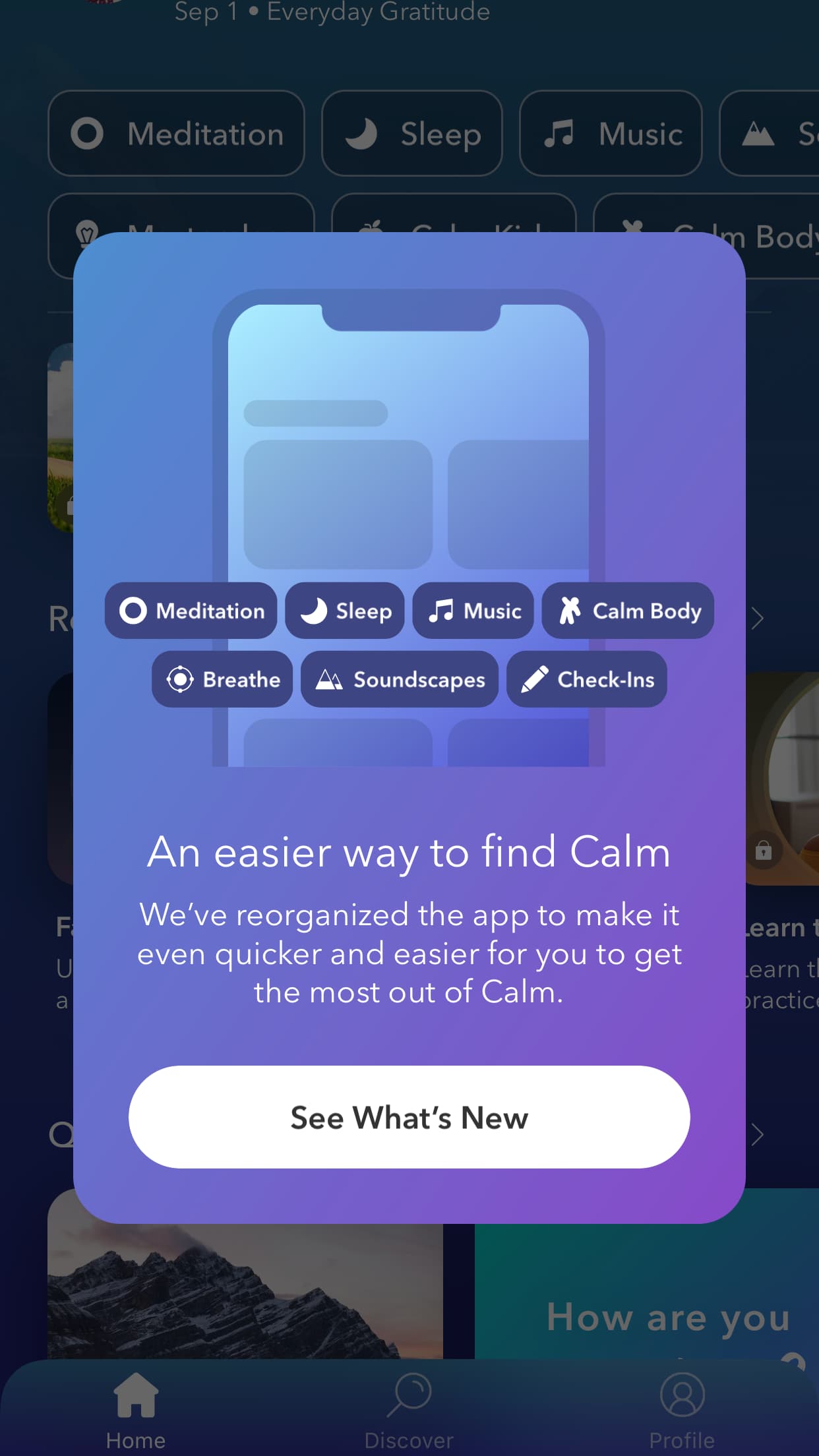
    An interesting element in the post is how they’ve handled the Apps re-organization for existing users: “Calm also offers an overview of changes to the app navigation for existing users, giving them an option to check it out with a “See What’s New” button.”

    Specifically the proactive handling of user’s aversion to change is key here – keep the users informed but with positive messaging and re-inforcing the Apps mission. 

    “By offering a tour, Calm reduces the likelihood that users will become confused by the app’s updated navigation. “

  • Increase Trial to Paid conversions by 10%

    Increase Trial to Paid conversions by 10%

    Our own product/design team were on a call with a UX expert this week. We were asked “whats your key usage metric?”.

    There was a cavernous pause until someone said “perhaps David can answer that”.

    It was a humbling moment.  Despite being a company that talks about: product management, user journeys, goals, “aha moments” and OKRs – we could not enunciate an answer that should really be a team mantra. 

    via GIPHY

    As I opened my mouth to respond, I realized our OMTM (one metric that matters) is too glib and too obvious.

    Laughably obvious.

    What is our OMTM?

    MRR: Monthly recurring revenue and MRR month-on-month growth are the metrics that investors want to see. But that is totally wrong at an execution level.

    Many small-to-mid size teams (including us) get pulled in many different directions. It’s the CEO and the Product Manager’s job to keep re-iterating tangible goals that a team can execute on. 

    Patrick Collins explained how Zip don’t use roadmaps but 90-day OKRs. 

    To focus product teams, inherit from a larger  business metric like MRR:

    Breaks down to at least, some macro areas:

    • Acquisition of Triallers (marketing team)
    • Trialler to Customer Conversion (Product Team, Customer Success)
    • Customer Retention (Product Team)
    • Plans and billing methods that work for customers (VP Product, VP Sales)

    Then a product team would negotiate with the business that: “Trialler to Customer Conversion” can be expressed as a 90-day OKRs. For example:

    “Increase Trial to Paid conversions by 10%”

    But this may be still too abstract for the product team – they could formulate more granular metrics:

    “20% increase of triallers complete and preview their first guide within 1 day”.

    We now have a clear answer for “what is your key user activation metric?”

    The team runs experiments focussed on hitting this goal and is a mantra for daily sanity checks on tasks. 

    How Contextual helps

    Contextual guides allow you to:

    • Target specific users. For example you may have several personas that connect into your App. You can guide each differently.
    • Track their interaction with the guide (did they use it or dismiss it)
    • Tie the guide to a Goal (your Product Metric). 
    • Do this without writing code. By having a no-code approach to helping user engagement with your product – you can keep your engineers focussed on features and fixes.

    via GIPHY

    Proxy Metrics

    Gibson Biddle, former CPO at Netflix has a 2019 series that is worth reading multiple times. Specifically relating to Proxy Metrics his piece on “How to define a metric to prove or disprove your hypotheses and measure progress”. 

    He covers how you can map from a higher level business metric to a product level proxy metric. 

    In the case above, even “Trialler to Customer Conversion” is large and too abstract for a product team, so breaking this down to “20% increase of triallers complete and preview their first guide within 1 day” is making a hypothesis that it “will move the needle” on the more abstract metrics.

    I won’t reiterate Gibson’s full epic post but he suggests:

    • Is measurable.
    • Is moveable.
    • Is not an average.
    • Correlates to your high-level engagement metric.
    • Specifies new v. existing customers.
    • Is not gameable.

    He also cautions that its not a quick fix: “we made decisions quickly, but isolating the right proxy metric sometimes took six months.”. Keep that in mind, you will be iterating on your metrics and the hypotheses that formed them.

  • Manage “empty states” with tips

    Manage “empty states” with tips

    Empty states are the unfortunate onboarding journey that your users often experience. This is the place where a user doesn’t experience value until the user has the “aha” moment. e.g for Trello or Monday, this is clicking “finish” on one of their action items.

    How do we solve this? 

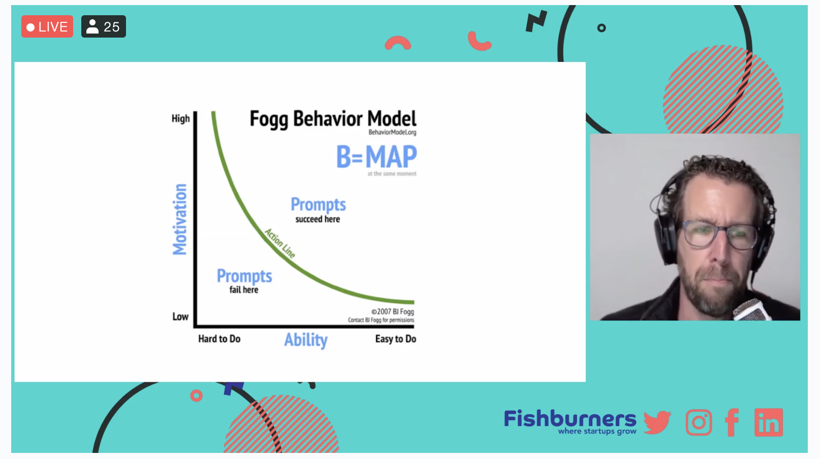
    I attended a great session with UX consultant Mark Lamb  who has 20 years of experience designing products at Google, Uber, and Adobe.

    Mark recommends reading B.J Fogg’s book to get a deep understanding of user psychological responses to your App in the FTUX. How to manage Empty states was a powerful part of the talk.


    tiny-habits-book

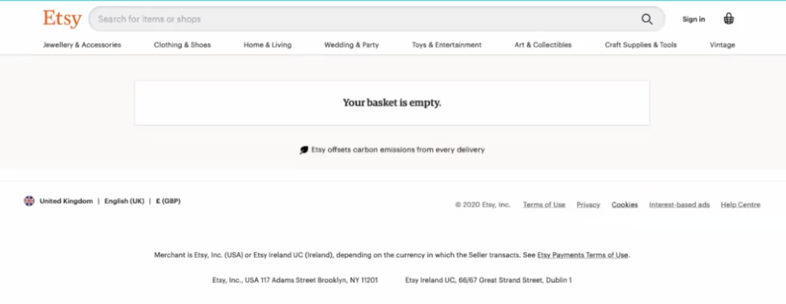
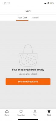
    Mark’s advice is “be helpful or hide”, he was a little harsh on our Microsoft Word friend “Clippy” because (as we wrote) he was “bolted on at the end”. Similarly an empty shopping cart like this from Etsy is a poor experience.

    Mark suggests hiding these experiences until the user is further into the journey but such design decisions are costly to implement.

    Many teams don’t have the budget or resources of Uber, Google or Adobe – when Mark was asked about cost constraints he recommended tools like Contextual.

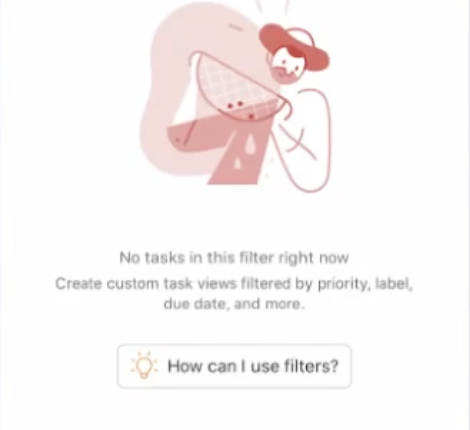
    Etsy didn’t take advantage of this state, a better onboarding FTUX would direct the user back the “Aha moment” is achieved with something like this next example:

    • it is playful
    • has a call-to-action
    • adds a little FOMO by showing “trending” as what other users are enjoying.

    You could be using tools like Contextual to potentially test different button styles and messages.

    cart_ios_etsy_uigarage

    The key message is “if it’s empty, then suggest things”. Clearly with Contextual you can test and iterate different suggestions (or creative) and measure uplift using goals.

    Another key principle Mark advocated was “Show don’t tell“. Product Managers and Designers can use guide tools but careful to make Clippy’s mistake.

    In “todoist” the “How can I use filters?” button is an opportunity.

    The button may be a Contextual tip that might popup some contextual help or an explanatory video.

    The key message is: What is the next step to get the user towards the “Aha” moment?

    Here is the “Empty States” section of Mark’s talk, thanks to Fishburners for the session and recording!

    If you’d like to explore further we have touched-on Empty States elsewhere here and here. If you want to see how Contextual can help you, book a screenshare. ????