Empty states are the unfortunate onboarding journey that your users often experience. This is the place where a user doesn’t experience value until the user has the “aha” moment. e.g for Trello or Monday, this is clicking “finish” on one of their action items.
How do we solve this?
I attended a great session with UX consultant Mark Lamb who has 20 years of experience designing products at Google, Uber, and Adobe.
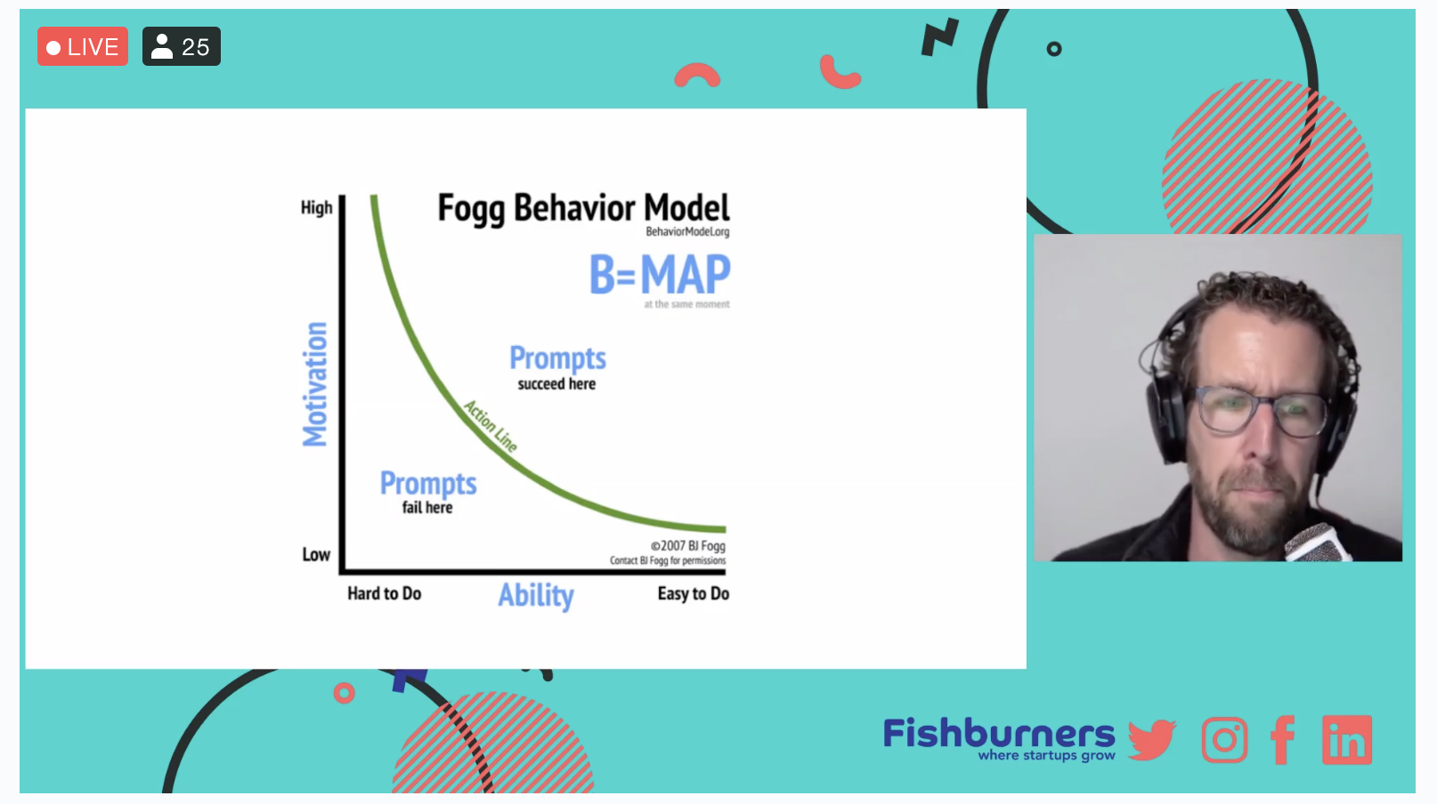
Mark recommends reading B.J Fogg’s book to get a deep understanding of user psychological responses to your App in the FTUX. How to manage Empty states was a powerful part of the talk.
Mark’s advice is “be helpful or hide”, he was a little harsh on our Microsoft Word friend “Clippy” because (as we wrote) he was “bolted on at the end”. Similarly an empty shopping cart like this from Etsy is a poor experience.
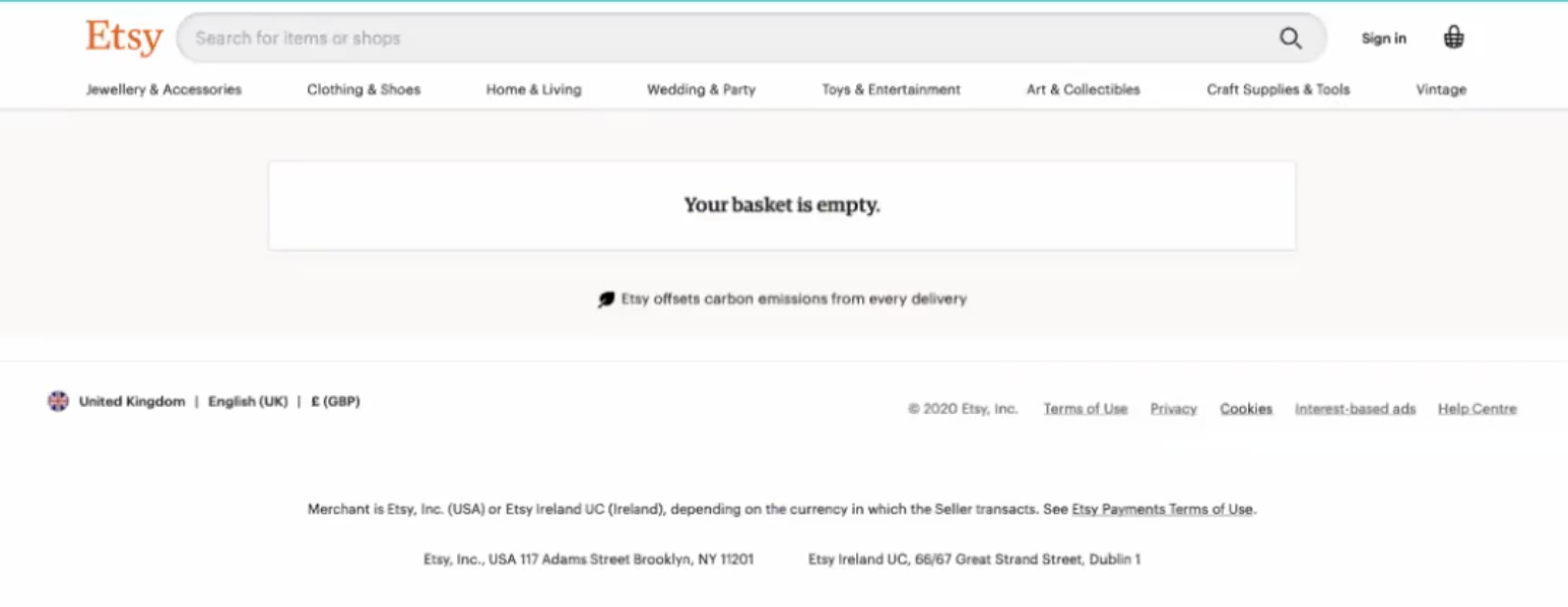
Mark suggests hiding these experiences until the user is further into the journey but such design decisions are costly to implement.
Many teams don’t have the budget or resources of Uber, Google or Adobe – when Mark was asked about cost constraints he recommended tools like Contextual.
Etsy didn’t take advantage of this state, a better onboarding FTUX would direct the user back the “Aha moment” is achieved with something like this next example:
- it is playful
- has a call-to-action
- adds a little FOMO by showing “trending” as what other users are enjoying.
You could be using tools like Contextual to potentially test different button styles and messages.
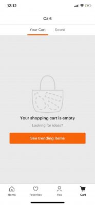
The key message is “if it’s empty, then suggest things”. Clearly with Contextual you can test and iterate different suggestions (or creative) and measure uplift using goals.
Another key principle Mark advocated was “Show don’t tell“. Product Managers and Designers can use guide tools but careful to make Clippy’s mistake.
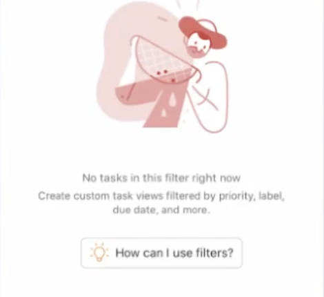
In “todoist” the “How can I use filters?” button is an opportunity.
The button may be a Contextual tip that might popup some contextual help or an explanatory video.
The key message is: What is the next step to get the user towards the “Aha” moment?
Here is the “Empty States” section of Mark’s talk, thanks to Fishburners for the session and recording!
https://vimeo.com/589498400
If you’d like to explore further we have touched-on Empty States elsewhere here and here. If you want to see how Contextual can help you, book a screenshare. ????
