I received a question from a recent uxdesign.cc post on Cognitive Overload in mobile app design. (It was a variant of my last post here).
Has Material Design already answered the need for reducing cognitive overload?
Material Design is a unified system that combines theory, resources, and tools for crafting digital experiences.
This initiative from Google (and gift to the world) is widely embraced but Apple is sticking with their own Human Interface Guidelines (and the battery efficient Flat Design). I won’t go down the rabbit hole of comparison but predictability, elegance and delight in design are all great cognitive tools for reducing negative human-computer interactions. (Also it didn’t hurt that Google clobbered Apple by having wide-spread tools and libraries for both web and mobile).
Material Design’s strength was sticking with a cognitive design balanced with device performance, processing power and battery efficiency — an acknowledgement that human perception uses light to interpret the physical world.
BUT — where Material Design stops short is that it solves “the current moment”. Its really a design tool, NOT a user experience tool.
It does not consider the user journey and the contextual nature of a design for the current user’s needs.
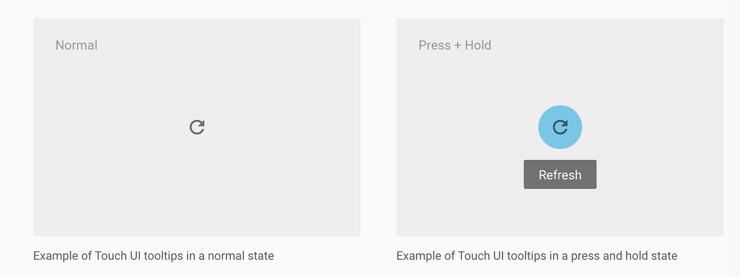
Material Design’s Approach to Mobile Tooltips
They take a well-meaning of hiding tips (similar to desktop where its hover that delivers the tip). The advocate the long-press (press-and-hold).

The problem for long-press is that:
a) mortals don’t know that gesture, only UX nerds.
b) confused use. Historically long press) gesture on a mobile devices mimics the secondary button press on a computer mouse. Traditionally it gave you the same alternative options as the secondary mouse click on a computer. So long-press for tips is competing with another function. Frankly, allowing the user to access “less, commonly used functions” is a far better pattern. “Help” could be one of the options provided.
c) gesture dissonance: the user has to drop their uncertainty of clicking the button in order to learn what the button does — wtf?!!!
d) Perhaps the greatest challenge is that nobody knows how to communicate it (contrast with the “Like” button that was self-marketing). Swiping could be illustrated in a sketch and also mimicked existing human behavior of swiping or dismissing something no longer needed.
e) not many apps use it. I long-pressed a bunch of Google Apps and can’t get a tooltip to show. Naturally if Apps don’t use it, then user’s won’t use it.
IOW — Long-press for mobile tips are dead. Sorry material.io 🙁