Category: case study

  • Slack’s Onboarding Carousel is short-sharp and on-message

    ul {
    list-style-type: square;
    margin-left: 2em;
    }

    Slack is one of the fastest growing companies in history taking only 2 years to get to $1B valuation. Their 2017 round was based on a $200M ARR and resulted in a $5B valuation – so based on real-enterprise value, not just hype. Here is a chart of their stellar growth.

    onboarding carousel

    Te really great thing about slack is that you can get started and feel the impact of chat very quickly, just like the experience you had when you started with DropBox. You can be started and chatting with Slack while Skype is still loading 😉

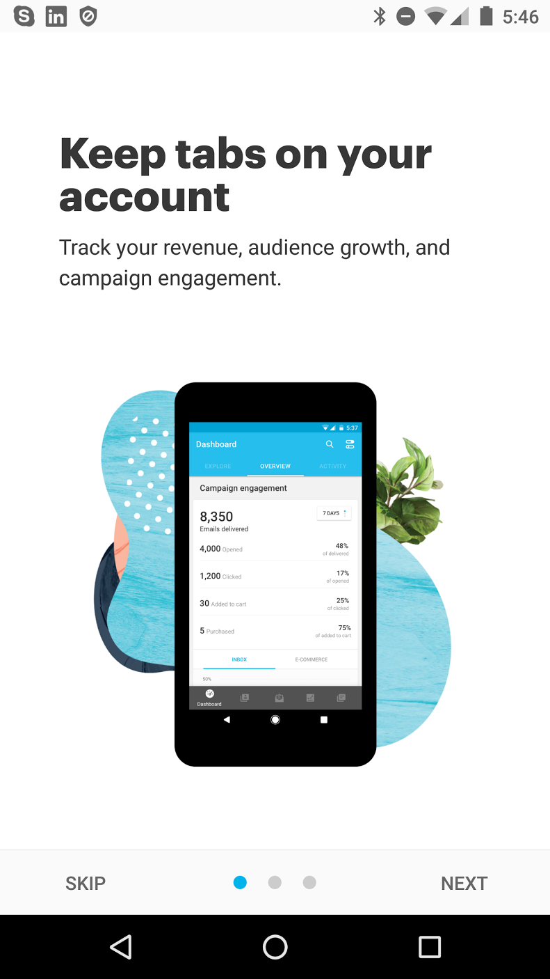
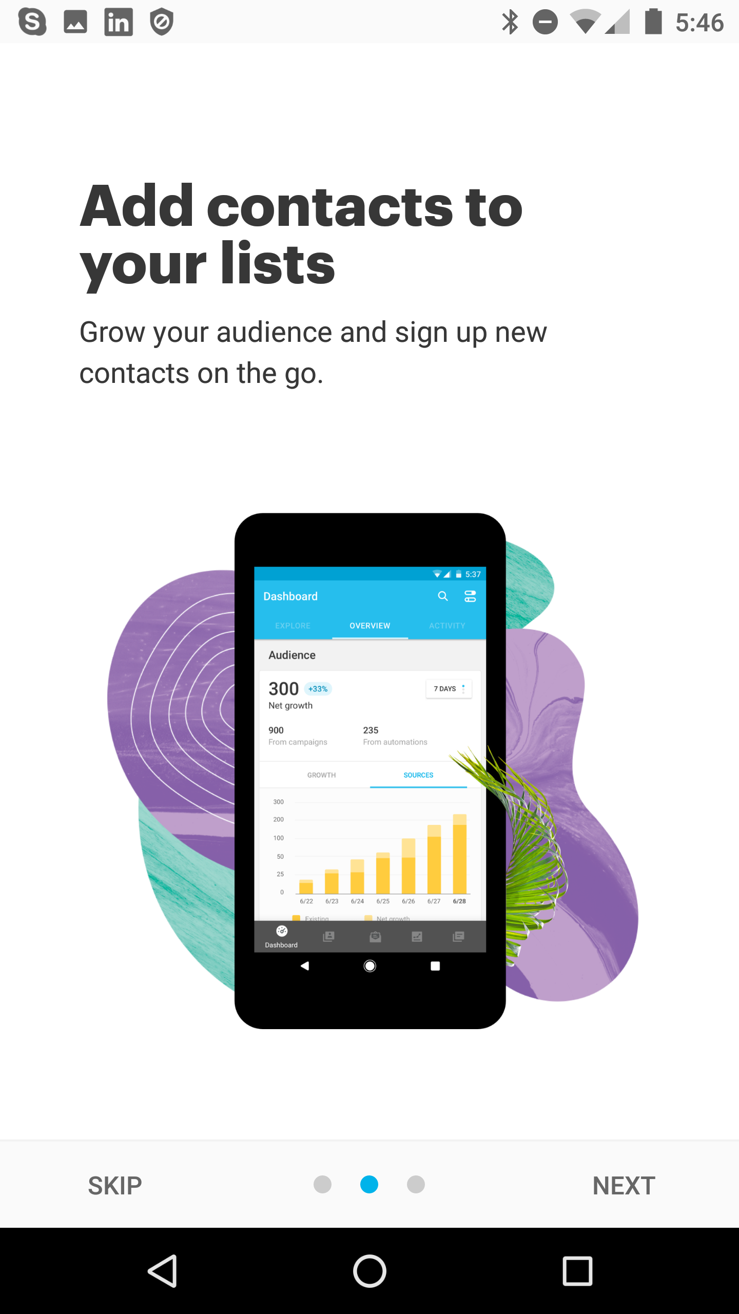
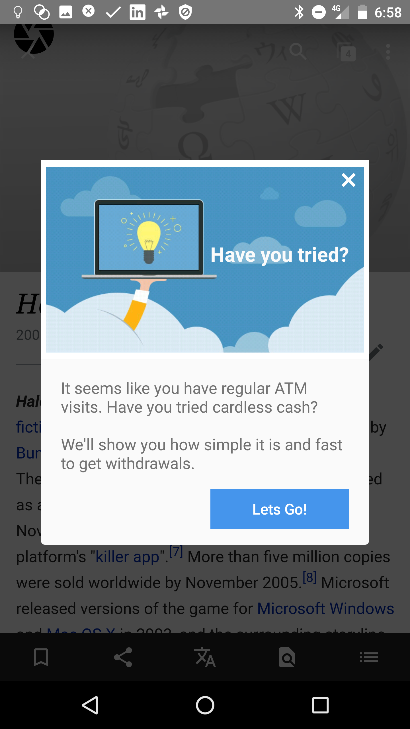
    So in the spirit of speed Slack give new App users a fun-designed Onboarding Carousel that reiterates the key reasons for using the product and then gets out of the way. Here is how it looks.

    onboarding carousel - example slack 1
    onboarding carousel - example slack 2
    carousel - example slack 3

    Style

    The design is playful, remisniscent of their product icon colours and the solid colours don’t distract from the key messages.

    This might just be a great case study for B2B Apps that don’t want to style to trump substance. For B2C Apps, there is an assumption that some eye-candy needs to be present in the carousel but in B2B its important that the functionality is the hero.

    Buttons and Swiping

    On each page of the carousel, the exit for the user is consistent:

    • sign in to a team 
    • OR create a team

    Having different buttons on different pages would be confusing so this design allows the user to escape the onboarding carousel with only the two call-to-actions that matter.

    The “CREATE A TEAM” call-to-action is unique to Slack but pivotal to the main use-case that MIGHT happen. I’d suspect that many Product Managers would think that mobile users would never create a team, so this step could be easily over-looked.

    Messaging and Text

    As implied by our post’s title, the text is perfect product positioning based on how a user’s JTBD (Jobs to be Done) mindset would be – they want to (1) talk to groups and (2) talk one-on-one.

    They don’t fluff about with other things like uploading images, snippets or linking docs. They will allow the user to discover that later.

    In fact in a post called “How Slack blends productivity and delight”​ the author discusses that “Principle 1: Put people, not features, first.” informs their design decisions. This Principle clearly impacts the wording they use. 

    I love the clarity and simplicity of this communication.

    Making Slack’s onboarding carousel with Contextual

    In this quick 3minute video, John shows how to create a carousel just like Slack with needing to get you developers involved. The benefits are:

    • free your developers to do more important app features and fixes
    • no need for an Appstore release
    • change the content at will.
    • measure the results and engagement.

    https://vimeo.com/269130715

    What about tips?

    Slack also use tips and tours once you are inside the App and we cover this is a separate blog post. Their rollout of threaded conversations was interesting in using phased tips.

    Are you looking to get more users to love your mobile and web apps? You can onboard users just like the bigs guys but without a big budget! Click on the buttons below to get your 14 day free trial or contact us for a demo! 


    Get Started


    Get a Demo


    Contact Us

  • Medium’s Tips for teaching new user habits

    When Medium replaced “Recommend” with “Claps” great confusion ensued. Here’s how Medium attempts to train us to understand the new feature.

    Whats the deal? Medium wanted to reward great stories more than good stories. But we’ve all been trained to Heart, Upvote, Like, and with a simple tap “Un-Like” – but that was too restricted for Medium’s goal.

    Medium's inApp tooltip to educate users on clapping more for more points

    Medium’s inApp tooltip to educate users on clapping more for more points is a simple cue to get users over the confusion factor about “claps”.

    In Contextual this is a very quick process – here is how its done.

    1. Add the SDK
    2. Screenshot your page
    3. Pick the page and select Tip tool, pick a style
    4. point at the placement of your tip. Add your own content and style. (colors, fonts, round corners etc)
    5. Target at an audience, Save. Set it live – EASY!

    If you’ve got a feature that is not getting uplift:

    1. consider how user’s might be a little confused about it.
    2. check with users to confirm.
    3. your tip should describe/or imply the action. Medium hijacks the long-press gesture and explains it: “Press and how to…”
    4. your tip should describe the value to the user. In Medium’s case: “show your support.”. Its crisp, clear.

    Its easy to under-estimate the power of simple tips to get uplift. Results vary and Contextual allows you to measure the uplift based on your stated “Success Metric” (Goal).


  • 10 Common App Prompts That Convert

    Mobile App user retention rate is <10%. That is largely attributable to not “Activating” user engagement quickly and at relevant times.

    If users don’t find utility and value from the product quickly, they rarely stick around. Figures for user churn are over 70% within first 3 days.

    To give your users the best chance of extracting utility, there are a few common use cases we see in successful Apps. Its no coincidence these use-cases are recurring – take note!

    In this post we cover 10 common app prompts that really make a difference to retention, activation and growth.

    1. The ‘Get Started’ Tip

    User activation is about getting the user to an “a-ha” moment as quickly as possible.

    So one of the simplest and most obvious things to do is place a tip pointing at the one action to deliver “instant-gratification” returns.

    e.g In a real-estate App it might be the first filtered search. In a social App it’s often sharing your first picture.

    In many applications, this is called “Empty State” – the single-player mode where the App is absolutely empty until the user gets started. 

    common app prompts - get started tip

    Todo-lists, CRMs, Mailboxes all have empty states. In this situation, you will probably design into the application but you may still want to iterate different A/B tests on messaging.

    You design a product, you’ve been staring at it for months and you’ve developed a habit that would make Pavlov’s dogs drool. You click happily and assume that your users will automagically guess how to use it.

    Not so.  The value this simple understated tip is triggering the user’s first action. The tip is never seen again because the user now has started the habit!

    2. Feature/Intro Tour

    There are different names:

    tours, flows, walkthroughs

    But they all mean the same thing. Building on the simple tip, you introduce the user to a set of key features and explain how to initiate those actions.

    In earlier posts we’ve discussed how targeted tips in a tour is superior to using a carousel that users will forget. This little animation shows how you can advance a user during early App experiences.

    common app prompts - guided tour

    3. Targeted Nudge for unused Feature

    Its common for popular apps to have a loyal user base but some of the users are missing key utility available in the application.

    With Contextual, you can target these users, to start using the feature. You can use an attractive prompt. That may lead to the screen in the App or kickoff a walk-through/tour.

    common app prompts - tour

    4. New Feature Announcement

    Here is 2 cool simple examples:

    1. Skype takes a smart approach to user education by telling me I can have more fun now because they support  “sharing photos”, “locations”, “GIFs” tasks. Read more here.
    2. Netflix’s 2-prong approach to prompt users to start using off-line video playing is a great re-inforcing approach. We’ve seen Slack do that too. Learn more…

    SkypeInCallOptions
    LD_1 (2)
    common app prompts - new feature

    5. Launchers

    As we mentioned in the last post, these valuable tip bubble app prompts can help clarify the purpose of a field or action without clogging up the screen.

    The user can simply tap/click on them, help the user understand and then get out of the way.

    6. Invite a friend

    Increase your virality or k-factor with app prompts to get a team mate or friend on board the app as well. Sometimes this sharing might have a referral incentive – we’ve written before why Uber and AirBnB use shared rewards as the most effective conversion. If only the referrer gets the reward, the recipient is suspicious of their motives. Remember that Uber gives new users free credits anyway via advertising or postcard handouts, so giving them a referral credit is easily within their cost-of-acquisition calculations.

    7. App updates and Service Alerts

    Either by push or inApp, content, you may want to tell users something thats happening immediately that may affect them.

    I like this one because its human and fun (who wouldn’t love a sad wrench!) and its a clear CTA. Notice also its a nuclear option, there is no dismiss on the modal so the user performs the CTA or presumably backgrounds the App and won’t be a live user until this step is completed.

    8. Welcome Popup or Carousel

    We’ve talked a lot about carousels before and our mixed feelings about them. If this is how you define “on-boarding” then you are NOT thinking about the full-user journey. BUT a welcome is good for orienting and informing the purpose of your App in terms of the user’s needs.


    9. Upsells, Offers & Rewards

    Converting Free to Paid or Upselling a plan is a key part of the the App economy. Allowing users to progressively unlock new capabilities is an action worth “testing”.

    When you test you are allowing the data to tell you what converts most effectively.

    A/B testing different prompts and messaging with a tool like Contextual can be done before hard-coding  into the application. This “test-and-learn approach is the iteration speed Prodict Managers need to achieve growth.

    10. Action Needed

    Different to the “Empty State” requirements of first-time on-boarding is driving more “sunk cost bias” into the user’s experience of the application. This sounds evil but is usually to reap returns for the users. LinkedIn is famous for driving users to complete their profile, they bread-crumbed ways that a user could enhance their profile and thus sinking more investment into the App and what it would return to the user.

    The red-box (I added for emphasis) shows how LI devotes a large amount of screen real-estate embedded to guilt users to complete this task.

  • Skype’s new look mobile onboarding

    Given there are so many options these days for chat + voice, you may have already abandoned Skype. Facebook, WeChat, Slack, Hangouts are just some of the contenders and many of us have all these plus WhatsApp running concurrent threads.

    But its clear the Skype team want to change that and get back into the game, a massive installed base is shifting to the other platforms and mobile. Skype was truly awful (slow, cumbersome) on mobile and is probably in the minds of most consumers “a desktop product”. Here is some onboarding from their new Mobile App (on Android).

    skype user interface
    skype app ux

    The most common landing page in Skype is your contact list and they’ve provided a basic 2-step tip tour to teach you about the new user interface.

    1. Its a nice design to have the personal profile at the top-center but its not a common design pattern, so its smart to tell users.
    2. Moving the “call” button is a great “instant gratification” change. But Skype has to retrain old users from going to the contact first and then calling from there. This inversion is smart but teaching us in this tip is smart too.

    In Chat/Call

    Whilst commencing the call, they provide a few clues for how you can handle chat oriented activities.

    To me, this is a bit of a miss. There are at least three other relevant CTA’s on the screen, so adding a tip is only increasing the cognitive load for the user.

    Using something like Contextual you can trigger based on certain conditions.

    skype user interface

    Here is a great example of smart user education. We call this Progressive Onboarding.

    Skype has decided that after at least one call, they will help me understand how to get more value out of the product in a chat session. 

    They may have also only triggered for users who hanve not completed the “sharing photos”, “locations”, “GIFs” tasks already.

    SkypeInCallOptions

    Missed Opportunities?

    I like Skype’s new design, its reduced some of it’s bloat and the UI is more “instant” as users expect for a modern chat/voice app.

    But, there is some missed opportunities for uncovering other features in the application.

    For example, these gems are hidden behind the “+” button but we’ve not been told about them.

    Group chat: is dead easy in Facebook Messenger and WeChat, but its buried in Skype.

    New Highlight: I had no idea what a Highlight is, I still don’t know 🙂 A tip could have educated me.

    Find Bots: This feature has been a powerhouse growth factor for Slack, so Skype want to catch up – but its unlikely we can find it here. Also it sounds a little scary.

    SkypeAdvancedFeatures

    Contextual could have helped Skype walk the user through a simple explanation of each of these Advanced Features, its more opportunity for Progressive onboarding – perhaps they will target me in the future. If you want to read a good example of how Twitter progressively onboards users, check this blog post.

    Also Contextual can put small “?” tooltips next to a new or confusing feature. You can find an example video on this page.

  • Mobile App design and onboarding by SC Moatti

    A little while ago I interviewed SC Moatti who has worked with companies like AirBnB on mobile UX.

    You can find the recording on iTunes and SoundCloud.

    In this episode, SC who is the best selling author of “Mobilized” shares some design wins and fails based on 3 rules of fullfilling the needs of Body, Heart and Mind.

    Here are 3 rules:

    1. The best mobile products are physically and functionally beautiful. (Body)
    2. The best mobile products focus on what matters to us. (Heart)
    3. The best mobile products learn as we use them. (Mind)
    Mobilized Book

    Here is a quick TL;DR:

    • What Uber, theSkimm and WhatsApp do really well.
    • Where AirBnB could improve because its typically been task-oriented but is missing opportunities for serendipity.
    • How “bots” are in the “uncanny valley” where people are unsure how to relate to them if they are almost convincingly human but still not when it really matters.
    • How SC is now doing investments both in and out of the mobile space and how you can get in touch.

    Mobile Growth Score

    We score all our interview anecdotes based on the 3 axes of: acquisition, UX and retention.

    Acquisition User Experience Retention
    1/10 9/10 3/10

    Let us know on our Twitter account how you score it.

    If you want to read the transcript, head over to our StreetHawk site.