Category: Design

  • Product Managers: Data-driven experiments are an excuse not to be brave

    Product Managers: Data-driven experiments are an excuse not to be brave

    Being “data-driven” is “virtual signalling for Product Managers” and not the best method for some product decisions and roles.

    This snippet from a longer conversation with Patrick Collins of Zip.co digs into the suprising insight of different traits in PMs.

    Patrick quipped about his experience: “I’ve only been doing this product thing for 10 or 15 years”. 

    So it’s clear he has a wealth of experience and carries a lot of lessons and scars from both web and mobile products.

    Patrick’s advice to aspiring and existing Product Managers is to know which type you are:

    1. Analytical
    2. Intuitive and/or creative.
    3. Technical

    In recent years he’s seen migration from Project Management and Business Analyst roles into Product Management. Also there is often a progression from developers into the PM track. But perhaps these new PMs are more analytical and don’t carry a sense of what a great user experience is like.

    The concern is that:

    “experimentation and being data driven,
    can be a cheap out for being brave”. 

    In other words a Product Manager who has the courage to make big bets based on solid user experience background is invaluable in creating a “generational leap” in product quality.

    Patrick notes that this trait is not based on seniority, its really that many PMs are risk adverse. They get into a process of “polishing the turd”.

    It’s an interesting conundrum, in other posts we’ve noted the time expense of A/B tests to get statistical significance, the challenge of PMs wearing many hats and personality traits.

    “But the idea that we can just test our way out of every problem is dangerous because it can really hold a product back.”

    Like most human skills, its part-art and part science. Patrick says:  “I still haven’t quite cracked the formula for what kinds of PM is able to know when to stop polishing and know when to go for a generational leap.”

    “some being more creative, some being more analytical and some being more technical and knowing who you are”

    ref: https://www.linkedin.com/pulse/types-product-managers-animal-kingdom-gaurav-rajan/

    The standard 3-legged stool for PMs is to balance UX, Tech, Business – you may have seen the Venn Diagram in other posts on this blog.

    But the image above illustrated the best fit for PM’s who are pre-disposed to traits of “Technologist”, “Generalist” and “Business-oriented” – the Focus field is a clue as to the persons strengths and weaknesses and ultimately what would be the right product-component for them to work on.

    Digging deeper into the downside of being too analytical, the obvious A/B problem arises:

    “The experimentation culture, I think is damaging in some ways, because it comes across as this kind of analytical thing that that you can test your way out of anything. But it’s like, well, what the hell are you going to test? And how are you coming up with that?”

    If you want to hear more from Patrick on a broad range of topics and experience, join me for our WFH Fireside chat this coming thursday. If you can’t make it, sign up to the blog and it will be in the upcoming posts.

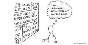
    A note about the cover cartoon

    I was wondering about what picture to put up the top of the post. Perhaps “fork-in-the-road” to reflect product management career choices. Perhaps an “all-in-bet” pic from a casino etc.

    But I actually found a post on Basecamp’s site under their ShapeUp series that captures part of what Patrick was covering. 

    Basecamp are often controvesial, always counter-trend and very, very authentic. This series says:

    Shapeup is Shape Up is for product development teams who struggle to ship. Full of eye-opening insights, Shape Up will help you break free of “best practices” that aren’t working, think deeper about the right problems, and start shipping meaningful projects.

    and that sounds pretty bloody good to me – I’m adding it to my reading list.

    The image came from:  https://basecamp.com/shapeup/2.1-chapter-07

    Transcript

    Patrick Collins 0:03
    Learning of the different kinds of product managers, some being more creative, some being more analytical and some being more technical and knowing who you are. And therefore what if you know i’d imagine the audience is probably going to be aspiring PMs, some of them anyway. knowing who you are as a PM really will help.

    Patrick Collins 0:27
    And you don’t want to be a creative PM, running the platform services team, or tech or a technical PM running the onboarding project for the app, right?

    David Jones 0:40
    Why was it specifically what did you learn that specifically at Moveweb?

    Patrick Collins 0:44
    I guess I’ve learned over both of these past roles, that those different PMs can actually fail in one role and succeed and I don’t mean outright fail, like crashing and burn. I mean succeed in other ones. And so when I look for PMS, I look carefully at their background. And I look at what skills they have. And that will lean me slightly towards where I think they’re probably going to succeed as PM. Creative requires you to take some bold steps. And I think the experimentation culture, I think is damaging in some ways, because it comes across as this kind of analytical thing that that you can test your way out of anything. But it’s like, What the hell are you going to test and how are you coming up with that? Which part and you know, I think I’m on consumer app in particular, it requires a lot of bravery and a lot of courage to translate what you’re hearing from customers into a point of view, and then go test that and having that having that courage to translate data analytics and and customer interview data into into a point of view: not many PMS have that.

    Patrick Collins 2:03
    And it’s actually not a seniority thing I’ve noticed it’s a, it’s a risk taking trait that some PMs just will never get.

    David Jones 2:12
    So just to, just to play that back to you, if I’m a really good data centric type product manager, there was a Stanford saw talk I saw which was called “gut, data, gut”, which was that you’ve got to start with an intuition first, then you can go and get the data to support it or actually run and experiment for that data, then you actually have a new iteration. Are you saying that an analytic type product manager really just misses that sort of “gut” type thing and testing many different sorts of things?

    Patrick Collins 2:44
    CAN. Yeah, I think the concept of experimentation and being data driven, can be a cheap out for being brave and not taking not making courageous leaps on the product and maybe polishing a turd, so to speak. And so sure, I think there’s a really difficult line to walk between knowing when to polish and knowing when to try to “go for it”, like a generational leap. And it’s still kind of I’ve only been doing this product thing for 10 or 15 years now, I still haven’t quite cracked the formula for what kinds of PM is able to know when to stop polishing and know when to go for a generational leap. That’s that’s a really challenging, challenging problem for most PMs. But the idea that we can just test our way out of every problem is dangerous because it can really hold a product back.

  • WFH: Will Design Sprints fail with remote teams?

    WFH: Will Design Sprints fail with remote teams?

    Product Teams are probably one of the least disrupted jobs that are affected by a work-from-home world. But Design Sprints are predicated that you clear your calendar and get everyone in a big room to grind on the creation of something new and substantial or solve a sticky problem.

    This is not just small things about button placement but parts of your solution that has multiple stakeholders and plenty of perspectives.

    I spent an hour with Tim Paciolla who is Lead Designer on Atlassian ServiceDesk to cover the approach and tools to keep Product Teams moving in this important practice.

    For the uninitiated, Design Sprints emerged from Google Ventures and largely have been kick-started by a book by Jake Knapp. You can refer an earlier post and fireside I did with Elliot Ng from Google.


    sprint-book-jake-knapp

    Focus, Challenges & Personalities

    Can you still run Design Sprints in a Work-from-home world?

    Tim claims that absolutely you can still run Design Sprints, but it’s critical the Facilitator needs to have their role confirmed, stakeholder support and ways to keep people focussed.

    1. Make sure roles and responsibilities are understood.
    2. Use ice-breakers and show vulnerability early to demonstrate the fears and errors are OK.
    3. Manage extroverts to leave enough oxygen in the room.
    4. Keep the allotted time discipline in place (we’ll cover compromises in another post)
    5. Make sure you have tools that support remote.
    6. Manage the heads-down time to make sure people stay focussed.

    There is a couple of golden points here:

    Firstly: the facilitator has to work harder. This person is not necessarily a designer or a Product Manager – she could be the executive stakeholders delegate or someone who leads a particular function, for example Customer Success or Billing.

    Second: there are real-risks that during the “heads-down” time that people will lose focus. Its a myth that you are all working together for the 4 or 5 days – there are large periods where the team is working on their particular aspect (sketching, user story, mocks etc) – this is the time where someone may get pulled into a customer support issue, a team problem, some admin or just distraction. 

    This is amplified on the WFH situation – someone may take lunch and stream some Netflix and never return!

    Atlassian’s Playbook

    Atlassian is noted for its supportive cultural initiatives – it’s referenced in various business books for its leadership. One day, I will share an example which is deeply personal but exemplary of what an amazing company it has been from its very early days.

    In the interview Tim lists several tools they use during team formation, project starts and Design Sprints.

    The Playbook is a collection of methods to help teams work together. It has been compiled with heart and open-sourced with generosity for anyone to use.

    Atlassian-Playbook-examples

    Tools for Online

    Surprisingly the solution for remote teams in a Design Sprint is a mix of low-fi and the latest internet tools.

    1. Tim eschews slavish use of online tools when a sketch on paper will do just fine.
    2. Holding the sketch up the camera on a zoom session is good enough to get the point across.
    3. Did someone mention Zoom? Absolutely.
    4. Photo syncing with Dropbox, Google Drive
    5. Shared Whiteboarding tools like Miro and Mural.
    6. The Contextual team are experimenting with Discord to allow free voice chatter to flow during the day. 

    The challenge remains for Facilitators to keep the energy and focus on the team high and not drift off. It appears that no tools other than solid communication can solve that.

    In summary: its truly difficult to keep people focussed on a task but its the Facilitator’s job to use tools and techniques to keep Design Sprints on track.

    Here is few snippets of the session and I’ll upload the full hour as soon as we can process the video.

    Transcript

    David Jones 0:05
    What about now so so here we are, as long as the Wi Fi holds up, we’ll be able to actually all work from home. And, you know, this this kind of like historic thing about design sprints? Is this this kind of like, huddle together and get things done. So is it gonna work? Is it gonna be a complete debacle? You know, am I am I saying that I’m actually here on the design sprint, when really I’m over here, actually, sort of, you know, working on something else or dealing with a customer support request or, or whatever, you know, that they’ve kind of that kind of like in the room accountability you have from like social close social contact is being taken away from us. So can you see it working on no?

    Tim Paciolla 0:46
    Yeah, I mean, yeah, absolutely. I can see it working. I mean, there are there are additional challenges that you have to as again as a facilitator, right as the person that’s sort of leading the team through the week. There are different Things that you’re going to have to pay attention to, right? If I were in a room together as a facilitator, I can very easily say, okay, laptops down phones away, right? Like, I don’t want to see a phone, I don’t want to see a laptop open. And that makes it a little bit more people can still check out. Right, but that makes it a little bit more difficult to check out. Online. I absolutely think I mean, there are companies very successful companies Trello, which is in Atlassian products, you know, they’re almost an entirely remote company. You know, there are others on this, you know, envision I believe is entirely remote automatic is entirely remote. Right. So there are companies out there that are entirely remote, you know, that follows similar processes. So, is it a change absolutely won’t be difficult, of course. But yeah, I think it can absolutely work.

    David Jones 1:46
    And so, if I sort of like just sort of like, go sideways from accountability to personalities, so let’s, let’s say I’m a, you know, I’m a real hardcore coder, and that’s what I do and I tend to look at everything Through the, through the lens of things, and I’ve been asked to join this particular design sprint. And, you know, it’s like, well, for any engineer, it’s like being called into meetings. It’s like a particular form of torture. And so the question is, okay, I’ve got this five day meeting. Am I the right person to be in that group? Tell us a little bit about what personalities you’ve seen? A golden, which, which aren’t so good.

    Tim Paciolla 2:23
    Yeah, I mean, you framed it as an engineer, but really, you know, you can almost use any discipline that question right? Like, I mean, I’ve seen designers that don’t want to be participate in design sprints, right? Like they don’t want to go into a room for five days. They’d rather just sort of sit at their, their, you know, their computer and their monitor and, and work away. The people the personalities that I think are important are people that are somewhat comfortable with being uncomfortable, right? A design sprint can be uncomfortable arrives.

    David Jones 2:52
    Okay?

    Tim Paciolla 2:53
    You know, at times being a bit uncomfortable, you know, or being comfortable with making something hard decisions, hard prioritization decisions, you know, sort of forcing yourself at different stages to sort of pick a direction and sort of stick with it. Right? So if, if you have people that like to, you know, keep all their options open right and have a hard time sort of making a decision. I think that’s a little bit of a challenge. I’ve seen introverts do extremely well in design sprints, right? Again, that’s more about how the design sprint is set up. One of the first things that we do a lot in our workshops or sprints or whenever we’re getting people together are things like icebreakers, right, just to people don’t get people to share a bit of their, of who they are with the rest of the group be a little bit vulnerable. We have an exercise we call hopes and fears exercise, which is meant to sort of expose both what you what you are excited about to get out of the sprint but also what you’re afraid of. Right. Again, that just shows a little bit of the difference. vulnerability and getting people to understand like, you know, concerns that people have. So there’s there’s definitely techniques you can do to get people to sort of, to open up and be involved.

    David Jones 4:11
    Yeah. But so we might just pause there and just sort of like do a shout out for the Atlassian playbook. If people aren’t aware of the Atlassian playbook, it’s basically on the site. There’s a bunch of sort of like human interaction type things and tools that are used for different kinds of things. Things like retrospectives, things like project team formation, like the balancing of a team and talents and stuff like that. But what’s what’s the sort of thing that you use quite commonly.

    Tim Paciolla 4:41
    There’s a couple of things that I think we use, especially as we’re forming new teams, we have a play called the roles and responsibilities play, which is just a really good conversation so that you get people on the same page, you know, earlier I talked about like, in that triad model, knowing who the decision maker is at different points of the Sort of the lifecycle, that roles and responsibilities play really helps draw that out. You know, we also have a play, we call the the DC, which is sort of a decision making framework, which also helps, right, it really does a nice job of articulating who the driver of the decision is, but who the approver The decision is, who are contributors and who are just informed. That’s what the DA ci stands for. Right. And again, it’s it’s all about being clear around expectations of people’s roles and the input that we’re looking for. Hmm,

    David Jones 5:33
    okay. Yeah, so all of those things there in the Atlassian, playbook.

    Tim Paciolla 5:37
    Correct. They’re all up on atlassian.com. And if you look for playbook, they’ll all be there.

    David Jones 5:42
    Okay. All right. Cool. All right. And so then just kind of like around personalities again. Are you saying that roles and responsibilities kind of like help moderate the extroverts?

    Tim Paciolla 5:54
    Yeah, so absolutely. I mean, we don’t typically do like a roles and responsibilities in a sprint. We He would do that more just like at the beginning of a team formation or when new members joined. But one of the things that we do do in Sprint’s is we sort of set the expectations of the room. Again, this is the role of the facilitator, right, like one of the keys, one of the phrases I hear a lot at Atlassian is the phrase, you know, leaving air in the room for others to speak, right? Like, if you think about the person that just speaks and speaks and speaks and speaks like, it’s just a good sort of gentle reminder for that person to kind of take a step back, let others speak, but others, you know, and that’s also modeled by the facilitator as well, like you can do you can make sure that you’re specifically calling people not to put them on the spot, but making sure that everyone’s voice you know, has had a chance to be heard. I think it’s, it’s, it’s really less about the tool and more about the facilitator. Right. I think the the biggest thing that we have to think about is is the structure of the day, right? You know, you know, one of the big things around the screen is sort of the alone time right like everyone thinks it’s it’s actually a you know that you’re you’re collaborating for eight hours a day but a large part of a lot of Sprint’s are just, you know, sort of heads downtime and people sort of thinking and working on their own. So how do you how do you keep not really keep track of but how do you monitor if you will, that time and make sure that that time is being well spent? Right. I think that might be one of the bigger challenges when you think about how a sprint is typically run.

    David Jones 7:36
    Right? Okay. Have you have you used a tool called Miro?

    Tim Paciolla 7:41
    I think it used to be called “real time board” at one time.

    Unknown Speaker 7:45
    It’s now called Miro. Oh, and we use Mural as well. Yeah. Yeah. So yeah,

    David Jones 7:50
    I just found Miro really interesting from a sort of like mind mapping type thing. They have many different use cases. I thought that was good. How would people in a remote world how would People present results of sketches back when they just basically sketch it and throw it on the screen. You know, what are the what have you seen being used? Now,

    Tim Paciolla 8:08
    we take a lot of pictures, you hold a lot of things up to you know, you just hold things up to the camera, you know, things like that. There’s certainly ways around that, you know, with the way certain photo apps can sync now it actually, you know, so I’m on an Android phone, I’ve sort of bought into the Google ecosystem. So as soon as I you know, draw something, I can take a picture of it, it pretty much syncs to my, my cloud based service fairly quickly. And then I can just throw that into a mural board or amuro board or something like that. So again, it adds a little bit of complexity to the process, but but not something that that I think is, you know, it doesn’t make it so difficult that we can’t still, you know, run those types of sessions.

    David Jones 9:02
    Sorry, just what about tools like, like figma? Or an envision? What What about those tools to sort of at least go sort of halfway there in terms of if I press here, and that takes me to this screen or something like that.

    Tim Paciolla 9:15
    So again, I don’t know, maybe this is the second or maybe third spicy thing potentially. I actually I actually don’t even want. So we use figma at Atlassian. Now, we used to use sketch we have libraries, pretty extensive libraries built around our design system, where it’s actually super easy for people to to start throwing together screens based off of the design system, right and the components, because everything’s just sort of at your fingertips in figma or in sketch. I actually don’t even want to do that right because I think then you start to worry too much about like the the pixels nature of it right or the component itself and you’re not really staying at that right level around the idea and the concept and the director That we’re headed. The conversation immediately changes as soon as you put something, you know, like a high fidelity screen in front of somebody, right? The like, there’s Yeah, there’s now the tension between like, are we talking about the idea? We’re talking about the execution? And you want to keep that conversation at the idea?

    David Jones 10:20
    Yep, got it. Yeah. So that’s, that’s why Balsamiq was so fashionable. You know what it was a decade ago, I guess. am I showing my age?

    Unknown Speaker 10:30
    No, I’ve used Balsamiq so it’s all good. I think we’re right there. I think the funny thing is, is that like, we actually do things for even when we do screens, we’ll use like Comic Sans, right? Or we’ll use you know, something that that, you know, makes sure that people understand this is not final. Right. It also brings a little levity because as soon as somebody sees a screen with Comic Sans in it, they’re like, what’s that? But, ya know, it’s, it’s definitely important to make sure that you’re keeping that conversation at the right level. What the right time? Right? There’s there’s a time and place to have those conversations about the final execution. But a design sprint is not, it’s not the place in my mind.

    David Jones 11:07
    So first questions from Philippe share, err, please ask him about digital tools to conduct a design sprint online. So I think we’ve kind of covered that. Is there anything else you wanted to say about tools?

    Tim Paciolla 11:22
    I mean, it depends on how like, if you are definitely getting into a situation or a period where everyone is sort of working remote, there are better ways to facilitate the sort of sketching things. You can have cameras that you can buy that it basically, you know, points down onto your desktop and will live stream what you’re drawing, right. So there are things there are models like that, that you can go to if you want to get sort of more involved, but the ones that we’ve talked about mural, Miro. They’re all sorts of good solutions around having a collaboration space that you know, you can sort of the the digital stickies, the digital whiteboards, zoom, obviously, you know would would be a or something like zoom Skype, whatever would be a requirement. You know, it’s interesting, I think most of the digital whiteboards also have voting and that type of stuff. So I’m just trying to think through all the like the hands on processes from a sprint. So I think most of the tools are probably fairly well suited for it.

    David Jones 12:29
    Yeah, one of the one of the things we’ve been doing is, this is this is our team is we’ve been using Discord, which is the gaming communications thing for where you can basically all talk at the same time and hear each other. So we’re doing using that more to try and basically have a much more connected sense in the work from home situation. So you know, I think sometimes we’re even talking more than we ever did when we’re at work sitting around a table Yeah, so that’s that’s just an interesting, interesting sort of test for us. You know, it’s still a little bit quiet but it does allow us to just kind of shoot the shit for for a while on different things or, you know, talk about what you had for lunch or anything like that.

  • Video Case Study: Airbnb renter activation

    Video Case Study: Airbnb renter activation

    In this 8min teardown Mellonie Francis of rareiio.com Digital Agency joins me to dig into AirBnB’s first-time-user-experience (FTUX) to see how the user’s job-to-be-done is resolved and motivates them to dive deeper into the platform. User Activation!

    This is Part 1 – stay tuned for Part 2 the home owner’s FTUX.

    Highlights include:

    • Why force a user to enter their cell-phone number
    • “Instant Gratification”: Why allow users to shop for a place to stay first before getting users to register.
    • Why OAUTH login experience is key for consumer apps.
    • Cognitive helpers like icons to silently hint at what I’m supposed to type in.
    • The use of “Stop-and-think” UI elements for compliance components.
    • The role of consistent and playful design elements in the journey.
    • Repeated design elements for predictability.

    Transcript

    David Jones
    Hello, this is David Jones and from Contextual. And we’re going to do a tear down today and have a look at Airbnb and see how they treat user onboarding. With me is Mellonie Francis. Mellonie, what are you up to?

    Mellonie Francis
    Hi. Well, I’m here with you. And I guess a bit about me is that I run a digital agency. We help people with UI UX, web design, web development, all the way through to marketing strategy and scale up. So looking forward to us talking about this onboarding experience, which is one of my favorite experiences and get point out what they’ve done really well. What could they could potentially improve, which is not a whole lot. I bet that

    David Jones
    they’ve probably figured out a lot by now and I may have recorded just one A/B test – they might might have multiple A/B tests running I don’t know. So we’ll just be looking at least what I saw. So you can imagine by this stage, they’ve got pretty, pretty well bedded down. So what we’re going to do is run through the run through the recording and start and stop it as needed. So let’s take it from there.

    Here we are, this is the front page did you get so you can actually start and actually go and do a search straight away, or you could actually login. So there’s an interesting thing for me in terms of instant gratification for the user, which is that I can go and actually search on properties and stuff like that without having to create an account. So that’s pretty interesting on that side of it. And now what I’ve done here is clicked on the link to actually go ahead and login. So that’s the process here naturally, we’ve got OAUTH stuff so login with Facebook Single Sign On, so that’s pretty cool.

    Alright, so standards standard sort of filling boxes there anything you want to say about this Miller?

    Mellonie Francis
    Ah, well, I think from a user experience perspective, no user would probably go and sign up until they had that first experience. So the thing that you pointed out is, I think so essential with what Airbnb is done is that before you can actually sign up, they actually enable you to experience their platform. And, and I think that is so key for user experience is not to just force people to get information first, because you kind of feel uncomfortable, right? All before seeing this. From this sign up perspective. They’ve got Facebook and Google API, which is fantastic. So you can just do the one click touch if you don’t feel comfortable going through this whole, you know, process of sharing your all your data. So I really like the API. And I think that’s really key to talk user experience.

    David Jones
    With your customers. Do you tend to find that adding that actually increases uptake on registrations and login?

    Mellonie Francis
    Yeah, yeah, I think when people people expect these days saying Facebook, Google, people also a now It depends on your platform. What API is that you want to integrate to. Because it depends on your user. Or where are they most likely to, you don’t want to like, if it’s HR App, you would be using LinkedIn to connect them into that. So really got to think about which API is relevant. I really like if if Airbnb wanted, they could have every API. They’re not just Facebook and Google. And they could be integrating with every API that’s out there, including LinkedIn, but they’ve kept it really simple and not confused, or what do I do that just giving you the two options? So that’s fantastic. What I really love about this screen is the icons over here to your right, David, how you filled it in, but it’s got the two person next to your name. Yeah. And at the top, it’s an email I didn’t I think that is top, top UI and top top UX because if I, if I’m from my perspective, I know what that icon means. I’ve been programmed for a long time to nice, I didn’t have to read any text making it much more friendly. In terms of the onboarding experience,

    David Jones
    Got it? Got it. Okay. Yeah. And they do provide the little island thing here as well to to actually see your passwords.

    Mellonie Francis
    Yes, exactly. Very, very cool.

    Here also the birth date, you’ll notice how they’ve presented there’s many ways to enable birthdays, but they’ve enabled a drop down. So I wonder why they’ve, you know, done a drop down and not a actual calendar where you press into the calendar and you just kind of have the drop down in there. So it’s interesting. How did you find that experience? The birthday my entering that was that?

    David Jones
    Yeah, well, I know that because I’m very old. Yeah, but ultimately with with calendar drop downs I’m clicking you know, many, many times to get back to get back through that if they don’t find it have a really good annual navigator. This is actually really quick, you can kind of go through that straightaway.

    This, this is a video so I’m too I’m too late to do it now. Okay, because I’m just pausing the video.

    But why do you think that? I mean, I know that they want to actually get your identity stuff here but it’s interesting nice right? This right up front. Have you got any perspective on that at all?

    Mellonie Francis
    Well because you need to be you need to be greater than 18 to be to be able to use Airbnb. So that’s what I love is that actually explained why they’re actually getting that and they’ve actually given me a confirmation that the people that use Airbnb won’t actually get your birthday just for compliance purposes.

    David Jones
    Yeah, they’ve obviously figured out that people balk at it, because they’re concerned about personally identifiable information stuff like. I always balk at that particular stuff just because I come from the security backgrounds. Yes, yes. Yes. Seems like an unnecessary thing, but

    Mellonie Francis
    Anyway, and I don’t think they had it when you think about 10 years ago, but you know, Airbnb has had a lot of compliance issues thrown at it by government and a lot of people happy in how they’ve disrupted the market. They’ve had put in additional fields to probably satisfy the whole compliance that they’ve got in housing and what they are doing in market. So they probably have to put that in.

    David Jones
    all right, very good. So let’s crack on then. Let’s continue the video and just, you’ll be allowed if you want me to, to stop something.

    Okay. So here I am here, I’m now presented with a modal so I can’t do anything else other than that. So I kind of like these kind of flows from an onboarding perspective in terms of you you’ve got to keep people from sort of wandering off the path so this is this is obviously something they they feel is important.

    Mellonie Francis
    Accept, okay, I’ll decline. Yeah. Cool.

    David Jones
    Yeah. So just some interesting sort of aspects, a lot of applications wouldn’t have sort of like an explanation of that about them.

    Mellonie Francis
    Yeah, this is really good.

    David Jones
    As you said, you know, they’ve probably been hit with a lot of compliance type things over the years or some controversy. So this is one of the ways of dealing with that, I guess.

    Mellonie Francis
    From a UX UI perspective usually with I accept terms of description is a little checkbox but you can see that Airbnb is now move to very clearly, you know, saying accept or decline. Having it as a stop and think like its got its own actual page just to get you to go here is all our laws or whatever. What that’s really interesting. What’s a movement away from that little I accept and move on on a tick box?

    David Jones
    So yep, Okay, that’s good. So tick boxes versus Yeah, basically, except decliners. Yeah, much more imperative, isn’t it? Alright, so let’s move on. As he did, he accepts it and moves on to the next thing. Okay, so it’s telling me I’ve got four steps next life. Yeah.

    Mellonie Francis
    Beautiful, beautifully presented.

    David Jones
    It’s interesting the framing of a two and kind of looks like an old Polaroid photo as well, too, with the white frame on the outside. I’m not quite sure if that’s still live.

    Mellonie Francis
    Yeah. They’re really trying to say it’s a community. It’s really the pictures being chosen to get people to go family environment.

    David Jones
    Yep, yep. All right, adding adding a profile photo pretty standard sort of thing for many social networks. But I guess it really helps here in terms of identity and trust and stuff like that.

    Mellonie Francis
    But it’s nice that this that I’ll do this later as well, just in the text here to make you really go through the journey quick. And I think that is top experience right there.

    David Jones
    Yeah, this should always be some sort of escape clause, if it’s not an absolute imperatives, that sort of thing. And it’s interesting to with the Facebook photo, at least that’s again, removing that friction point of having to go and do get a profile photo.

    Mellonie Francis
    Yeah. Even though Yeah, exactly. So again, if you didn’t do the API look into giving you another opportunity to connect into API again, here, so nicely, nicely done. And see the little bit off points at the top yet, again, reconfirming, you’re on. This is only one step kind of making you feel, oh, there’s only three more steps to go. And it’s so easy. The first step.

    David Jones
    Yeah, very reinforcing, isn’t it? It was the last day that it did with Monday. You know, they had this progressive disclosure thing and it just every time you filled out a form they gave you like, an extra field to do so you always felt as though the the journey was getting longer. You did didn’t feel like you’re getting rewarded. So this is much nicer in terms of being transparent about it. So here we go. You get my ugly mug on here. There is and get out of there pretty quick. Right? So now what we’re doing is we’re doing is phone stuff. So this is interesting. Why are they doing this? Is it a critical part of the whole process of being involved?

    Mellonie Francis
    Yeah, well, I think they want your phone to verify you as a real person, because for them, it’s really important that they get real people on here. And we don’t have you know, any documents or anything like that. Because, Yes, okay. Yeah. So from my Threatmetrix days, basically the people who create fake accounts and stuff like that maybe once a social network gets to or some sort of platform marketplace gets to be really valuable, then you get the scammers come in. And you’ve got

    to think about why the mobile is so important. And this is something 10 years ago when they started and I was one of the host, and I was a user of it. I remember i’d booked in for a accommodation in Hobart and this information wasn’t given out by Airbnb, and then I was in Hobart, hoping that someone would email me back, but I just didn’t have confidence of what if they don’t, you know, how do I contact them, I’m now in Hobart. And this information has to be given very, like, they have to be able to give this information up front so people can easily get in contact. And that’s why I think they’re now doing this really nice onboarding, to get those critical information because you’re gonna have people stay. And we don’t want any confusion when you come to a foreign land or foreign countries often, and you don’t, you can’t get in contact. So I think that it’s critical for them and they figure that out much later.

    David Jones
    Yeah, I kind of feel you know, whenever I whenever I use it, to say I’m in Italy, and you kind of you know, you’ve got you, you’ve got your local 4G SIM card or whatever. So you’re up and running with your data. And then what they what they tend to do is least maybe they did do it, maybe they still do it was push notification, SMS and email. They try and hit you when it’s around that transactional stuff of meeting the host or whatever. It’s like they they don’t leave it to chance. You get it on each of these channels, which I think people will appreciate, appreciate it more than hated in that transactional sense.

    Mellonie Francis
    Again on this. I really love the icon use, which I pointed out to before, but again, icon. I know what I need to do. I know that it’s an email thing and I really encourage people to use that. Whenever I’m designing, it just makes it so much easier to know where what I’ve got to do.

    Subtle, subtle, reinforcing type thing. All right. Good. I think in the video I went out and did the validation from the emails. But so there we are. So we’ve we’ve gone through that particular flow, I’m now a legitimate user. You can see my icon in the in the top right hand side. And now I can get on with actually doing my search, and presumably actually do a booking at that particular stage. So, yeah, so that was interesting. So there’s a couple of painful points in there. But as you said, they’re tied into the actual mission of being able to actually ultimately book something. So that’s kind of interesting on that.

    Because this bit already, right. I think at that point, when you’re going to sign up, they probably pretty much need that because when you’re going to sign up is probably when you’re ready to make that booking. So those information become critical for them to get that information to apply it to that end person that you’re booking with the host.

    David Jones
    Yep, yep. Okay. All right. So I think that’s all we had on there. Do you want to jump straight on to the the host as well, too?

    Transcribed by https://otter.ai

  • Eventbrite tracked anger and delight in UX

    Eventbrite tracked anger and delight in UX

    In the last post, we covered how Rachael Neumann’s role at Eventbrite’s Customer Experience/Success saved building the wrong feature. In the same talk the idea of assessing a customer’s anger through a journey is a fascinating and fresh lens to review your design.

    The normal process is to map the user journey with flow charts or post-it notes and treat things very functionally.
    Instead, Rachael prefers to review each step in the process through an emotional or psychological lens.
    Specifically ask the questions:

    • what is the emotional state of the user at each stage?
    • What is the potential to delight and potential to anger?

    • have you built up good will?

    • there are moments in the journey where there is a high tolerance for stuff going wrong.

    • The idea is to maps steps in your user’s journey on a 2D axis like this.

    This kind of empathy for the customer’s emotional state was quite revolutionary to me and is valuable coming from [effectively] the “customers champion” – whereas inward-facing Product Managers might just map this as binary pass-fail states.

    Its a great lesson for Product Managers to take note of and to learn more from their Customer Success, Customer Support teams.

    “Not all moments are created equal”

    Check out the video for the full context and more great advice.

    Other gems of wisdom

    Aligned with the points made above were some gems:

    1. “delightful things don’t matter if you don’t solve the critical moment are a terrible experience”.
    2. Customers make terrible product designers.
      • Get as much feedback as possible from customer BUT you cannot take at face value.
      • The customer’s job is to show you their pain.  Your job is to translate into meaningful product solutions.
    3. You need a champion of the customer


    “Customer-Driven Product/Design  Loop”

    If you’ve read “Lean Startup” you understand the principle but it was great to hear that Eventbrite actually treated this as a “muscle” to be developed. To be high velocity in:

    • method to measure the temperature of a particular “moment”
    • what are my hypothesis about the things I can change
    • implement the change
    • measure again and see how you did
  • Mobile Tooltips: the unobtrusive UX pattern to deepen engagement

    Remember Clippy? Perhaps you’d rather not!

    Clippy was Microsoft’s “Office Assistant” and became universally derided. Here are 5 reasons why people hated Clippy:

    1. Obtrusive – power users hated Clippy because it had patronizing suggestions.
    2. Distracting – the image at right (without the gun) is literally Clippy looking bored and wanting you to stop your job and pay attention to it. As we’ve talked about before, JTBD (jobs to be done) is how a product manager should think of a user’s flow
    3. Always there – he(?) sat on top of Word/Excel taking up screen realestate
    4. Killed your flow – this hilarious Quora answer lampoons how it would take 30 seconds to hijack you writing a sentence.

    How to be unobtrusively useful

    We’ve blogged before about how tips need to be unobtrusive. In particular if a web “desktop design” approach is shoe-horned into a mobile App, the patterns conflicts with a user’s “Jobs To Be Done” (JTBD) imperative.

    The best way to deliver unobtrusive user guidance via tips is:

    Contextual

    Unlike Clippy, tips should show when relevant to users.

    Audience: We have customers in Health and Telecoms that have older customers that prefer guidance whereas Milenialls will click/touch/swipe a thousand things until it works. I’m not being “age-ist” – its just a fact.

    Trigger: Apps should only show the tip to the correct audience and stage of user journey. If a user has already user a feature, then they shouldn’t be seeing tooltips explaining what they know. If a user is about to commence a complex task for the first time, then offer to help them!

    Simple & Distinct

    In my recent popular article at uxdesign.cc, the idea of “Cognitive Overload” was discussed and how App Product Managers should design to reduce this overload. In this article we suggest that launchers and tips need to be perceived as a layer on top of the application but not compete for screen real-estate.

    In this simple tip, Youtube taught me something new – that I can pinch the screen. It obeys two simple rules that we think are important:

    • Get the Job Done (JTBD)
    • Get out of the way

    Note how simple this tip is, it can be dismissed by simply touching.

    mobile tooltips mobile tooltips - example youtube

    Also, these two Youtube tips are similar but also point to a clickable screen element (the bell button and the drop-down filter). Notice how “cognitively” the tip looks very different to the rest of the App. Its very easy for the user to distinguish the tip from the App content – in fact they’ve interesting used the same colour in round badges over channels as discussed in my previously mentioned post.

    The lesson is that Google: one of the largest tech companies on the planet has figured out that this design pattern of: simple, distinct, coloured tips converts their users to adopt the recommended features. Google would have massive teams of analytics, data scientists to come to that conclusion and we should take notice!

    Data Driven

    Which is a nice segue that puts substance to our first recommendation of “Contextual”. All tooltips need to justify their existence and Product Managers need to know what uplift they get on feature usage, engagement or other success metrics. We’ve written other posts on A/B split tests to verify that your in App education is data driven and working. Our two main points are:

    • Measure the success of tooltips – we’ve seen uplift range from 20-80% for new features. Pick your metric and compare against your Apps default state.
    • No Code – using tools like Contextual, the ability to deploy tooltips is codeless, no more Appstore releases or fighting for resources on the Product Roadmap. This is critical, you need to iterate fast!

    Significant New FeaturesGoogle Maps add a Pit-Stop

    Its worth mentioning a slightly different style tooltip that Google also shows for significant feature additions. Many Apps will throw this up as a popup or carousel page when the user opens the App – but that’s lazy and google does a great job here of contextualizing this new feature mid-task.

    The inclusion of title, icon and “GOT IT” button are simple but significant to catch the users attention that this is significant. In particular, the use of a button allows the Product Manager to use analytically see who dismissed by the button or clicked elsewhere (or outside) the tip. In Contextual, this gives measures of “Accept” and “Reject” to measure how positive the response was for the tooltip.

    Summary

    Clippy got it wrong but was a brave piece of help technology for products (Word and Excel) that had become very feature rich (bloated?) and complicated to use. Microsoft had to solve the problem of surfacing features and their approach is what you should avoid – especially in Mobile apps!

    Clippy Best Practice
    Obtrusive
    Distracting
    Always there
    Killed your flow
    Job Centric (JTBD)
    Simple
    Contextual
    Get out of the way