Category: User onboarding

  • Unlock the Secrets of Black Friday Success with Contextual User Onboarding!

    Unlock the Secrets of Black Friday Success with Contextual User Onboarding!

    In case you thought it was too early to be talking about Black Friday sales, think again.

    This period from Black Friday through Cyber Monday is make or break for retailers, accounting for up to 40% of annual sales. With the holiday season just six weeks away, data.ai reports a staggering 22% increase in visits to mobile shopping apps as consumers eagerly research, compare prices, and hunt for discounts.

    But here’s the catch: while downloads are important, user engagement on mobile shopping apps has grown nearly twice as fast. The time users spend in these apps directly correlates to higher retail sales. As the world faces an acute shortage of software developers, retailers struggle to quickly adopt a mobile-first strategy to capitalize on this massive trend. Additionally, inflation continues to impact consumer wallets, making the upcoming holiday season even more challenging.

    To win over mobile users and maximize sales, retailers and service providers must do more than simply release a mobile app. They need a solid strategy for mobile app user onboarding and ongoing user engagement. Mobile shopping apps, in particular, are prone to high user churn, making it crucial to guide users to the “Aha moment” swiftly. This moment occurs when users experience the initial value of the app, such as finding a desired product and making a purchase—also known as “Activation.” Activation aligns with the methodology of Product Teams, ensuring the app fulfills a potential customer’s needs to be done (JTBD). Since users invest only a few minutes or even seconds before moving on, a well-designed mobile app walkthrough is essential for them to activate and return to the app repeatedly.

    When it comes to mobile app user onboarding, best practice involves designing contextual mobile app walkthroughs. Contextual mobile tooltips deliver the right information to the right user at the right time, enhancing the onboarding flow and ensuring a seamless user experience.

    Experienced retailers understand the art of maximizing customer spending by optimizing impulse buying decisions. Mobile app shopping is unique because time is of the essence, and users will quickly move on if their needs aren’t met within seconds. This is where contextual mobile in-app tooltips come into play, helping users achieve their goals and nudging them toward the next desired action, such as checkout and continued shopping.

    As mentioned earlier, software development resources are expensive and in high demand. They are also slow. To catch the wave of mobile e-commerce consumers, app developers, designers, and product managers must move faster than traditional software development sprint cycles allow. The market is evolving too rapidly for current methodologies to keep up. That’s where Contextual, a no-code SDK plug-in, becomes invaluable. It empowers product teams to create mobile app user onboarding guides, in-app tooltips, onboarding carousels, mobile app videos, and user feedback surveys through an Engagement layer, without the need for extensive coding. This preserves precious development resources, allowing them to focus on the app’s feature layer.

    Don’t miss out on the incredible opportunities presented by Black Friday and beyond. Embrace Contextual User Onboarding to supercharge your mobile app success and leave your competition in the dust!

  • Empty States and UX Anti-Patterns: Best Practices for Engaging User Experiences

    Empty States and UX Anti-Patterns: Best Practices for Engaging User Experiences

    Are you throwing up roadblocks to your users before they’ve Activated in your App?

    When a user is getting started – quite often there won’t be any data for them to visualize how your product can help. This is a called an Empty State.


    What is a UX Anti-pattern?

    A UX Anti-pattern is a common mistake that is made when designing user interfaces. These mistakes can lead to poor user experiences, which can in turn lead to users abandoning your product.

    What are common examples of poor and good Onboarding experiences?

    Here are some examples of poor and good onboarding experiences:

    • Poor Onboarding: A poor onboarding experience is one that is confusing, frustrating, or time-consuming. For example, an onboarding experience that requires users to fill out a lot of forms or go through a long tutorial is likely to result in app abandonment.
    • Good Onboarding: A good onboarding experience is one that is clear, concise, and engaging. For example, an onboarding experience that uses tooltips, walkthroughs, or interactive demos is likely to result in an optimum outcome, Activation! .

    Empty States in Onboarding.

    When a user first opens your app, they may be greeted by an empty state. This is a blank screen or page that doesn’t have any content. Empty states can be a problem because they can confuse and frustrate users.


    How to Address Empty States

    There are a few things you can do to address empty states in your app:

    • Use mock data: If your app doesn’t have any data yet, you can use mock data to fill up the empty states. Mock data is fake data that looks like real data. Using mock data can help users understand what your app is about and how it works.
    • Show useful starter content: If you have some useful starter content, such as tips or tutorials, you can show it to users when they first open your app. This can help users get started with your app and learn how to use it.
    • Use tooltips: Tooltips are small pop-up windows that provide additional information about a button or icon. You can use tooltips to explain what a button or icon does, or to provide instructions on how to use it.
    • Use walkthroughs: Walkthroughs are step-by-step instructions that show users how to use a feature or function. You can use walkthroughs to help users get started with your app and learn how to use it.
    Remove Frictions

    When users are first using your app, they are likely to be hesitant to give you any information. This is because they don’t know you or your app yet. To encourage users to give you information, you need to remove as much friction as possible.

    Here are a few things you can do to remove friction:

    • Ask for the minimum amount of information: Only ask for the information that you absolutely need. If you ask for too much information, users will be less likely to give it to you.
    • Make it easy to give information: Make it easy for users to give you information. Use clear and concise forms, and make sure that the submit button is easy to find.
    • Thank users for their information: When users give you information, thank them. This will show them that you appreciate their time and effort.
    Keep the Experience Consistent

    If you have multiple platforms, such as a web app and a mobile app, it’s important to keep the user experience consistent across all platforms. This will help users learn how to use your app more quickly and easily.

    Here are a few things you can do to keep the user experience consistent:

    • Use the same design language: Use the same design language across all platforms. This will help users recognize your app and know how to use it.
    • Use the same terminology: Use the same terminology across all platforms. This will help users understand what the different features and functions do.
    • Use the same navigation: Use the same navigation across all platforms. This will help users find what they’re looking for more easily.

    By following these tips, you can create a better onboarding experience for your users. This will help you increase activation and improve user retention.

    In the video below is a presentation (snippet) from Bess and David where they cover some actual patterns and anti-patterns in Mobile App examples to compare with.


    In a followup post we will cover one popular B2B webapp (Monday.com) and summarize some patterns and ux anti-patterns we’ve come across – especially for Mobile Apps!

    https://vimeo.com/manage/videos/746752726/02af45cf24

    Webinar: How to Automate Product-Led Growth in APAC

    With MeshAI

    Tue 29th September 2022, 12:00 pm SGT (2:00pm AEST)

    • How Product Led Growth is transforming in 2022
    • Evolving your software  product’s PLG model
    • Automating PLG the who and how
    • Product-Led Go-To Market strategy
    • The PLG Automation analytics, onboarding and communications


    ux anti-pattern

    Are you looking to get more users to love your mobile and web apps?  Click on the buttons below to get your 14 day free trial or contact us for a demo! 


    Get a Demo


    Get Started


    Contact us

  • Pirate Metrics, PLG, user journey

    Pirate Metrics, PLG, user journey

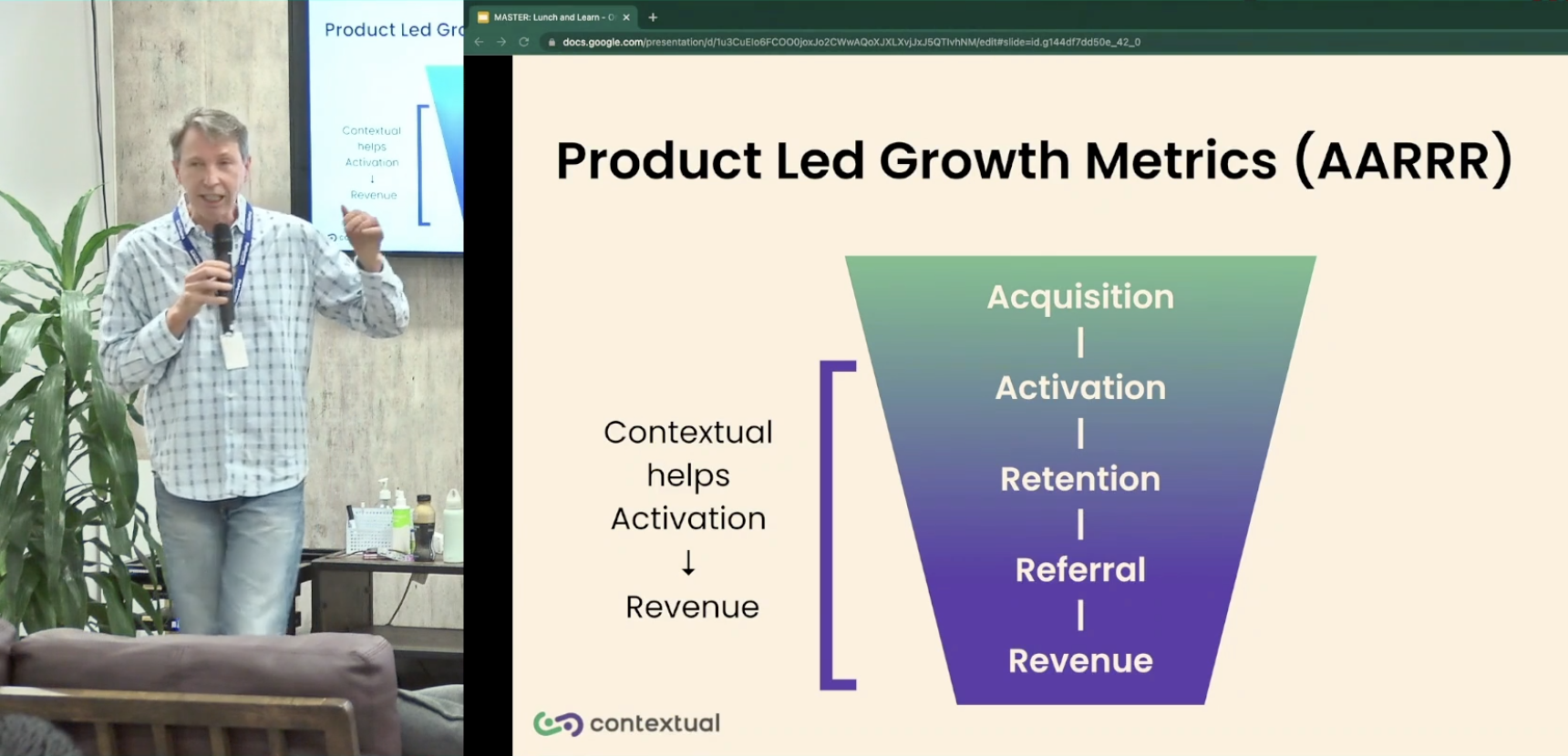
    By David Jones Founder and CEO Contextual

    The wave of Product Led Growth has revolutionized the industry in recent years. When discussing Product Led Growth (PLG), it is often compared to “sales-led” approaches, the dirty little secret is that many SaaS companies presenting as PLG are in reality Sales-Led.

    In addition to Product-Led and “sales-led” approach, other prevalent strategies include marketing led, customer led, engineering led, and service led. However, in this presentation, I dare to suggest that most PLG software products rely on the tried-and-true “Pirate Metrics” (AARRR) framework. By examining key elements of PLG, we can always reframe them in terms of AARRR and their correlation to the user journey.

    To summarize, Pirate Metrics represent a funnel for fostering deeper engagement. Typically, ownership of these metrics lies with Product Management, Customer Success, and Growth teams, encompassing interconnected phases such as:

    • Acquisition: Typically owned by marketing is the user journey up to registering with your product and logging in Attracting users through various channels and acquiring them as customers.
    • Activation:. Is discussed extensively in this video. Activation is the moment where the user extracts value in the product. This can also be the first moment the user completes an action such as filling out their profile, inviting their co-workers to sign-up for the app or completing a transaction. Activation is guiding users to experience the core value of the product and ensuring a successful onboarding process.
    • Retention: Encouraging users to continue using the product and cultivating long-term engagement. This can be measured in revisits to the application, typically measured in Daily Active Uses, average session length and custom (per application) engagement metrics. Of course an important metric might be (one or recurring) monetary transactions.
    • Referral: Harnessing the power of satisfied users to advocate for the product and refer others. This includes activities where your user is inviting and engaging other users in a virtuous circle that grows Activation and Retention. This is a key part of Product Led growth where marketing and acquisition costs are significantly subsidised (or eliminated entirely by harnessing network effects of the users in the App). Whilst B2C apps like social networks are poster-children for network effects, B2B apps like Atlassian have been well documented as having a growth flywheel based on this strategy.
    • Revenue: There is no growth without revenue!  As can be seen, this can happen at one or more points elsewhere in AARRR and single or multiple times. Optimizing monetization strategies to drive revenue growth and maximize customer value is the ultimate measure of success

    So we can see that PLG is very much supported by a product design that rolls up these key User Journey components. This talk tracks the journey on a timeline.  By leveraging the power of contextual walkthroughs, contextual user onboarding, contextual mobile tooltips, and a comprehensive digital adoption platform, businesses can enhance their product adoption and effectively implement PLG strategies.

    Webinar: How to Automate Product-Led Growth in APAC

    With MeshAI

    Tue 29th September 2022, 12:00 pm SGT (2:00pm AEST)

    • How Product Led Growth is transforming in 2022
    • Evolving your software  product’s PLG model
    • Automating PLG the who and how
    • Product-Led Go-To Market strategy
    • The PLG Automation analytics, onboarding and communications


    ux anti-pattern

  • For mobile user onboarding. Does the world really love Android more than Apple?

    For mobile user onboarding. Does the world really love Android more than Apple?

    Smartphone manufacturers are clearly the earliest proponents of sophisticated digital product adoption techniques like mobile user onboarding flows and product walkthroughs but how are they faring in their global battle for hearts and minds? 

    A report by Electronics Hub in 2021 showed that out of 142 countries, 74 prefer Android over Apple 65 with Belarus, Fiji and Peru showing a draw.  The survey methodology described in the report was based on sentiment analysis of over 347,000 tweets.


    What was remarkable about the survey is that North America overwhelmingly prefers Android (yep you read that right) over Apple with Android averaging 32, over Apple 19 in terms of positive sentiment.  Curiously Poland emerged as the world’s number 1 Android hater with 34% of tweets averaging negative.  Latvia ranked as the world’s number one Apple hater with 35% tweets about Apple averaging negative.


    Whatever religious standing consumers hold over either platform the sentiment doesn’t stack up when it comes to B2B and B2B2C mobile apps.  A tally of Apple and Android SDKs for three of the most popular analytics firms Segment, Amplitude and Mixpanel tell a very different story. A sample of Business and Finance apps using SDKs for the aforementioned analytics firms reveal Apple as the clear front runner with almost double the number of SDKs over Android.


    Love or hate when it comes to the question of how users feel the apps they use, analytics will provide some insight however they don’t provide any tools enabling quick response to change or influence user behaviour.   App developers are largely limited to hard coding which extends to any user engagement strategies like mobile app user onboarding tours, product walkthroughs, contextual mobile tooltips, in-app FAQ’s and user surveys.  Darryl Goede, CEO and founder of Sparkbox knows first hand how long and painful software development can be, however being able to use a low-code user engagement platform like Contextual allows his team to quickly respond to changes in user behaviour and maintain the love of Spark Pico users


    React Native shares the love!. At Contextual we are noticing emerging B2B apps are trending towards Android particularly in Asia and South America however what we are also seeing is a preference for React Native for the development of both Android and IOS business apps.  This is great news for Product Teams looking to accelerate their apps across both iOS and Android platforms.  The good news is Contextual provides a simple easy to implement solution for creating and targeting mobile and web application user onboarding guides and walkthroughs and in-app contextual tooltips, FAQs and user surveys across each operating system.